---
title: "Prof D's Regression Sessions - Vol 1"
subtitle: "AKA - Applied Linear Regression - Basics"
format:
html:
code-fold: true
code-tools: true
ipynb: default
filters:
- qna
- multicode
- quarto # keep Quarto’s built-ins as the last filter or it won't work
---
```{r}
#| message: false
#| warning: false
#| include: false
library(here)
here()
```
```{r}
#| message: false
#| warning: false
#| include: false
## Notes - make sure that reticulate is pointing to a local reticulate install of python or things might go squiffy.
## in terminal type: where python - to find out where reticulate might have stashed a version of the python.exe
## make sure you point to it before installing these packages using:
## reticulate::use_python("C:/Path/To/Your/Python/python.exe", required = TRUE)
#renv::install("C:/GitHubRepos/casaviz.zip")
# Get all packages from the lockfile
#lockfile <- renv::load("renv.lock")
#packages <- setdiff(names(lockfile$Packages), "casaviz")
# Restore only the selected packages
#renv::restore(packages = packages)
library(reticulate)
#virtualenv_list()
#virtualenv_root()
#use_virtualenv(virtualenv = NULL, required = NULL)
#reticulate::virtualenv_remove("r-reticulate")
# point reticulate to the right python installation - ideally the one reticulate installed.
#reticulate::use_python("C:/Users/Adam/AppData/Local/R/cache/R/reticulate/uv/cache/archive-v0/EiTNi4omakhlev5ckz2WP/Scripts/python.exe", required = TRUE)
#use_condaenv("qmEnv", conda = "C:/Users/adam_/anaconda3/Scripts/conda.exe", required = TRUE)
#reticulate::use_python("C:/Users/adam_/anaconda3/envs/qmEnv/python.exe", required = TRUE)
#py_run_string("import pyproj; print(pyproj.CRS.from_epsg(27700))")
#virtualenv_create("r-reticulate", python = "C:/Users/Adam/AppData/Local/R/cache/R/reticulate/uv/cache/archive-v0/EiTNi4omakhlev5ckz2WP/Scripts/python.exe")
#virtualenv_install("r-reticulate", packages = c("pyyaml", "jupyter", "statsmodels","pyjanitor","pathlib","matplotlib","pandas", "numpy", "scipy", "seaborn", "geopandas", "folium", "branca"))
#use_virtualenv("r-reticulate", required = TRUE)
# reticulate::py_config()
# reticulate::py_require("pyyaml")
# reticulate::py_require("jupyter")
# reticulate::py_require("statsmodels")
# reticulate::py_require("pandas")
# reticulate::py_require("numpy")
# reticulate::py_require("pyjanitor")
# reticulate::py_require("pathlib")
# reticulate::py_require("matplotlib")
# reticulate::py_require("seaborn")
#reticulate::py_install("folium")
#reticulate::py_install("geopandas")
#reticulate::py_install("contextily", pip = TRUE)
#reticulate::py_install("scikit-learn", pip = TRUE)
```
```{=html}
<iframe data-testid="embed-iframe" style="border-radius:12px" src="https://open.spotify.com/embed/track/1f2SbTAoE90QelFZlrpzxT?utm_source=generator" width="100%" height="352" frameBorder="0" allowfullscreen="" allow="autoplay; clipboard-write; encrypted-media; fullscreen; picture-in-picture" loading="lazy"></iframe>
```
## Preamble
Over the next 3 weeks we are going **DEEP** into linear regression. The QM Regression Sessions will be tough, but we will be eased through the journey in the company of LTJ Bukem, Blame, Conrad and others. Plug into the Progression Sessions, let them sooth your mind and allow you to get fully into the Regression Sessions!
## Introduction
This week's practical is focused on understanding the most basic form of regression analysis, but in an applied context discovering what these models help you understand about your data in great detail. You will essentially re-create some of the analysis you saw in the lecture, but for slightly different variables and for different places.
Most of what you will be doing in this practical won't actually be modelling - although this will come at the end - but you will be getting to know your data so that your final models make sense. This is how it should be!! Going back to our bake-off analogy, the modelling is really just the final bake after hours of preparation.
## Aims
By the end of this week's regression session you should:
- Be able to use R or Python to process data in order to carry out a scientific investigation
- Feel comfortable in plotting and visualising that processed data to assess relationships between x and y variables
- Understand how to use built-in statistical software functions in R and Python to run specify and a basic regression model and produce statistical outputs from those models
- Interpret those model outputs critically in order to evaluate the strenght and direction of the relationships you are observing.
::: callout-note
Below you will find code-blocks that will allow you to run your analysis in either R or Python. It's up to you which you decide to use - you might even want to try both to compare (Of course, R will be better)!
The Juypter notebook attached to this practical *might* work, but you are probably better off just firing up RStudio or VS code, creating a new notebook and editing from scratch on your local machine.
:::
## Tasks
::: callout-warning
Make sure you complete each of the tasks below, 1-4. All of these will be covered in the code examples as you work your way down the page, but this is the full [workflow](https://dictionary.cambridge.org/dictionary/english/workflow):
:::
### 1. Downloading: Download and read data into your software environment:
- School locational and attribute information, downloaded from here - <https://get-information-schools.service.gov.uk/Downloads> - or read it in using the code supplied below. This will include the following datasets:
- **edubase_schools** = this is the 'all establishment' data for every school in England and Wales
- School-level Key Stage 4 (14-16 GCSE level) attainment and other attribute information. [I have put this on Moodle here](https://moodle.ucl.ac.uk/mod/folder/view.php?id=8199904), but it can also be downloaded from here - <https://www.compare-school-performance.service.gov.uk/download-data>.
Download to a local drive on your computer from Moodle, unzip it and then read it in using the code supplied below. The zip folders contain the following data files in one folder and the associated metadata in the other folder:
a. **england_ks4final** = data on the 2022/23 academic year, school-level, KS4 outcomes and associated statistics
b. **england_abs** = data on the 2022/23 academic year, school-level absence rates
c. **england_census** = additional school-level pupil information for the 2022/23 academic year
d. **england_school_information** = additional school-level institution information such as Ofsted rating etc. for the 2022/23 academic year
e. **england_ks4_pupdest** = pupil destination data (where students go once they leave school at 16)
### 2. Data Munging: Join, filter, select and subset:
- Create a master file for England called **england_school_2022_23.** This will be made by joining together all of the school-level data above into a single file and then reducing it in size using:
a. **filter** - so that it just contains open secondary schools
b. **select** - so that only a few key variables relating to attainment, progress, deprivation, absence and school quality remain, alongside key locational and other attributes.
- Create two local authority data **subsets** from this main file:
a. A subset containing all of the secondary schools in one of the 32 London Boroughs (not including the City of London)
b. A subset containing all of the secondary schools in any other local authority in England. Any local authority you like - go wild!
At the end of this you will have **x3 datasets** - one national and two local authority subsets
### 3. Exploratory Data Analysis
- Choose:
a. one attainment related dependent variable from your set
b. one possible explanatory variable which you think might help explain levels of attainment in schools
- Create a series of graphs and statistical outputs to allow you to understand the structure and composition of your data. You should produce:
a. A histogram for the dependent and independent variables you are analysing for **both your two subsets** and the **national dataset** (x6 histograms in total). You might want to augment your histograms to include:
i. mean and median lines
ii. lines for the upper and lower quartiles
iii. indications of outliners
iv. a kernel density smoothing
b. Alternative plots such as violin plots or box plots to compare with the histogram
c. Point Maps of the locations of your schools in your two subsets - points sized by either of your variables
d. A scatter plot of your dependent (attainment) and independent (disadvantage) variables (national and two local subsets) - on these plots you might want to include:
i. a regression line of best fit
ii. the R-squared, slope and intercept parameters
### 4. Explanatory Data Analysis - Attainment and Factors Affecting it in Different Parts of England
- Carry out a bi-variate regression analysis to explore the relationship between your chosen attainment dependent variable and your single explanatory independent variable, for your two subsets and the national dataset. **Questions to Answer**:
a. After visualising the relationships using scatter plots, do you think you need to transform your variables (e.g. using a log transformation) before putting into a regression model? Maybe plot scatter plots of your logged variables too!
b. What are the slope and intercept coefficients in each model? Are they statistically significant and how do vary between your two subsets? How do they compare with the national picture?
c. How do the R-squared values differ and how reliable do you think they are (what do the degrees of freedom tell you)?
d. What observations can you make about your two local authority study areas relative to the national picture?
## Task 1 - Download your data and read into your software environment
- I've made this task easy for you by giving you the code to download all of this data. You'll need to download a selection of files - click on either tab to see the code for each.
- In order to run this code, you should first [download and unzip the data from Moodle](https://moodle.ucl.ac.uk/mod/folder/view.php?id=8199904), before editing the code below so that you can read the data from a local folder on your computer:
::: callout-note
I would encourage you **NOT** to just copy and paste this code blindly, but try to understand what it is doing at each stage.
You may notice that there are some bits that are redundant (some of the NA code that I was messing with before deciding on a single way of removing NAs).
What am I doing to the URN field? Why might I be doing that?
What is the regex function doing and why might I be searching out those characters? What might happen to the data if I didn't handle those first?
:::
::: qna
#### {width="30"}
```{python}
import pandas as pd
import numpy as np
# --- pandas_flavor compatibility shim (run this before importing janitor) ---
import pandas_flavor as pf
import janitor
from janitor import clean_names
from pathlib import Path


# If groupby decorator doesn't exist, alias it to the dataframe decorator
if not hasattr(pf, "register_groupby_method") and hasattr(pf, "register_dataframe_method"):
    pf.register_groupby_method = pf.register_dataframe_method
# ---------------------------------------------------------------------------

try:
    from janitor import clean_names as jn_clean_names
    HAS_JANITOR = True
except Exception as e:
    HAS_JANITOR = False
    print(f"pyjanitor unavailable or failed to import: {e}\nUsing local clean_names fallback.")

def clean_names_fallback(df: pd.DataFrame) -> pd.DataFrame:
    def _clean(s):
        s = str(s).strip().lower().replace(" ", "_").replace("-", "_")
        s = s.encode("ascii", "ignore").decode()
        while "__" in s:
            s = s.replace("__", "_")
        return s
    return df.rename(columns=_clean)


# little function to define the file root on different machines
def find_qm_root(start_path: Path = Path.cwd(), anchor: str = "QM") -> Path:
    """
    Traverse up from the start_path until the anchor folder (e.g., 'QM_Fork')      is found. Returns the path to the anchor folder.
    """
    for parent in [start_path] + list(start_path.parents):
        if parent.name == anchor:
            return parent
    raise FileNotFoundError(f"Anchor folder '{anchor}' not found in path      hierarchy.")

qm_root = find_qm_root()


# Read CSV file
edubase_schools = pd.read_csv(
    "https://www.dropbox.com/scl/fi/fhzafgt27v30lmmuo084y/edubasealldata20241003.csv?rlkey=uorw43s44hnw5k9js3z0ksuuq&raw=1",
    encoding="cp1252",
    low_memory=False,
    dtype={"URN": str}
)
edubase_schools = jn_clean_names(edubase_schools) if HAS_JANITOR else clean_names_fallback(edubase_schools)
#py_edubase_schools.dtypes
#dtype_df = py_edubase_schools.dtypes.reset_index()
#dtype_df.columns = ["column_name", "dtype"]

########################################
# Define base path and common NA values - NOTE YOU WILL NEED TO DOWNLOAD THIS DATA AND PUT INTO YOUR OWN base_path LOCATION ON YOUR MACHINE - not this one as this is my path!!!
#base_path = Path("E:/QM/sessions/L6_data/Performancetables_130242/2022-2023")
base_path = qm_root / "sessions" / "L6_data" / "Performancetables_130242" / "2022-2023"
##################################################
na_values_common = ["", "NA", "SUPP", "NP", "NE"]
na_values_extended = na_values_common + ["SP", "SN"]
na_values_attainment = na_values_extended + ["LOWCOV", "NEW"]
na_values_mats = na_values_common + ["SUPPMAT"]
na_all = ["", "NA", "SUPP", "NP", "NE", "SP", "SN", "LOWCOV", "NEW", "SUPPMAT", "NaN"]

# Absence data
england_abs = pd.read_csv(base_path / "england_abs.csv", na_values=na_all, dtype={"URN": str})

# Census data
england_census = pd.read_csv(base_path / "england_census.csv", na_values=na_all, dtype={"URN": str})
england_census.iloc[:, 4:23] = england_census.iloc[:, 4:23].apply(lambda col: pd.to_numeric(col.astype(str).str.replace('%', '', regex=False), errors="coerce"))

# KS4 MATs performance data
england_ks4_mats_performance = pd.read_csv(base_path / "england_ks4-mats-performance.csv", na_values=na_all, encoding="cp1252", low_memory=False, dtype={"URN": str})
england_ks4_mats_performance["TRUST_UID"] = england_ks4_mats_performance["TRUST_UID"].astype(str)
england_ks4_mats_performance["P8_BANDING"] = england_ks4_mats_performance["P8_BANDING"].astype(str)
england_ks4_mats_performance["INSTITUTIONS_INMAT"] = england_ks4_mats_performance["INSTITUTIONS_INMAT"].astype(str)

cols_to_convert = england_ks4_mats_performance.columns[10:]
exclude = ["P8_BANDING", "INSTITUTIONS_INMAT"]
cols_to_convert = [col for col in cols_to_convert if col not in exclude]
england_ks4_mats_performance[cols_to_convert] = england_ks4_mats_performance[cols_to_convert].apply(lambda col: pd.to_numeric(col.astype(str).str.replace('%', '', regex=False), errors="coerce"))

# KS4 pupil destination data
england_ks4_pupdest = pd.read_csv(base_path / "england_ks4-pupdest.csv", na_values=na_all, dtype={"URN": str})
england_ks4_pupdest.iloc[:, 7:82] = england_ks4_pupdest.iloc[:, 7:82].apply(lambda col: pd.to_numeric(col.astype(str).str.replace('%', '', regex=False), errors="coerce"))

# KS4 final attainment data
england_ks4final = pd.read_csv(base_path / "england_ks4final.csv", na_values=na_all, dtype={"URN": str})
start_col = "TOTPUPS"
end_col = "PTOTENT_E_COVID_IMPACTED_PTQ_EE"
cols_range = england_ks4final.loc[:, start_col:end_col].columns
# Strip % signs and convert to numeric
england_ks4final[cols_range] = england_ks4final[cols_range].apply(
    lambda col: pd.to_numeric(col.astype(str).str.replace('%', '', regex=False), errors="coerce")
)

# School information data
england_school_information = pd.read_csv(
    base_path / "england_school_information.csv",
    na_values=na_all,
    dtype={"URN": str},
    parse_dates=["OFSTEDLASTINSP"],
    dayfirst=True  # Adjust if needed
)
```
#### {width="41" height="30"}
```{r}
#| message: false
#| warning: false
library(tidyverse)
library(janitor)
library(readr)
library(dplyr)
library(here)

# Read CSV file
edubase_schools <- read_csv("https://www.dropbox.com/scl/fi/fhzafgt27v30lmmuo084y/edubasealldata20241003.csv?rlkey=uorw43s44hnw5k9js3z0ksuuq&raw=1") %>%
  clean_names() %>%
  mutate(urn = as.character(urn))
#str(r_edubase_schools)

# Define base path and common NA values - NOTE YOU WILL NEED TO DOWNLOAD THIS DATA AND PUT INTO YOUR OWN base_path LOCATION ON YOUR MACHINE
base_path <- here("sessions", "L6_data", "Performancetables_130242", "2022-2023")
na_common <- c("", "NA", "SUPP", "NP", "NE")
na_extended <- c(na_common, "SP", "SN")
na_attainment <- c(na_extended, "LOWCOV", "NEW")
na_mats <- c(na_common, "SUPPMAT")
na_all <- c("", "NA", "SUPP", "NP", "NE", "SP", "SN", "LOWCOV", "NEW", "SUPPMAT")

# Absence data
england_abs <- read_csv(file.path(base_path, "england_abs.csv"), na = na_all) |>
  mutate(URN = as.character(URN))

# Other School Census data
england_census <- read_csv(file.path(base_path, "england_census.csv"), na = na_all) |>
  mutate(URN = as.character(URN)) |>
  mutate(across(5:23, ~ parse_number(as.character(.))))

# KS4 MATs performance data
#First read
england_ks4_mats_performance <- read_csv(
  file.path(base_path, "england_ks4-mats-performance.csv"),
  na = na_all
) |>
  mutate(
    TRUST_UID = as.character(TRUST_UID),
    P8_BANDING = as.character(P8_BANDING),
    INSTITUTIONS_INMAT = as.character(INSTITUTIONS_INMAT)
  )

# Then Identify columns to convert (excluding character columns)
cols_to_convert <- england_ks4_mats_performance |>
  select(-(1:10), -P8_BANDING, -INSTITUTIONS_INMAT) |>
  names()

# Then apply parse_number safely to convert characters to numbers
england_ks4_mats_performance <- england_ks4_mats_performance |>
  mutate(across(all_of(cols_to_convert), ~ parse_number(as.character(.))))


# KS4 pupil destination data
england_ks4_pupdest <- read_csv(file.path(base_path, "england_ks4-pupdest.csv"), na = na_all) |>
  mutate(URN = as.character(URN)) |>
  mutate(across(8:82, ~ parse_number(as.character(.))))

# KS4 final attainment data
england_ks4final <- read_csv(file.path(base_path, "england_ks4final.csv"), na = na_all) |>
  mutate(URN = as.character(URN)) |>
  mutate(across(TOTPUPS:PTOTENT_E_COVID_IMPACTED_PTQ_EE, ~ parse_number(as.character(.))))

# School information data
england_school_information <- read_csv(
  file.path(base_path, "england_school_information.csv"),
  na = na_all,
  col_types = cols(
    URN = col_character(),
    OFSTEDLASTINSP = col_date(format = "%d-%m-%Y")
  )
)
```
:::
## Task 2 - Data Munging
- Use Python or R to join all of the datasets you loaded in the previous step into a single master file that we will called `england_school_2022_23` using the unique school reference number (URN) as the key.
- Create the master file:
::: qna
#### {width="30"}
```{python}
# Left join england_ks4final with england_abs, census, and school information
england_school_2022_23 = (
    england_ks4final
    .merge(england_abs, on="URN", how="left")
    .merge(england_census, on="URN", how="left")
    .merge(england_school_information, on="URN", how="left")
    .merge(edubase_schools, left_on="URN", right_on="urn", how="left")
)
```
#### {width="41" height="30"}
```{r}
#| warning: false
# Left join england_ks4final with england_abs
england_school_2022_23 <- england_ks4final %>%
  left_join(england_abs, by = "URN") %>%
  left_join(england_census, by = "URN") %>%
  left_join(england_school_information, by = "URN") %>%
  left_join(edubase_schools, by = c("URN" = "urn"))
```
:::
#### Iterative Checking and initial exploratory analysis
- It's never too soon to start exploring your data - even (or indeed especially) in the data 'munging' (processing, cleaning etc.) stage.
- You will probably find yourself iteratively plotting, filtering, plotting again, switching variables, plotting again, over and over again until you are happy with the data you have. This is all part of the Exploratory Data Analysis Process and vital before applying any other methods to your data!
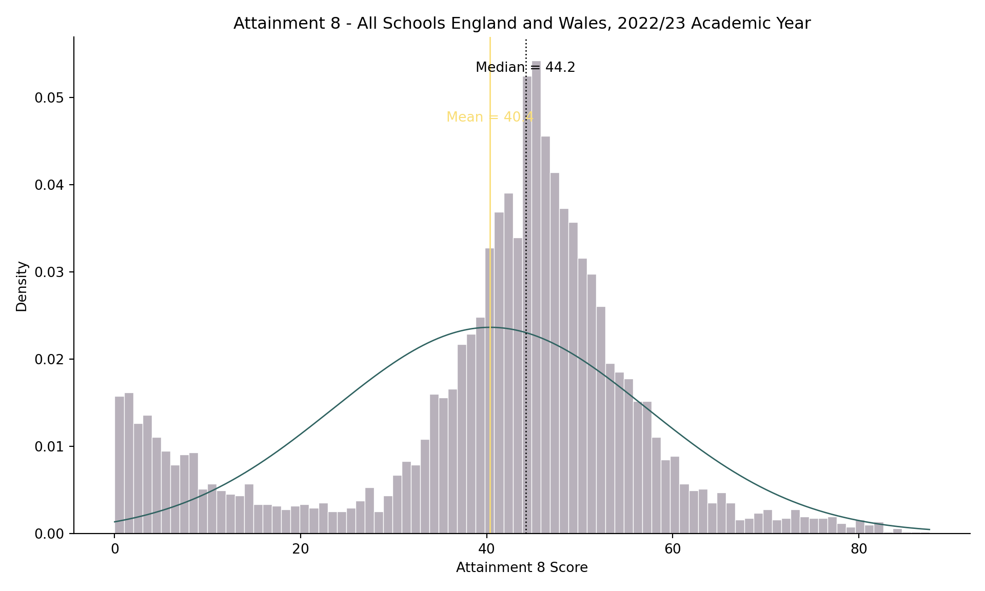
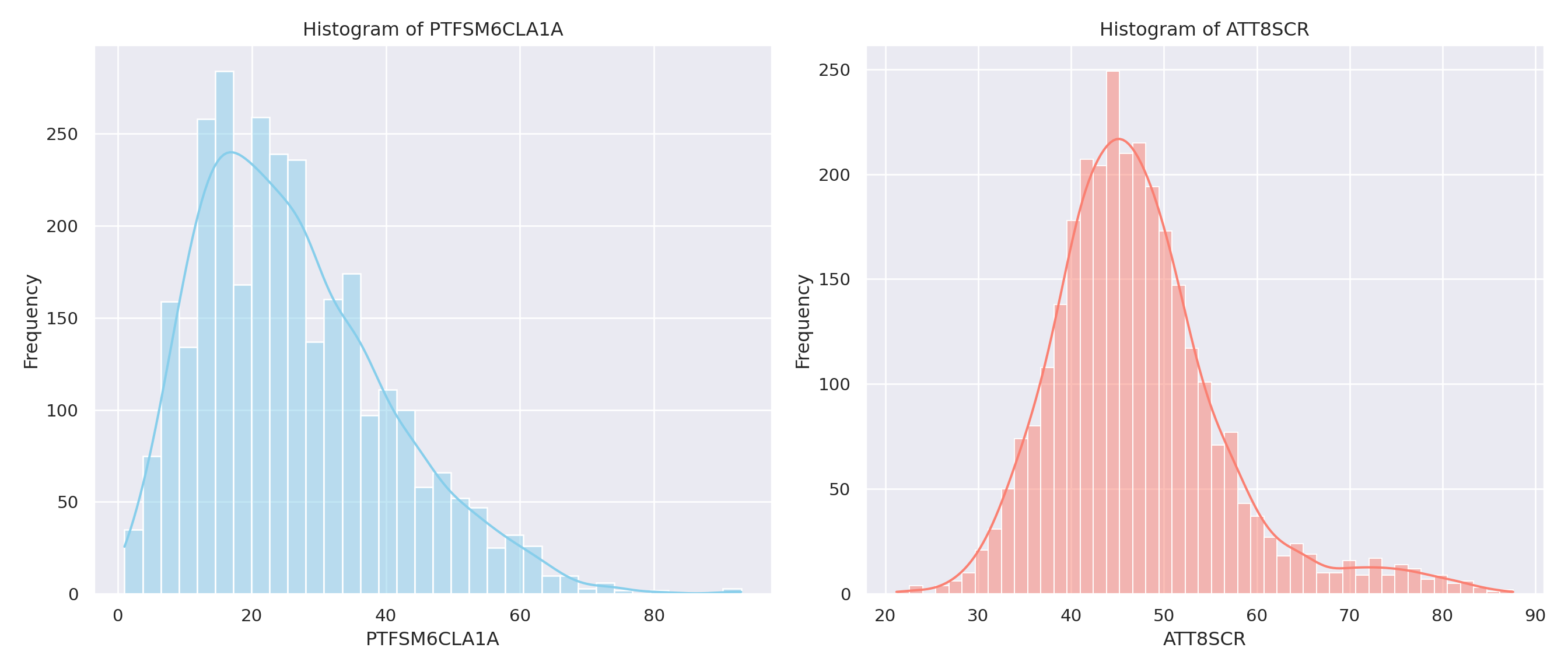
- If you recall from the lecture, the histogram of attainment 8 in the whole of England dataset looked a bit odd:
::: {.multicode}
#### {width="30"}
```{python}
#| echo: true
import matplotlib.pyplot as plt
import seaborn as sns
import numpy as np

# Compute statistics
median_value = england_school_2022_23["ATT8SCR"].median(skipna=True)
mean_value = england_school_2022_23["ATT8SCR"].mean(skipna=True)
sd_value = england_school_2022_23["ATT8SCR"].std(skipna=True)

# Set up the figure
plt.figure(figsize=(10, 6))

# Histogram with density
sns.histplot(
    data=england_school_2022_23,
    x="ATT8SCR",
    stat="density",
    binwidth=1,
    color="#4E3C56",
    alpha=0.4,
    linewidth=0.5,
    edgecolor="white"
)

# Overlay normal distribution curve
x_vals = np.linspace(
    england_school_2022_23["ATT8SCR"].min(),
    england_school_2022_23["ATT8SCR"].max(),
    500
)
normal_density = (
    1 / (sd_value * np.sqrt(2 * np.pi))
) * np.exp(-0.5 * ((x_vals - mean_value) / sd_value) ** 2)
plt.plot(x_vals, normal_density, color="#2E6260", linewidth=1)

# Add vertical lines for median and mean
plt.axvline(median_value, color="black", linestyle="dotted", linewidth=1)
plt.axvline(mean_value, color="#F9DD73", linestyle="solid", linewidth=1)

# Annotate median and mean
plt.text(median_value, plt.gca().get_ylim()[1]*0.95, f"Median = {median_value:.1f}",
         color="black", ha="center", va="top", fontsize=10)
plt.text(mean_value, plt.gca().get_ylim()[1]*0.85, f"Mean = {mean_value:.1f}",
         color="#F9DD73", ha="center", va="top", fontsize=10)

# Customize labels and theme
plt.title("Attainment 8 - All Schools England and Wales, 2022/23 Academic Year")
plt.xlabel("Attainment 8 Score")
plt.ylabel("Density")
sns.despine()
plt.tight_layout()

# Show the plot
# plt.show()
```
#### {width="41" height="30"}
```{r}
#| echo: true
#| warning: false
median_value <- median(england_school_2022_23$ATT8SCR, na.rm = TRUE)
mean_value   <- mean(england_school_2022_23$ATT8SCR, na.rm = TRUE)
sd_value   <- sd(england_school_2022_23$ATT8SCR, na.rm = TRUE)

ggplot(england_school_2022_23, aes(x = ATT8SCR)) +
  geom_histogram(aes(y = ..density..), binwidth = 1, fill = "#4E3C56", alpha = 0.4) +
  stat_function(fun = dnorm, args = list(mean = mean_value, sd = sd_value), color = "#2E6260", linewidth = 1) +
  geom_vline(xintercept = median_value, color = "black", linetype = "dotted", size = 1) +
  geom_vline(xintercept = mean_value, color = "#F9DD73", linetype = "solid", size = 1) +
  annotate("text",
           x = median_value, y = Inf,
           label = paste0("Median = ", round(median_value, 1)),
           vjust = 1.3, color = "black", size = 3.5) +
  annotate("text",
           x = mean_value, y = Inf,
           label = paste0("Mean = ", round(mean_value, 1)),
           vjust = 30.5, color = "#F9DD73", size = 3.5) +
  scale_y_continuous(expand = expansion(mult = c(0, 0.08))) +
  labs(
    title = "Attainment 8 - All Schools England and Wales, 2022/23 Academic Year",
    x = "Attainment 8 Score",
    y = "Density"
  ) +
  theme_minimal()
```
:::
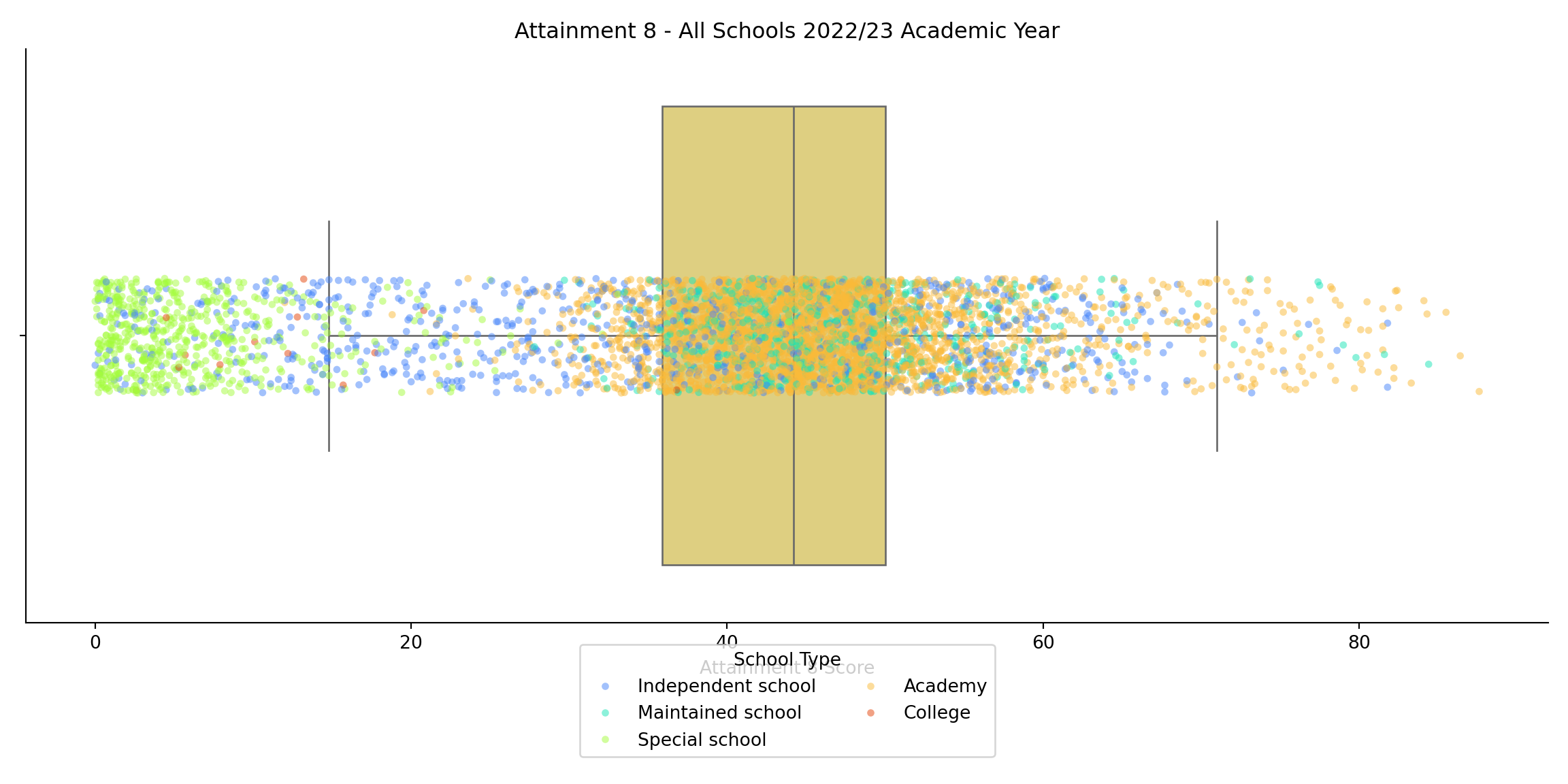
- You may also recall from the lecture that this odd distribution was related to different types of school in the system. We can create a similar visualisation here:
::: {.multicode}
#### {width="30"}
```{python}
import matplotlib.pyplot as plt
import seaborn as sns

# Set up the figure
plt.figure(figsize=(12, 6))

# Boxplot grouped by MINORGROUP
sns.boxplot(
    x='ATT8SCR',
    data=england_school_2022_23,
    color="#EDD971",
    fliersize=0,
    linewidth=1
)

# Jittered points
sns.stripplot(
    x='ATT8SCR',
    data=england_school_2022_23,
    hue='MINORGROUP',
    dodge=False,
    jitter=True,
    alpha=0.5,
    size=4,
    palette='turbo'
)

# Customize the plot
plt.title("Attainment 8 - All Schools 2022/23 Academic Year")
plt.xlabel("Attainment 8 Score")
plt.ylabel("")
plt.legend(title="School Type", loc='lower center', bbox_to_anchor=(0.5, -0.25), ncol=2)
sns.despine()
plt.tight_layout()

# Show the plot
plt.show()
```
#### {width="41" height="30"}
```{r}
#| warning: false
ggplot(england_school_2022_23, aes(x = ATT8SCR, y = "")) +
  geom_boxplot(fill = "#EDD971", alpha = 0.3, outlier.shape = NA) +
  geom_jitter(aes(colour = MINORGROUP), height = 0.2, alpha = 0.3, size = 1) +
  scale_colour_viridis_d(option = "turbo") +  # applies the default casaviz discrete palette
  labs(
    title = "Attainment 8 - All Schools 2022/23 Academic Year",
    x = "Attainment 8 Score",
    y = NULL,
    colour = "School Type"
  ) +
  theme_minimal() +
  theme(
    legend.position = "bottom",
    legend.key.size = unit(10, "mm"),   # increase dot space
    legend.text = element_text(size = 10)  # optional: larger legend labels
  ) + guides(colour = guide_legend(override.aes = list(size = 4)))
```
:::
#### Further filtering and subsetting
- Having joined all of these data frames into a single master dataframe for the whole of England and observed some issues, we will need to filter out some of the rows we don't want and the columns that we don't need
- In the two folders you downloaded from Moodle, one contains all of the data we need, the other contains all of the metadata which tells us what the variables are
- If you open up, for example `ks4_meta.xlsx` these are the variables related to attainment for each school.
- Similarly `abbreviations.xlsx` attaches some meaning to some of the codes associated with some of these variables, with other metadata files containing other info. Take some time to look at these so you understand the range of variables we'll be exploring.
::: callout-note
One of the key filtering asks carried out in the code below is to filter the schools so that we only retain the maintained schools and the academies in the dataset
:::
## Task 2 (continued) - Filtering, Selecting and Subsetting
The Code Below already has the syntax to allow you to filter your dataset and drop special schools, independent schools and colleges.
It also contains the start of some code to allow you to select a smaller set of variables from the 700-odd in the main file.
1. Adapt this Python or R code so that it contains these variables plus the additional variables listed below (see the note about how you may need to adjust the names depending on whether using Python or R). - You should end up with 34 in total
2. Once you have created this filtered and reduced file called `england_filtered`, write it out as a csv (e.g. england_filtered.csv) and save to your local working directory - we will use it again in future practicals
3. Now you have your `england_filtered` file, use this code below as the template for creating two new data subsets:
a. london_borough_sub
b. england_lad_sub These two new files should create a subset which has filtered on the name or code of a London borough and another local authority in England
::: {.multicode}
#### {width="30"}
```{python}
#| eval: false
#| include: true
import pandas as pd
# Assuming england_filtered is a pandas DataFrame
england_filtered.to_csv("england_filtered.csv", index=False)
```
#### {width="41" height="30"}
```{r}
#| eval: false
#| include: true
library(tidyverse)
write_csv(england_filtered, "england_filtered.csv")
```
:::
::: callout-note
If you are unsure of the names of the local authorities in England, use the `la_and_region_codes_meta.csv` file in your metadata folder to help you. You might want to name your "sub" files according to the names of the local authorities you choose.
:::
```{r}
#| eval: false
#| include: false
#str(england_school_2022_23)
```
::: qna
#### {width="30"}
```{python}
import pandas as pd

## check all of your variable names first as R and python will call them something different
column_df = pd.DataFrame({'Column Names': england_school_2022_23.columns.tolist()})

# Define excluded MINORGROUP values
excluded_groups = ["Special school", "Independent school", "College", None]

# Filter and select columns
england_filtered = (
    england_school_2022_23[
        ~england_school_2022_23["MINORGROUP"].isin(excluded_groups) &
        (england_school_2022_23["phaseofeducation_name_"] == "Secondary") &
        (england_school_2022_23["establishmentstatus_name_"] == "Open")
    ][["URN", "SCHNAME_x", "LEA", "TOWN_x", "TOTPUPS", "ATT8SCR", "OFSTEDRATING", "MINORGROUP", "PTFSM6CLA1A"]]
)
```
```{python}
#| include: false
import pandas as pd
## check all of your variable names first as R and python will call them something different
column_df = pd.DataFrame({'Column Names': england_school_2022_23.columns.tolist()})
# Define excluded MINORGROUP values
excluded_groups = ["Special school", "Independent school", "College", None]
# Filter and select columns
england_filtered = (
england_school_2022_23[
~england_school_2022_23["MINORGROUP"].isin(excluded_groups) &
(england_school_2022_23["phaseofeducation_name_"] == "Secondary") &
(england_school_2022_23["establishmentstatus_name_"] == "Open")
][["URN", "SCHNAME_x", "LEA", "LANAME", "TOWN_x", "gor_name_", "TOTPUPS", "ATT8SCR", "ATT8SCRENG", "ATT8SCRMAT", "ATT8SCR_FSM6CLA1A", "ATT8SCR_NFSM6CLA1A", "ATT8SCR_BOYS", "ATT8SCR_GIRLS", "P8MEA", "P8MEA_FSM6CLA1A", "P8MEA_NFSM6CLA1A", "PTFSM6CLA1A", "PTNOTFSM6CLA1A", "PNUMEAL", "PNUMENGFL", "PTPRIORLO", "PTPRIORHI", "NORB", "NORG", "PNUMFSMEVER", "PERCTOT", "PPERSABS10", "SCHOOLTYPE_x", "RELCHAR", "ADMPOL_y", "ADMPOL_PT", "gender_name_", "OFSTEDRATING", "MINORGROUP", "easting", "northing"]]
)
```
#### {width="41" height="30"}
```{r}
# Filter data
england_filtered <- england_school_2022_23 %>%
  filter(!MINORGROUP %in% c("Special school", "Independent school", "College", NA)) %>%   filter(phase_of_education_name == "Secondary") %>%
  filter(establishment_status_name == "Open") %>%
  select(URN, SCHNAME.x, TOWN.x, TOTPUPS, ATT8SCR, OFSTEDRATING, MINORGROUP, PTFSM6CLA1A)
```
```{r}
#| include: false
# Filter data
england_filtered <- england_school_2022_23 %>%
filter(!MINORGROUP %in% c("Special school", "Independent school", "College", NA)) %>% filter(phase_of_education_name == "Secondary") %>%
filter(establishment_status_name == "Open") %>%
select(URN, SCHNAME.x, LEA, LANAME, TOWN.x,gor_name, TOTPUPS, ATT8SCR, ATT8SCRENG, ATT8SCRMAT,ATT8SCRMAT,ATT8SCR_FSM6CLA1A,ATT8SCR_FSM6CLA1A,ATT8SCR_NFSM6CLA1A,ATT8SCR_BOYS,ATT8SCR_GIRLS,P8MEA,P8MEA_FSM6CLA1A,P8MEA_NFSM6CLA1A,PTFSM6CLA1A,PTNOTFSM6CLA1A,PNUMEAL,PNUMENGFL,PTPRIORLO,PTPRIORHI,NORB,NORG,PNUMFSMEVER,PERCTOT,PPERSABS10,SCHOOLTYPE.x,RELCHAR,ADMPOL.y,ADMPOL_PT,gender_name,OFSTEDRATING, MINORGROUP, easting, northing)
#write_csv(england_filtered, "england_filtered.csv")
```
:::
::: {.callout-important title="Other variables to include in your reduced dataset"}
Other variables to include in your reduced dataset:
1. Local Authority (LEA) Code and Name - **LEA** and **LANAME**
2. Total Number of Pupils on Roll (all ages) - **TOTPUPS**
3. Average Attainment 8 score per pupil for English element - **ATT8SCRENG**
4. Average Attainment 8 score per pupil for mathematics element - **ATT8SCRMAT**
5. Average Attainment 8 score per disadvantaged pupil - **ATT8SCR_FSM6CLA1A**
6. Average Attainment 8 score per non-disadvantaged pupil - **ATT8SCR_NFSM6CLA1A**
7. Average Attainment 8 score per boy - **ATT8SCR_BOYS**
8. Average Attainment 8 score per girl - **ATT8SCR_GIRLS**
9. Progress 8 measure after adjustment for extreme scores - **P8MEA**
10. Adjusted Progress 8 measure - disadvantaged pupils - **P8MEA_FSM6CLA1A**
11. Adjusted Progress 8 measure - non-disadvantaged pupils - **P8MEA_NFSM6CLA1A**
12. \% of pupils at the end of key stage 4 who are disadvantaged - **PTFSM6CLA1A**
13. \% of pupils at the end of key stage 4 who are not disadvantaged - **PTNOTFSM6CLA1A**
14. \% pupils where English not first language - **PNUMEAL**
15. \% pupils with English first language - **PNUMENGFL**
16. \% of pupils at the end of key stage 4 with low prior attainment at the end of key stage 2 - **PTPRIORLO**
17. \% of pupils at the end of key stage 4 with high prior attainment at the end of key stage 2 - **PTPRIORHI**
18. Total boys on roll (including part-time pupils) - **NORB**
19. Total girls on roll (including part-time pupils) - **NORG**
20. Percentage of pupils eligible for FSM at any time during the past 6 years - **PNUMFSMEVER**
21. Percentage of overall absence - **PERCTOT**
22. Percentage of enrolments who are persistent absentees - **PPERSABS10**
23. School Type e.g. Voluntary Aided school - **SCHOOLTYPE**
24. Religious character - **RELCHAR**
25. Admissions Policy - **ADMPOL**
26. Admissions Policy new definition from 2019 - **ADMPOL_PT**
27. Government Office Region Name - **gor_name**
28. Mixed or Single Sex - **gender_name**
:::
::: callout-note
When you joined your datasets earlier, you will find that some variables appear in more than one of the datasets. This may cause a problem now as R and Python will try and distinguish them in the join by appending a `.x` or `.y` (R) or `_x` or `_y` (Python) so you may get an error when joining, particularly with the **SCHOOLTYPE** and **ADMPOL** variables. For these try **SCHOOLTYPE.x** and **ADMPOL.y** (underscore for Python) instead.
:::
## Task 3 - Further Exploratory Analysis and Visual Modelling
- Using the example code below as a guide, select your own $Y$ variable related to attainment from your smaller filtered dataset. You have a range of attainment or progress related variables in there
- Select your own $X$ variable that might help explain attainment, this might relate to disadvantage, prior attainment, absence or anything else that is a **continuous** variable (DO NOT SELECT A CATEGORICAL VARIABLE AT THIS TIME).
- Once you have selected your two variables, plot them against each other on a scatter plot to see if there is an obvious relationship - again, use the code below as a guide.
::: {.callout-tip title="AI tip"}
AI - yes, that dreaded thing that's invading everything. Well, it's hear to stay and while it's here, you might as well use it to help you with your coding. Of course, I don't want you to blindly copy things and not understand what's going on, but if you get stuck with syntax and getting plots to look how you want - feed your favourite AI with your code and get it to help you out.
:::
#### Exploratory Data Analysis Plots
```{python}
#| include: false
camden_sub = england_filtered[england_filtered['LANAME'] == 'Camden']
leeds_sub = england_filtered[england_filtered['LANAME'] == 'Leeds']
```
```{r}
#| include: false
camden_sub <- england_filtered %>%
filter(LANAME == "Camden")
leeds_sub <- england_filtered %>%
filter(LANAME == "Leeds")
```
::: {.callout-tip title="Questions to Answer"}
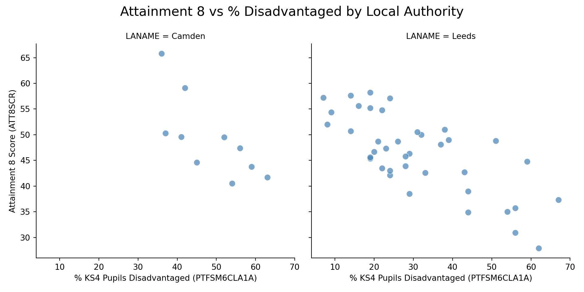
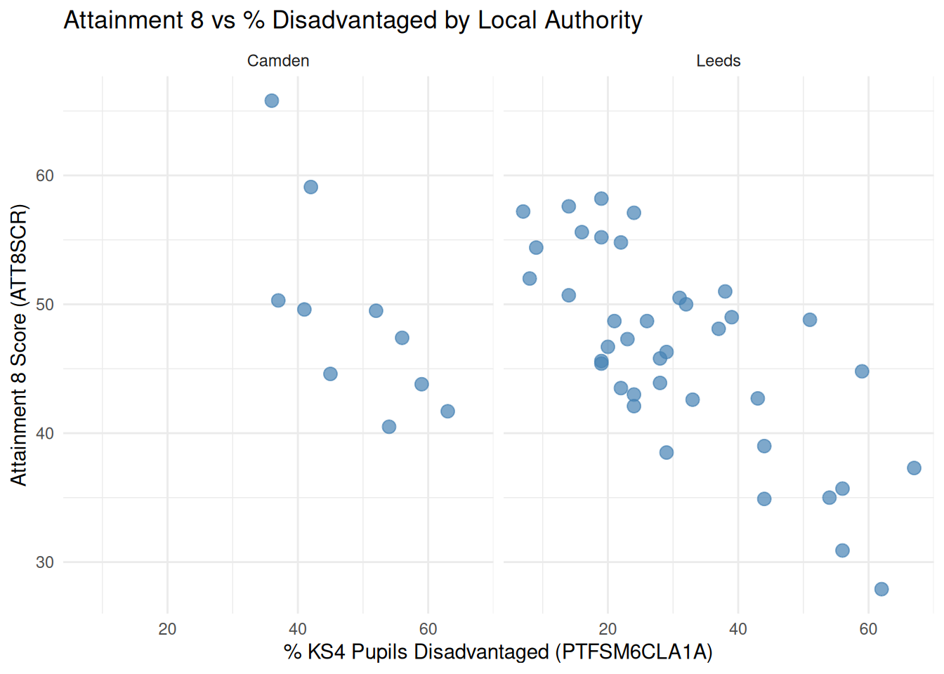
Just from looking at your plots: - How do you expect the intercepts (baseline Y) to differ between your London and non-London local authority (if at all)? Which is higher and which is lower? - How do you think the slope values (influence of X on Y) are different (if at all)?
:::
::: {.multicode}
#### {width="30"}
```{python}
import pandas as pd
import seaborn as sns
import matplotlib.pyplot as plt

# Combine the datasets
combined_data = pd.concat([camden_sub, leeds_sub])

# Create a function to make and customize the plot
def make_plot():
    g = sns.FacetGrid(combined_data, col="LANAME", height=5, aspect=1)
    g.map_dataframe(
        sns.scatterplot,
        x="PTFSM6CLA1A",
        y="ATT8SCR",
        color="steelblue",
        alpha=0.7,
        s=60
    )
    g.set_axis_labels("% KS4 Pupils Disadvantaged (PTFSM6CLA1A)", "Attainment 8 Score (ATT8SCR)")
    g.fig.suptitle("Attainment 8 vs % Disadvantaged by Local Authority", fontsize=16)
    g.fig.tight_layout()
    g.fig.subplots_adjust(top=0.85)
    plt.show()

# Call the function once
make_plot()
```
#### {width="41" height="30"}
```{r}
#| warning: false
library(ggplot2)
library(dplyr)

# Combine the datasets and label them
combined_data <- bind_rows(
  camden_sub %>% mutate(Area = "Camden"),
  leeds_sub %>% mutate(Area = "Leeds")
)

# Create faceted scatter plot
ggplot(combined_data, aes(x = PTFSM6CLA1A, y = ATT8SCR)) +
  geom_point(alpha = 0.7, size = 3, color = "steelblue") +
  facet_wrap(~ Area) +
  labs(
    title = "Attainment 8 vs % Disadvantaged by Local Authority",
    x = "% KS4 Pupils Disadvantaged (PTFSM6CLA1A)",
    y = "Attainment 8 Score (ATT8SCR)"
  ) +
  theme_minimal()
```
:::
#### Exploratory Data Analysis Maps
- Maps are great, they help you understand all kinds of things if your data have a spatial identifier. Try some maps out here!
- You might find R is a bit better at mapping things. Just saying.
::: {.multicode}
#### {width="30"}
```{python}
#| include: false
import geopandas as gpd
import folium
from branca.colormap import linear
# Create GeoDataFrame from BNG coordinates
sf_df_bng = gpd.GeoDataFrame(
camden_sub,
geometry=gpd.points_from_xy(camden_sub['easting'], camden_sub['northing']),
crs='EPSG:27700'
)
# Reproject to WGS84
sf_df = sf_df_bng.to_crs('EPSG:4326')
# Extract lat/lon from geometry
sf_df['lat'] = sf_df.geometry.y
sf_df['lon'] = sf_df.geometry.x
# Scale marker size by TOTPUPS
min_pupils = sf_df['TOTPUPS'].min()
max_pupils = sf_df['TOTPUPS'].max()
sf_df['size_scale'] = 4 + (sf_df['TOTPUPS'] - min_pupils) * (12 - 4) / (max_pupils - min_pupils)
# Create magma color scale based on ATT8SCR
att_values = sf_df['ATT8SCR'].dropna()
vmin, vmax = sorted([att_values.min(), att_values.max()])
magma_scale = linear.magma.scale(vmin, vmax)
magma_scale.caption = 'ATT8SCR'
# Create interactive map centered on Camden
center_lat = sf_df['lat'].mean()
center_lon = sf_df['lon'].mean()
m = folium.Map(location=[center_lat, center_lon], tiles='CartoDB.Positron', zoom_start=12)
# Add circle markers
for _, row in sf_df.iterrows():
popup_html = f"<strong>{row['SCHNAME_x']}</strong><br>Pupils: {row['TOTPUPS']}"
folium.CircleMarker(
location=[row['lat'], row['lon']],
radius=row['size_scale'],
color=magma_scale(row['ATT8SCR']),
fill=True,
fill_color=magma_scale(row['ATT8SCR']),
fill_opacity=0.8,
popup=folium.Popup(popup_html, max_width=250)
).add_to(m)
# Add color legend
magma_scale.add_to(m)
# Save map
m.save("interactive_school_map.html")
```
```{python}
import geopandas as gpd
import matplotlib.pyplot as plt
import matplotlib.cm as cm
from matplotlib.colors import Normalize
import contextily as ctx

# Reproject to Web Mercator for contextily
sf_df_mercator = sf_df_bng.to_crs(epsg=3857)

# Scale marker size
min_val = sf_df_mercator['TOTPUPS'].min()
max_val = sf_df_mercator['TOTPUPS'].max()
sf_df_mercator['size_scale'] = 4 + (sf_df_mercator['TOTPUPS'] - min_val) * (12 - 4) / (max_val - min_val)

# Color mapping
norm = Normalize(vmin=sf_df_mercator['ATT8SCR'].min(), vmax=sf_df_mercator['ATT8SCR'].max())
cmap = plt.colormaps['magma']
sf_df_mercator['color'] = sf_df_mercator['ATT8SCR'].apply(lambda x: cmap(norm(x)))

# Plot
fig, ax = plt.subplots(figsize=(10, 10))
sf_df_mercator.plot(ax=ax, color=sf_df_mercator['color'], markersize=sf_df_mercator['size_scale']**2, alpha=0.8)
# Add basemap
ctx.add_basemap(ax, source=ctx.providers.CartoDB.Positron)

# Final touches
ax.set_title("Static Map of Schools Colored by ATT8SCR and Sized by TOTPUPS", fontsize=14)
ax.set_axis_off()

# Colorbar
sm = cm.ScalarMappable(cmap=cmap, norm=norm)
sm.set_array([])
cbar = fig.colorbar(sm, ax=ax, orientation='vertical', fraction=0.03, pad=0.01)
cbar.set_label('ATT8SCR', fontsize=12)

plt.tight_layout()
plt.savefig("static_school_map_with_basemap.png", dpi=300)
plt.show()
```
#### {width="41" height="30"}
```{r}
#| message: false
#| warning: false
library(sf)
library(leaflet)
library(dplyr)
library(scales)
library(viridis)

# Convert to sf object with EPSG:27700
sf_df <- st_as_sf(leeds_sub, coords = c("easting", "northing"), crs = 27700)

# Transform to EPSG:4326
sf_df <- st_transform(sf_df, crs = 4326)

# Extract lat/lon for leaflet
sf_df <- sf_df %>%
  mutate(
    lon = st_coordinates(.)[,1],
    lat = st_coordinates(.)[,2]
  )


# Define size and color scales
size_scale <- rescale(sf_df$TOTPUPS, to = c(1, 15))  # radius from 4 to 12

# Create a color palette based on ATT8SCR
pal <- colorNumeric(palette = "magma", domain = sf_df$ATT8SCR)

leaflet(sf_df) %>%
  addProviderTiles("CartoDB.Positron") %>%
  addCircleMarkers(
    lng = ~lon,
    lat = ~lat,
    radius = size_scale,
    stroke = FALSE,
    fillOpacity = 0.8,
    color = ~pal(ATT8SCR),
    popup = ~paste0(
      "<strong>", SCHNAME.x, "</strong><br>",
      "Pupils: ", TOTPUPS
    )
  ) %>%
  addLegend(
    "bottomright",
    pal = pal,
    values = ~ATT8SCR,
    title = "ATT8SCR",
    opacity = 0.8
  )
```
:::
#### Exploratory Data Analysis - Distributions and slicing and dicing
- You can also explore the scatter plot for your whole of England dataset.
- One really interesting thing to do is to slice and dice your data according to some of the categorical variables.
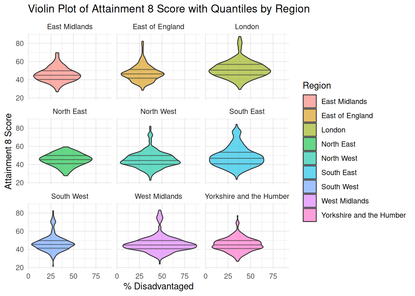
- In the R visualisation, you can see how we can start to slide and dice by regions, for example. Maybe try some of your other categorical variables.
::: callout-note
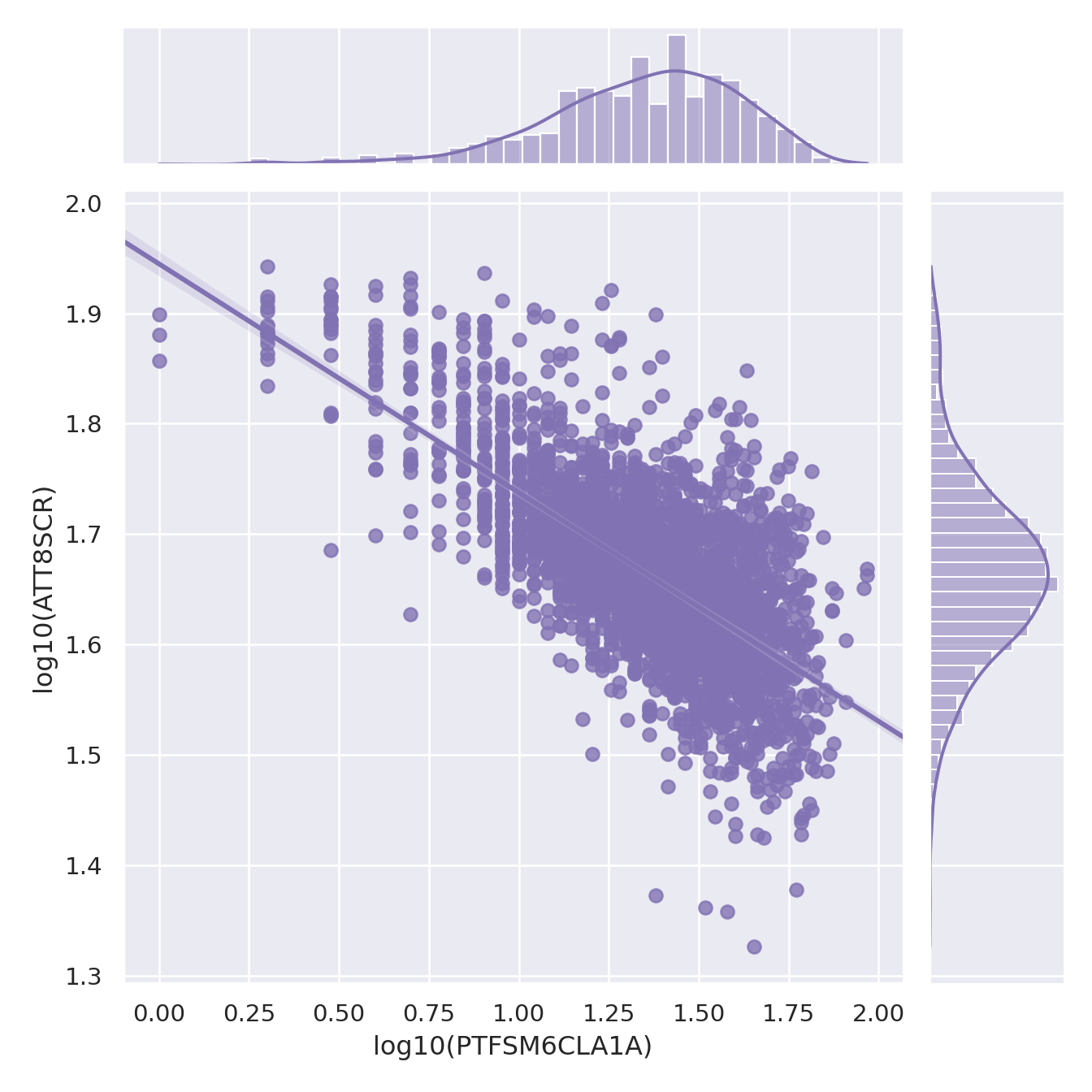
You will notice that in the plots below I have used a log10() transformation, but you could also use the natural log() or a range of other possible transformations. If you want to understand a bit more about transformations for normalisng your data, you should explore Tukey's Ladder of Powers - <https://onlinestatbook.com/2/transformations/tukey.html> - in R (and probably in Python too) there are packages to apply appropriate Tukey transformations so your data gets a little closer to a normal distribution.
:::
::: {.multicode}
#### {width="30"}
```{python}
#| echo: true
import seaborn as sns
import matplotlib.pyplot as plt
import numpy as np
import pandas as pd

# Load your data into a DataFrame named england_filtered
# england_filtered = pd.read_csv("your_data.csv")

# Apply log10 transformation (replace 0s to avoid log(0))
england_filtered['log_PTFSM6CLA1A'] = np.log10(england_filtered['PTFSM6CLA1A'].replace(0, np.nan))
england_filtered['log_ATT8SCR'] = np.log10(england_filtered['ATT8SCR'].replace(0, np.nan))

# Drop rows with NaNs from log(0)
england_filtered = england_filtered.dropna(subset=['log_PTFSM6CLA1A', 'log_ATT8SCR'])

# Set theme
sns.set_theme(style="darkgrid")

# Create jointplot
g = sns.jointplot(
    x="log_PTFSM6CLA1A",
    y="log_ATT8SCR",
    data=england_filtered,
    kind="reg",
    truncate=False,
    color="m",
    height=7
)

# Label axes
g.set_axis_labels("log10(PTFSM6CLA1A)", "log10(ATT8SCR)")
plt.show()
```
#### {width="41" height="30"}
```{r}
#| warning: false
library(ggside)
library(ggplot2)

ggplot(england_filtered, aes(x = log10(PTFSM6CLA1A), y = log10(ATT8SCR), colour = gor_name)) +
  geom_point(alpha = 0.5, size = 2) +
  geom_xsidedensity(aes(y = after_stat(density)), alpha = 0.5, size = 1, position = "stack") +
  geom_ysidedensity(aes(x = after_stat(density)), alpha = 0.5, size = 1, position = "stack") +
  theme(ggside.panel.scale.x = 0.4,ggside.panel.scale.y = 0.4)
```
:::
::: {.multicode}
#### {width="30"}
```{python}
#| echo: true
import seaborn as sns
import matplotlib.pyplot as plt
# Set the theme
sns.set_theme(style="darkgrid")
# Create side-by-side histograms
fig, axes = plt.subplots(1, 2, figsize=(14, 6))
# Histogram for PTFSM6CLA1A
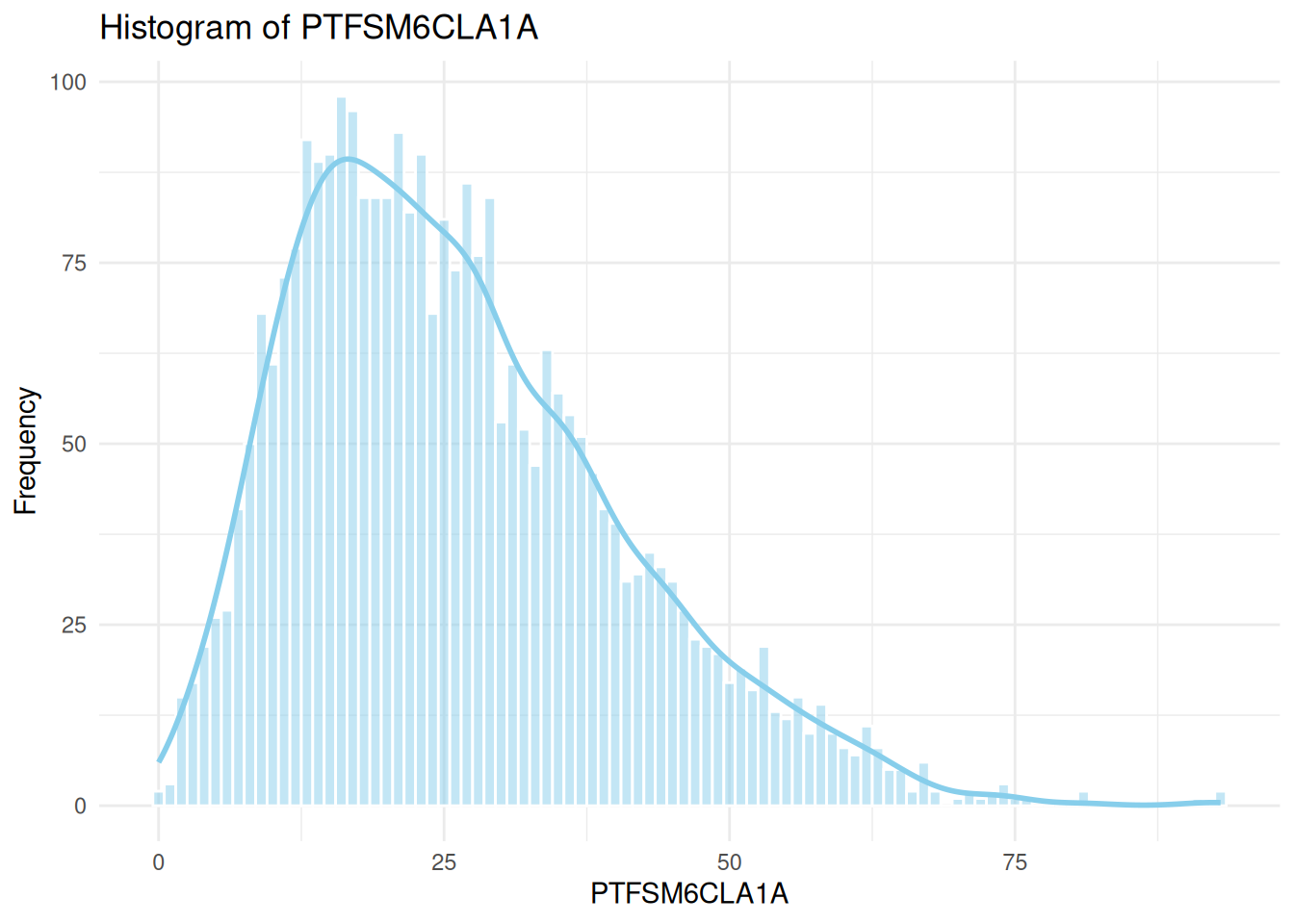
sns.histplot(data=england_filtered, x="PTFSM6CLA1A", ax=axes[0], kde=True, color="skyblue")
axes[0].set_title("Histogram of PTFSM6CLA1A")
axes[0].set_xlabel("PTFSM6CLA1A")
axes[0].set_ylabel("Frequency")
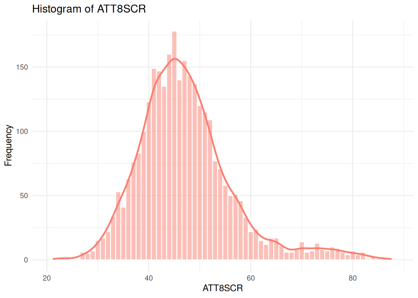
# Histogram for ATT8SCR
sns.histplot(data=england_filtered, x="ATT8SCR", ax=axes[1], kde=True, color="salmon")
axes[1].set_title("Histogram of ATT8SCR")
axes[1].set_xlabel("ATT8SCR")
axes[1].set_ylabel("Frequency")
plt.tight_layout()
plt.show()
```
#### {width="41" height="30"}
```{r}
#| warning: false
library(ggplot2)
library(dplyr)

# Histogram for PTFSM6CLA1A
ggplot(england_filtered, aes(x = PTFSM6CLA1A)) +
  geom_histogram(binwidth = 1, fill = "skyblue", color = "white", alpha = 0.5) +
  geom_density(aes(y = ..count..), color = "skyblue", size = 1) +
  theme_minimal() +
  labs(
    title = "Histogram of PTFSM6CLA1A",
    x = "PTFSM6CLA1A",
    y = "Frequency"
  )
# Histogram for ATT8SCR
ggplot(england_filtered, aes(x = ATT8SCR)) +
  geom_histogram(binwidth = 1, fill = "salmon", color = "white", alpha = 0.5) +
  geom_density(aes(y = ..count..), color = "salmon", size = 1) +
  theme_minimal() +
  labs(
    title = "Histogram of ATT8SCR",
    x = "ATT8SCR",
    y = "Frequency"
  )
```
:::
::: {.callout-tip title="Explore Different Visualisations"}
I've just given you a few very basic visualisation types here, but there are so many extensions and options available in packages like [ggplot2](https://exts.ggplot2.tidyverse.org/gallery/) in R and [Seaborn](https://seaborn.pydata.org/examples/index.html) in Python so you can get visualising in very creative ways - have a look at some of these gallery examples in the links and maybe try experimenting with a few different ones! There are no excuses these days for 💩 data visualisations!
:::
```{r}
#| warning: false
ggplot(england_filtered, aes(x = PTFSM6CLA1A, y = ATT8SCR, fill = gor_name)) +
  geom_violin(
    position = position_dodge(width = 0.8),
    alpha = 0.6,
    draw_quantiles = c(0.25, 0.5, 0.75)
  ) +
  facet_wrap(~ gor_name) +
  theme_minimal() +
  labs(
    title = "Violin Plot of Attainment 8 Score with Quantiles by Region",
    x = "% Disadvantaged",
    y = "Attainment 8 Score",
    fill = "Region"
  )
```
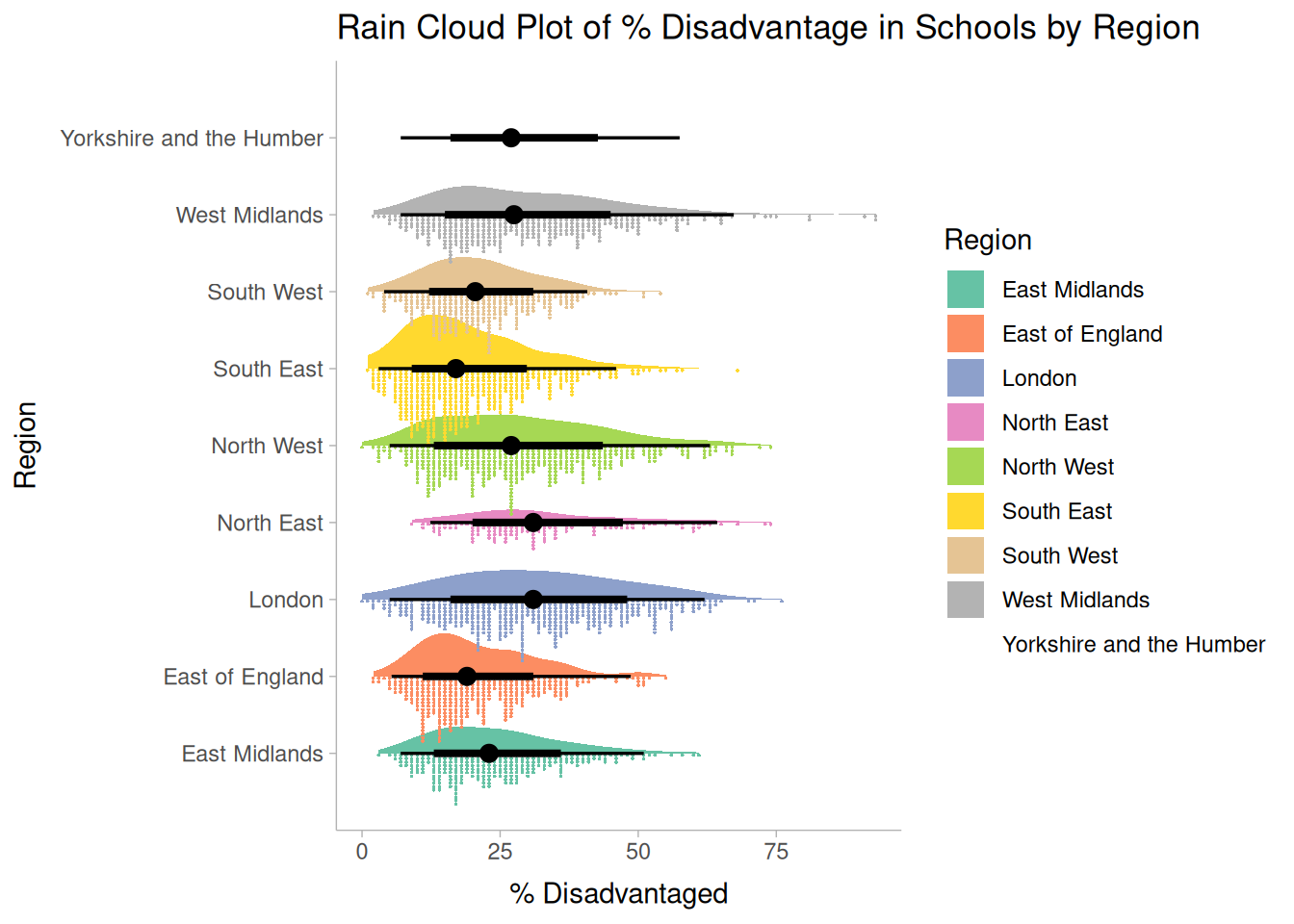
```{r}
#| warning: false
library(ggdist)

ggplot(england_filtered, aes(x = PTFSM6CLA1A, y = gor_name, fill = gor_name)) +
  stat_slab(aes(thickness = after_stat(pdf*n)), scale = 0.7) +
  stat_dotsinterval(side = "bottom", scale = 1, slab_linewidth = NA) +
  scale_fill_brewer(palette = "Set2") +
  theme_ggdist() +
  labs(
    title = "Rain Cloud Plot of % Disadvantage in Schools by Region",
    x = "% Disadvantaged",
    y = "Region",
    fill = "Region"
  )
```
## Task 4 - Explanatory Analysis - Running Your Regression Model
- Now you have carried out some appropriate exploratory data analysis, you should run a simple bi-variate regression model for your two local authority areas and compare it with a similar analysis run on the national dataset
::: callout-tip
- Depending on your variables and whether or not there appears to be a linear relationship or a log-log or level-log relationship, if you transform a variable for the national data or one of your subsets, you could also transform it for the others, otherwise it will be impossible to compare
:::
- The Code below is an example using my variables, but you should use the variables you have selected.
#### Running the Model for the first (London) local authority
::: {.multicode}
#### {width="30"}
```{python}
import numpy as np
import statsmodels.api as sm

# Log-transform the variables
camden_sub['log_ATT8SCR'] = np.log(camden_sub['ATT8SCR'])
camden_sub['log_PTFSM6CLA1A'] = np.log(camden_sub['PTFSM6CLA1A'])

# Define independent and dependent variables
X = sm.add_constant(camden_sub['log_PTFSM6CLA1A'])  # adds intercept
y = camden_sub['log_ATT8SCR']

# Fit the model
camden_model1 = sm.OLS(y, X).fit()
#camden_summary = extract_model_summary(camden_model1, 'Camden Model')

# Print summary
print(camden_model1.summary())
```
#### {width="41" height="30"}
```{r}
# Fit linear model and get predicted values
camden_model1 <- lm(log(ATT8SCR) ~ log(PTFSM6CLA1A), data = camden_sub)
summary(camden_model1)
```
:::
#### Running the Model for the second local authority
::: {.multicode}
#### {width="30"}
```{python}
import numpy as np
import statsmodels.api as sm


# Log-transform safely: replace non-positive values with NaN
leeds_sub['log_ATT8SCR'] = np.where(leeds_sub['ATT8SCR'] > 0, np.log(leeds_sub['ATT8SCR']), np.nan)
leeds_sub['log_PTFSM6CLA1A'] = np.where(leeds_sub['PTFSM6CLA1A'] > 0, np.log(leeds_sub['PTFSM6CLA1A']), np.nan)

# Drop rows with NaNs in either column
leeds_clean = leeds_sub.dropna(subset=['log_ATT8SCR', 'log_PTFSM6CLA1A'])

# Define independent and dependent variables
X = sm.add_constant(leeds_clean['log_PTFSM6CLA1A'])  # adds intercept
y = leeds_clean['log_ATT8SCR']

# Fit the model
leeds_model1 = sm.OLS(y, X).fit()
#leeds_summary = extract_model_summary(leeds_model1, 'Leeds Model')

# Print summary
print(leeds_model1.summary())
```
#### {width="41" height="30"}
```{r}
# Fit linear model and get predicted values
leeds_model1 <- lm(log(ATT8SCR) ~ log(PTFSM6CLA1A), data = leeds_sub)
summary(leeds_model1)
```
:::
#### Running the Model for all Schools in England
::: {.multicode}
#### {width="30"}
```{python}
import numpy as np
import statsmodels.api as sm


# Log-transform safely: replace non-positive values with NaN
england_filtered['log_ATT8SCR'] = np.where(england_filtered['ATT8SCR'] > 0, np.log(england_filtered['ATT8SCR']), np.nan)
england_filtered['log_PTFSM6CLA1A'] = np.where(england_filtered['PTFSM6CLA1A'] > 0, np.log(england_filtered['PTFSM6CLA1A']), np.nan)

# Drop rows with NaNs in either column
england_clean = england_filtered.dropna(subset=['log_ATT8SCR', 'log_PTFSM6CLA1A'])

# Define independent and dependent variables
X = sm.add_constant(england_clean['log_PTFSM6CLA1A'])  # adds intercept
y = england_clean['log_ATT8SCR']

# Fit the model
england_model1 = sm.OLS(y, X).fit()
#england_summary = extract_model_summary(england_model1, 'England Model')

# Print summary
print(england_model1.summary())
```
#### {width="41" height="30"}
```{r}
# Fit linear model and get predicted values
england_filtered_clean <- england_filtered[
  !is.na(england_filtered$ATT8SCR) &
  !is.na(england_filtered$PTFSM6CLA1A) &
  england_filtered$ATT8SCR > 0 &
  england_filtered$PTFSM6CLA1A > 0,
]

england_model1 <- lm(log(ATT8SCR) ~ log(PTFSM6CLA1A), data = england_filtered_clean)
summary(england_model1)
```
:::
#### Combining your outputs for comparison
Don't forget to run some basic regression modelling checks on all of your models:
:::callout-note
If you are doing this in Python, it appears there isn't a nice little package with the code for diagnostic plots already created. However, the statsmodels pages do have some code we can borrow - https://www.statsmodels.org/dev/examples/notebooks/generated/linear_regression_diagnostics_plots.html - run this first before using the functions below
:::
```{python}
#| include: false
# base code
import numpy as np
import seaborn as sns
import statsmodels as statsmodels
from statsmodels.tools.tools import maybe_unwrap_results
from statsmodels.graphics.gofplots import ProbPlot
from statsmodels.stats.outliers_influence import variance_inflation_factor
import matplotlib.pyplot as plt
from typing import Type
style_talk = "seaborn-talk" # refer to plt.style.available
class LinearRegDiagnostic:
"""
Diagnostic plots to identify potential problems in a linear regression fit.
Mainly,
a. non-linearity of data
b. Correlation of error terms
c. non-constant variance
d. outliers
e. high-leverage points
f. collinearity
Authors:
Prajwal Kafle (p33ajkafle@gmail.com, where 3 = r)
Does not come with any sort of warranty.
Please test the code one your end before using.
Matt Spinelli (m3spinelli@gmail.com, where 3 = r)
(1) Fixed incorrect annotation of the top most extreme residuals in
the Residuals vs Fitted and, especially, the Normal Q-Q plots.
(2) Changed Residuals vs Leverage plot to match closer the y-axis
range shown in the equivalent plot in the R package ggfortify.
(3) Added horizontal line at y=0 in Residuals vs Leverage plot to
match the plots in R package ggfortify and base R.
(4) Added option for placing a vertical guideline on the Residuals
vs Leverage plot using the rule of thumb of h = 2p/n to denote
high leverage (high_leverage_threshold=True).
(5) Added two more ways to compute the Cook's Distance (D) threshold:
* 'baseR': D > 1 and D > 0.5 (default)
* 'convention': D > 4/n
* 'dof': D > 4 / (n - k - 1)
(6) Fixed class name to conform to Pascal casing convention
(7) Fixed Residuals vs Leverage legend to work with loc='best'
"""
def __init__(
self,
results: Type[statsmodels.regression.linear_model.RegressionResultsWrapper],
) -> None:
"""
For a linear regression model, generates following diagnostic plots:
a. residual
b. qq
c. scale location and
d. leverage
and a table
e. vif
Args:
results (Type[statsmodels.regression.linear_model.RegressionResultsWrapper]):
must be instance of statsmodels.regression.linear_model object
Raises:
TypeError: if instance does not belong to above object
Example:
>>> import numpy as np
>>> import pandas as pd
>>> import statsmodels.formula.api as smf
>>> x = np.linspace(-np.pi, np.pi, 100)
>>> y = 3*x + 8 + np.random.normal(0,1, 100)
>>> df = pd.DataFrame({'x':x, 'y':y})
>>> res = smf.ols(formula= "y ~ x", data=df).fit()
>>> cls = Linear_Reg_Diagnostic(res)
>>> cls(plot_context="seaborn-v0_8-paper")
In case you do not need all plots you can also independently make an individual plot/table
in following ways
>>> cls = Linear_Reg_Diagnostic(res)
>>> cls.residual_plot()
>>> cls.qq_plot()
>>> cls.scale_location_plot()
>>> cls.leverage_plot()
>>> cls.vif_table()
"""
if (
isinstance(
results, statsmodels.regression.linear_model.RegressionResultsWrapper
)
is False
):
raise TypeError(
"result must be instance of statsmodels.regression.linear_model.RegressionResultsWrapper object"
)
self.results = maybe_unwrap_results(results)
self.y_true = self.results.model.endog
self.y_predict = self.results.fittedvalues
self.xvar = self.results.model.exog
self.xvar_names = self.results.model.exog_names
self.residual = np.array(self.results.resid)
influence = self.results.get_influence()
self.residual_norm = influence.resid_studentized_internal
self.leverage = influence.hat_matrix_diag
self.cooks_distance = influence.cooks_distance[0]
self.nparams = len(self.results.params)
self.nresids = len(self.residual_norm)
def __call__(self, plot_context="seaborn-v0_8-paper", **kwargs):
# print(plt.style.available)
# GH#9157
if plot_context not in plt.style.available:
plot_context = "default"
with plt.style.context(plot_context):
fig, ax = plt.subplots(nrows=2, ncols=2, figsize=(10, 10))
self.residual_plot(ax=ax[0, 0])
self.qq_plot(ax=ax[0, 1])
self.scale_location_plot(ax=ax[1, 0])
self.leverage_plot(
ax=ax[1, 1],
high_leverage_threshold=kwargs.get("high_leverage_threshold"),
cooks_threshold=kwargs.get("cooks_threshold"),
)
plt.show()
return (
self.vif_table(),
fig,
ax,
)
def residual_plot(self, ax=None):
"""
Residual vs Fitted Plot
Graphical tool to identify non-linearity.
(Roughly) Horizontal red line is an indicator that the residual has a linear pattern
"""
if ax is None:
fig, ax = plt.subplots()
sns.residplot(
x=self.y_predict,
y=self.residual,
lowess=True,
scatter_kws={"alpha": 0.5},
line_kws={"color": "red", "lw": 1, "alpha": 0.8},
ax=ax,
)
# annotations
residual_abs = np.abs(self.residual)
abs_resid = np.flip(np.argsort(residual_abs), 0)
abs_resid_top_3 = abs_resid[:3]
for i in abs_resid_top_3:
ax.annotate(i, xy=(self.y_predict[i], self.residual[i]), color="C3")
ax.set_title("Residuals vs Fitted", fontweight="bold")
ax.set_xlabel("Fitted values")
ax.set_ylabel("Residuals")
return ax
def qq_plot(self, ax=None):
"""
Standarized Residual vs Theoretical Quantile plot
Used to visually check if residuals are normally distributed.
Points spread along the diagonal line will suggest so.
"""
if ax is None:
fig, ax = plt.subplots()
QQ = ProbPlot(self.residual_norm)
fig = QQ.qqplot(line="45", alpha=0.5, lw=1, ax=ax)
# annotations
abs_norm_resid = np.flip(np.argsort(np.abs(self.residual_norm)), 0)
abs_norm_resid_top_3 = abs_norm_resid[:3]
for i, x, y in self.__qq_top_resid(
QQ.theoretical_quantiles, abs_norm_resid_top_3
):
ax.annotate(i, xy=(x, y), ha="right", color="C3")
ax.set_title("Normal Q-Q", fontweight="bold")
ax.set_xlabel("Theoretical Quantiles")
ax.set_ylabel("Standardized Residuals")
return ax
def scale_location_plot(self, ax=None):
"""
Sqrt(Standarized Residual) vs Fitted values plot
Used to check homoscedasticity of the residuals.
Horizontal line will suggest so.
"""
if ax is None:
fig, ax = plt.subplots()
residual_norm_abs_sqrt = np.sqrt(np.abs(self.residual_norm))
ax.scatter(self.y_predict, residual_norm_abs_sqrt, alpha=0.5)
sns.regplot(
x=self.y_predict,
y=residual_norm_abs_sqrt,
scatter=False,
ci=False,
lowess=True,
line_kws={"color": "red", "lw": 1, "alpha": 0.8},
ax=ax,
)
# annotations
abs_sq_norm_resid = np.flip(np.argsort(residual_norm_abs_sqrt), 0)
abs_sq_norm_resid_top_3 = abs_sq_norm_resid[:3]
for i in abs_sq_norm_resid_top_3:
ax.annotate(
i, xy=(self.y_predict[i], residual_norm_abs_sqrt[i]), color="C3"
)
ax.set_title("Scale-Location", fontweight="bold")
ax.set_xlabel("Fitted values")
ax.set_ylabel(r"$\sqrt{|\mathrm{Standardized\ Residuals}|}$")
return ax
def leverage_plot(
self, ax=None, high_leverage_threshold=False, cooks_threshold="baseR"
):
"""
Residual vs Leverage plot
Points falling outside Cook's distance curves are considered observation that can sway the fit
aka are influential.
Good to have none outside the curves.
"""
if ax is None:
fig, ax = plt.subplots()
ax.scatter(self.leverage, self.residual_norm, alpha=0.5)
sns.regplot(
x=self.leverage,
y=self.residual_norm,
scatter=False,
ci=False,
lowess=True,
line_kws={"color": "red", "lw": 1, "alpha": 0.8},
ax=ax,
)
# annotations
leverage_top_3 = np.flip(np.argsort(self.cooks_distance), 0)[:3]
for i in leverage_top_3:
ax.annotate(i, xy=(self.leverage[i], self.residual_norm[i]), color="C3")
factors = []
if cooks_threshold == "baseR" or cooks_threshold is None:
factors = [1, 0.5]
elif cooks_threshold == "convention":
factors = [4 / self.nresids]
elif cooks_threshold == "dof":
factors = [4 / (self.nresids - self.nparams)]
else:
raise ValueError(
"threshold_method must be one of the following: 'convention', 'dof', or 'baseR' (default)"
)
for i, factor in enumerate(factors):
label = "Cook's distance" if i == 0 else None
xtemp, ytemp = self.__cooks_dist_line(factor)
ax.plot(xtemp, ytemp, label=label, lw=1.25, ls="--", color="red")
ax.plot(xtemp, np.negative(ytemp), lw=1.25, ls="--", color="red")
if high_leverage_threshold:
high_leverage = 2 * self.nparams / self.nresids
if max(self.leverage) > high_leverage:
ax.axvline(
high_leverage, label="High leverage", ls="-.", color="purple", lw=1
)
ax.axhline(0, ls="dotted", color="black", lw=1.25)
ax.set_xlim(0, max(self.leverage) + 0.01)
ax.set_ylim(min(self.residual_norm) - 0.1, max(self.residual_norm) + 0.1)
ax.set_title("Residuals vs Leverage", fontweight="bold")
ax.set_xlabel("Leverage")
ax.set_ylabel("Standardized Residuals")
plt.legend(loc="best")
return ax
def vif_table(self):
"""
VIF table
VIF, the variance inflation factor, is a measure of multicollinearity.
VIF > 5 for a variable indicates that it is highly collinear with the
other input variables.
"""
vif_df = pd.DataFrame()
vif_df["Features"] = self.xvar_names
vif_df["VIF Factor"] = [
variance_inflation_factor(self.xvar, i) for i in range(self.xvar.shape[1])
]
return vif_df.sort_values("VIF Factor").round(2)
def __cooks_dist_line(self, factor):
"""
Helper function for plotting Cook's distance curves
"""
p = self.nparams
formula = lambda x: np.sqrt((factor * p * (1 - x)) / x)
x = np.linspace(0.001, max(self.leverage), 50)
y = formula(x)
return x, y
def __qq_top_resid(self, quantiles, top_residual_indices):
"""
Helper generator function yielding the index and coordinates
"""
offset = 0
quant_index = 0
previous_is_negative = None
for resid_index in top_residual_indices:
y = self.residual_norm[resid_index]
is_negative = y < 0
if previous_is_negative == None or previous_is_negative == is_negative:
offset += 1
else:
quant_index -= offset
x = (
quantiles[quant_index]
if is_negative
else np.flip(quantiles, 0)[quant_index]
)
quant_index += 1
previous_is_negative = is_negative
yield resid_index, x, y
```
### Linearity
::: {.multicode}
#### {width="30"}
```{python}
cls = LinearRegDiagnostic(england_model1)

cls.residual_plot();
plt.show()
```
#### {width="41" height="30"}
```{r}
library(performance)

check_model(england_model1,
            check = c("linearity"))
```
:::
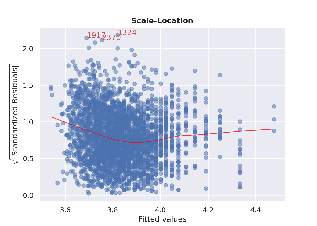
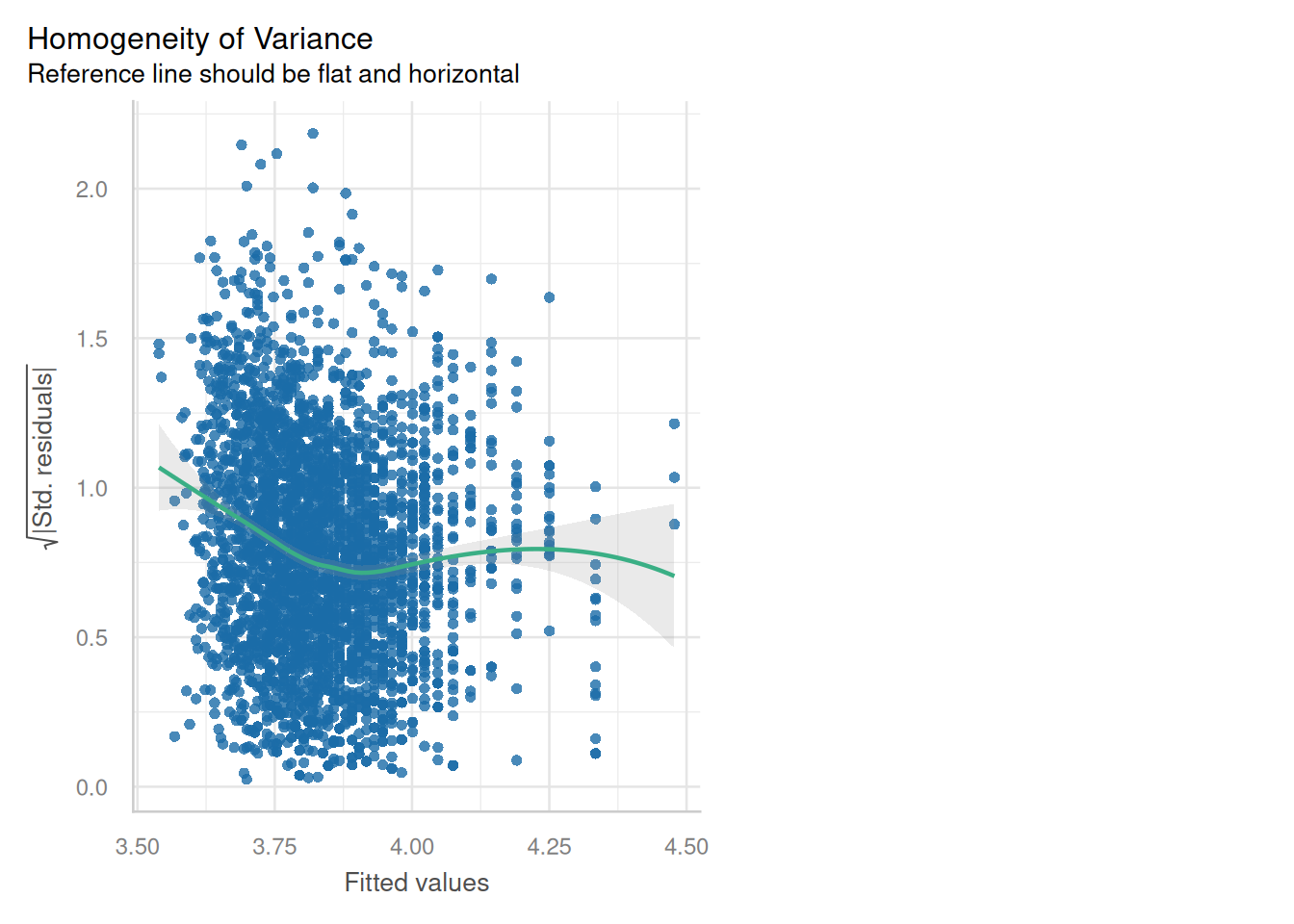
### Homoscedasticity (Constant variance)?
::: {.multicode}
#### {width="30"}
```{python}
cls.scale_location_plot();
plt.show()
```
#### {width="41" height="30"}
```{r}
check_model(england_model1,
            check = c("homogeneity"))
```
:::
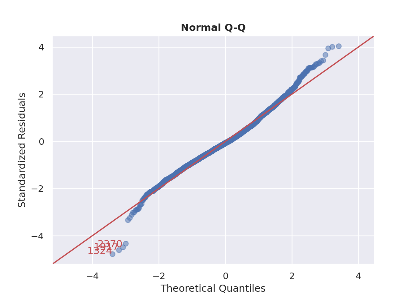
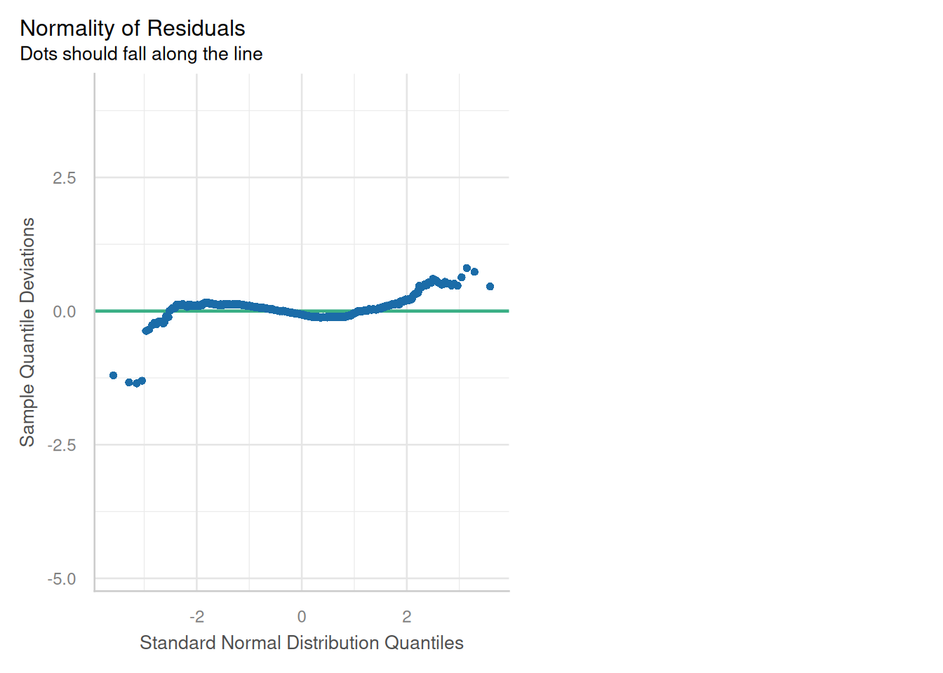
### Normality of Residuals
::: {.multicode}
#### {width="30"}
```{python}
cls.qq_plot()
plt.show()
```
#### {width="41" height="30"}
```{r}
check_model(england_model1,
            check = c("qq"))
```
:::
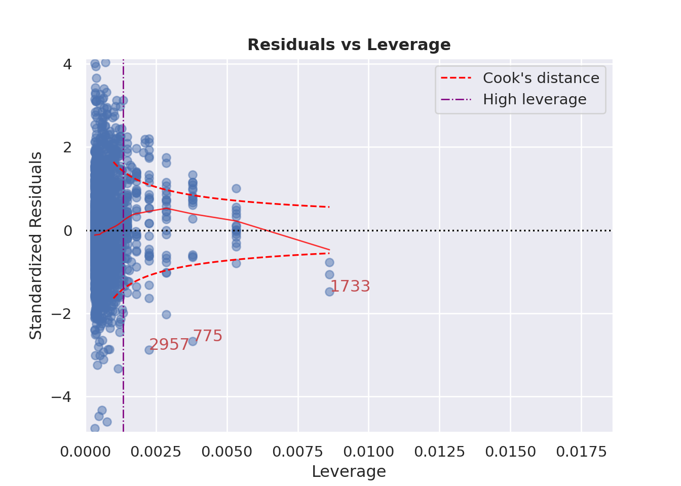
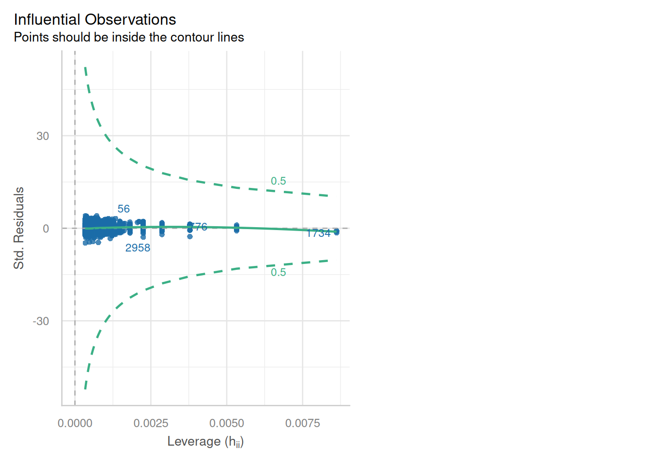
### Influence of Outliers
::: {.multicode}
#### {width="30"}
```{python}
cls.leverage_plot(high_leverage_threshold=True, cooks_threshold="dof")
plt.show()
```
#### {width="41" height="30"}
```{r}
check_model(england_model1,
            check = c("outliers"))
```
:::
#### Combining your outputs for comparison
::: callout-note
You might notice that R is a bit better at things like manipulating model outputs than Python!
:::
::: {.multicode}
#### {width="30"}
```{python}
import pandas as pd
import statsmodels.api as sm
from statsmodels.iolib.summary2 import summary_col

results_table = summary_col(
    results=[camden_model1, leeds_model1, england_model1],
    model_names=['Camden Model', 'Leeds Model', 'England Model'],
    stars=True,
    float_format="%0.3f",
    # You can customize what model statistics show up here (like R2, N, F-stat)
    info_dict={'N':lambda x: "{0:d}".format(int(x.nobs))}
)

#
# # Round for readability
print(results_table)
```
#### {width="41" height="30"}
```{r}
library(jtools)
export_summs(camden_model1, leeds_model1, england_model1, error_format = "", error_pos = "same", model.names = c("Camden Model", "Leeds Model", "England Model"))
```
:::
::: {.callout-tip title="Questions to Answer"}
Comparing your three regression models:
1\. How do the intercept (baseline) attainment values differ between your three models? **remember, if you (natural)logged your variables, you will need to take the exponential of the coefficient to interpret it back on the original scale.**
2\. What do the differences in the slope values tell you?
3\. Are your intercept and slope values statistically significant? If so, at what level?
4\. How do the R-squared values differ between your models?
5\. What can you say about your degrees of freedom and the reliability of your R-squared and other coefficients between your models?
6\. What is the overall story of the relationship between your attainment variable and your explanatory variable considering both your local examples and comparison with schools across the rest of England?
:::
### What does my model show?
1. Baseline attainment (intercept) is much higher in Camden than in Leeds or the whole of England. Exp(6.12) = 455.32. So the Attainment 8 Score in Camden would be 455 (an impossible score) when % of disadvantaged children in a school are 0. This compares to exp(4.547) = 94.35 in Leeds and exp(4.478) = 88.06 in England as a whole. All of these intercepts are statistically significant (i.e. observed values not a chance relationship). While unrealistic (potentially due to the low degrees of freedom), the Camden intercept shows us that after controlling for disadvantage, baseline attainment in Camden is better than in Leeds or the rest of England.
2. The slope value of -0.207 for England shows that across the country. As this is a log-log model, it is an **Elasticity**: A 1% increase in % of disadvantaged students in a school is associated with a 0.21% decrease in attainment. HOWEVER, as this is a log-log model, the effect is far stronger at one end of the distribution than the other.
- What this means is that a change from 1% to 10% of disadvantaged students in a school there is a 37.9% decrease in attainment, however, change from 21% to 30% leads to just a 7.1% decrease in attainment.
::: {.callout-tip title="AI can help here!"}
One of the things that large language models are quite good at is interpreting regression coefficients in the context of real data.
They don't always get it right, so **USE WITH EXTREME CAUTION AND ALWAYS DOUBLE CHECK WITH YOUR OWN UNDERSTANDING**, however, they *can* help explain what YOUR model coefficients mean in relation to YOUR data in an incredibly helpful way. If you get stuck, try feeding an LLM (ChatGTP, Gemini etc.) with your regression outputs and a description of your data and see what it can tell you
:::
This effect is similar for Leeds, but apparently far more severe in Camden where the slope is much steeper. However, Camden doesn't experience very low levels of disadvantage in its schools (unlike in Leeds and the rest of the county), with the lowest level around 35%. With low numbers of schools in the Borough, this observation is potentially unreliable.
3. The slopes and intercept coefficients in all models are all apparently statistically significant - but as we have seen with Camden, this does not necessarily mean our observations are generalisable! This is a good lesson in the difference between statistical significance (p-values are not a panacea!) and why you should always interrogate your model fully when interpreting outputs.
4. Again, R-squared values might fool you into thinking the Camden model is 'better' than the other models, however, the R-squared is partially an artefact of the low degrees of freedom in the model.
5. See above.
6. Overall, we can make some crucial observations that encourage further research. While the model for England suggests a moderately strong log-log relationship between levels of disadvantage in a school and attainment, looking at this relationship for a London Borough (Camden) - and another Local Authority in England (Leeds) it's the case that this is unlikely to be a universal relationship.
The baseline of attainment in Camden, controlling for disadvantage, is much higher than in the rest of the country. Students get higher levels of attainment, even when controlling for disadvantage. The log log relationship is crucial as it shows that on average, at low levels of disadvantage small increases have a more severe impact on attainment level, whereas at higher levels, similar changes have much reduced effects.
### Your Turn
To finish off the practical, see if you can answer the questions above for your example.