import numpy as np
import pandas as pd

from scipy import stats
from scipy.stats import pearsonr, spearmanr

import statsmodels.api as sm
from statsmodels.formula.api import ols

import matplotlib.pyplot as plt
import seaborn as sns

pd.set_option('display.max_columns', None)Practical 5: Measuring relationships
This week is focused on measuring the relationship between two variables using Pearson/Spearman correlation coefficients.
In the practical, we’re going to explore the correlation between different variables in the school dataset.
Dataset
We’re going to use a piece of filtered school data that is kindly provided by Adam. In W6, Adam will describe the source and processing of this dataset in details. For now, we just use this dataset as is.
# read in the dataset from Github
df_school = pd.read_csv("https://raw.githubusercontent.com/huanfachen/QM/refs/heads/main/sessions/L6_data/Performancetables_130242/2022-2023/england_filtered.csv")
Check the shape and columns of this data frame.
print(f"df_school has {df_school.shape[0]} rows and {df_school.shape[1]} columns.")
print("First 5 rows:\n")
print(df_school.head(5))
df_school has 3056 rows and 37 columns.
First 5 rows:
URN SCHNAME.x LEA LANAME TOWN.x \
0 100053 Acland Burghley School 202 Camden London
1 100054 The Camden School for Girls 202 Camden London
2 100052 Hampstead School 202 Camden London
3 100049 Haverstock School 202 Camden London
4 100059 La Sainte Union Catholic Secondary School 202 Camden London
gor_name TOTPUPS ATT8SCR ATT8SCRENG ATT8SCRMAT ATT8SCR_FSM6CLA1A \
0 London 1163.0 50.3 10.7 10.2 34.8
1 London 1047.0 65.8 13.5 12.7 54.7
2 London 1319.0 44.6 9.7 9.1 39.3
3 London 982.0 41.7 8.7 8.8 37.7
4 London 817.0 49.6 10.8 9.4 45.9
ATT8SCR_NFSM6CLA1A ATT8SCR_BOYS ATT8SCR_GIRLS P8MEA P8MEA_FSM6CLA1A \
0 59.2 51.5 46.8 -0.16 -0.99
1 72.0 NaN 65.8 0.77 0.25
2 49.0 41.9 47.1 -0.03 -0.18
3 48.5 40.1 43.7 -0.28 -0.44
4 52.2 NaN 49.6 0.06 -0.20
P8MEA_NFSM6CLA1A PTFSM6CLA1A PTNOTFSM6CLA1A PNUMEAL PNUMENGFL \
0 0.34 37.0 63.0 23.6 70.5
1 1.13 36.0 64.0 25.5 73.7
2 0.09 45.0 55.0 38.1 61.9
3 0.02 63.0 37.0 57.5 41.9
4 0.25 41.0 59.0 50.6 46.0
PTPRIORLO PTPRIORHI NORB NORG PNUMFSMEVER PERCTOT PPERSABS10 \
0 15.0 33.0 765.0 398.0 39.6 8.1 24.7
1 5.0 50.0 139.0 908.0 30.3 4.5 6.6
2 21.0 18.0 681.0 638.0 51.3 8.2 24.0
3 30.0 15.0 559.0 423.0 69.8 10.1 33.1
4 16.0 28.0 40.0 777.0 42.7 10.3 33.8
SCHOOLTYPE.x RELCHAR ADMPOL.y ADMPOL_PT \
0 State-funded secondary Does not apply Non-selective OTHER NON SEL
1 State-funded secondary NaN Non-selective OTHER NON SEL
2 State-funded secondary Does not apply Non-selective OTHER NON SEL
3 State-funded secondary Does not apply Non-selective OTHER NON SEL
4 State-funded secondary Roman Catholic Non-selective OTHER NON SEL
gender_name OFSTEDRATING MINORGROUP easting northing
0 Mixed Good Maintained school 528962.0 185931.0
1 Girls Good Maintained school 529441.0 184659.0
2 Mixed Good Maintained school 524402.0 185633.0
3 Mixed Good Maintained school 528159.0 184498.0
4 Girls Good Maintained school 528379.0 186191.0 The metadata of this data is available here. For convenience, the columns are described as below:
1. URN: Unique Reference Number identifying a school.
2. SCHNAME.x: School name as recorded in the official register.
3. LEA: Local Education Authority (code).
4. LANAME: Name of the Local Authority.
5. TOWN.x: Town in which the school is located.
6. gor_name: Government Office Region name.
7. TOTPUPS: Total number of pupils on roll.
8. ATT8SCR: Average Attainment 8 score for all pupils.
9. ATT8SCRENG: Average Attainment 8 score for English subject grouping.
10. ATT8SCRMAT: Average Attainment 8 score for Maths subject grouping.
11. ATT8SCR_FSM6CLA1A: Average Attainment 8 score for pupils eligible for Free School Meals in the last 6 years and/or Children Looked After.
12. ATT8SCR_NFSM6CLA1A: Average Attainment 8 score for pupils not eligible for Free School Meals in the last 6 years and not Children Looked After.
13. ATT8SCR_BOYS: Average Attainment 8 score for male pupils.
14. ATT8SCR_GIRLS: Average Attainment 8 score for female pupils.
15. P8MEA: Progress 8 measure for all pupils.
16. P8MEA_FSM6CLA1A: Progress 8 measure for disadvantaged pupils (FSM6 and/or CLA1A).
17. P8MEA_NFSM6CLA1A: Progress 8 measure for non-disadvantaged pupils.
18. PTFSM6CLA1A: Percentage of pupils eligible for FSM6 and/or CLA1A.
19. PTNOTFSM6CLA1A: Percentage of pupils not eligible for FSM6 and/or CLA1A.
20. PNUMEAL: Percentage of pupils whose first language is known or believed to be other than English.
21. PNUMENGFL: Percentage of pupils whose first language is English.
22. PTPRIORLO: Percentage of pupils with low prior attainment from Key Stage 2.
23. PTPRIORHI: Percentage of pupils with high prior attainment from Key Stage 2.
24. NORB: Number of boys on roll.
25. NORG: Number of girls on roll.
26. PNUMFSMEVER: Percentage of pupils who have been eligible for free school meals in the past six years (FSM6 measure).
27. PERCTOT: Percentage of total pupil absence (authorised and unauthorised combined).
28. PPERSABS10: Percentage of pupils who are persistently absent (overall absence rate 10% or more).
29. SCHOOLTYPE.x: Official classification of the school type (e.g., Academy, Community, Voluntary Aided).
30. RELCHAR: Religious character of the school (e.g., Church of England, Roman Catholic, None).
31. ADMPOL.y: Admission policy type (e.g., non-selective, selective).
32. ADMPOL_PT: Percentage breakdown related to admission policy (context-specific).
33. gender_name: Gender intake of the school (Mixed, Boys, Girls).
34. OFSTEDRATING: Latest Ofsted inspection overall effectiveness grade.
35. MINORGROUP: Ethnic minority group classification for aggregation purposes.
36. easting: Ordnance Survey Easting coordinate of school location.
37. northing: Ordnance Survey Northing coordinate of school location.
To demonstrate, we will focus on 6 columns of this dataset. 1. LANAME: local authority name 2. SCHNAME.x: school name 3. ATT8SCR: Average Attainment 8 score per pupil (0-100) 4. PERCTOT: Percentage of total absence 5. PTFSM6CLA1A: Percentage of pupils eligible for FSM6 (free school meals at any point in the last six years) and/or CLA1A (proxy for socio-economic disadvantage). CLA1A stands for Children Looked After (for at least one day), which identifies pupils who have been in the care of a local authority. 6. PNUMEAL: Percentage of pupils whose first language is known or believed to be other than English.
# Extract the selected columns
df_school_reduced = df_school[['LANAME', 'SCHNAME.x', 'ATT8SCR', 'PERCTOT', 'PTFSM6CLA1A', 'PNUMEAL']]

# Display the first few rows
print(df_school_reduced.head())
LANAME SCHNAME.x ATT8SCR PERCTOT \
0 Camden Acland Burghley School 50.3 8.1
1 Camden The Camden School for Girls 65.8 4.5
2 Camden Hampstead School 44.6 8.2
3 Camden Haverstock School 41.7 10.1
4 Camden La Sainte Union Catholic Secondary School 49.6 10.3
PTFSM6CLA1A PNUMEAL
0 37.0 23.6
1 36.0 25.5
2 45.0 38.1
3 63.0 57.5
4 41.0 50.6 First question: is overall absence related to average attainment 8 score?
We will start with investigating the relationship between percentage of overall absence and attainment 8 score. The very first step is to make a scatterplot:
# Scatterplot between PERCTOT and ATT8SCR
plt.scatter(df_school_reduced['PERCTOT'], df_school_reduced['ATT8SCR'], alpha=0.7, edgecolor='k')

# Axis labels
plt.xlabel('Pct of total absence (%)')
plt.ylabel('Average Attainment 8 score per pupil')

# Title
plt.title('Scatterplot of Total Absence vs. Attainment 8 Score')

# Optional: grid
plt.grid(True, linestyle='--', alpha=0.5)

plt.show()
The plot shows a decreasing trend: the higher total absence, the lower average attainment.
The records with PERCTOT greater than 25% look like outliers, which are printed as below:
# Filter rows where PERCTOT > 25
filtered_rows = df_school_reduced[df_school_reduced['PERCTOT'] > 25]

print("Schools with %total_absence > 25:")
print(filtered_rows)
Schools with %total_absence > 25:
LANAME SCHNAME.x ATT8SCR PERCTOT \
616 Walsall Walsall Studio School 35.5 26.2
976 Bradford Hanson Academy 32.2 25.3
2207 Kent Mayfield Grammar School, Gravesend 64.4 32.6
PTFSM6CLA1A PNUMEAL
616 42.0 3.2
976 46.0 30.3
2207 10.0 24.5 For now, we are keeping these records because there is no evidence to confirm they are outliers
As both variables are continous, we can use Pearson correlation to measure if they follow a linear relationship. we’ll use the pearsonr function the scipy.stats package, as this fucntion calculates the correlation coefficient and p values in one line.
# Calculate Pearson correlation
corr_coef, p_value = pearsonr(df_school_reduced['PERCTOT'], df_school_reduced['ATT8SCR'])

print("Pearson correlation coefficient:", corr_coef)
print("Two-tailed p-value:", p_value)
Pearson correlation coefficient: nan
Two-tailed p-value: nanWait. We got an ERROR - ValueError: array must not contain infs or NaNs. Remember that we discussed NA or NaN values in W1. You might want to remove the above code cell from the notebook, since it doesn’t run.
Unfortunately, the pearsonr function doesn’t handle NaNs internally. We would have to handle NaNs before computing.
The logic would be: 1. Retain the rows with no NaN in PERCTOT and ATT8SCR: ~np.isnan(df_school_reduced['PERCTOT']) & ~np.isnan(df_school_reduced['ATT8SCR']) returns a list of mask, which is True when no NaN values are in PERCTOT and ATT8SCR. 2. Calculate the Pearson correlation between PERCTOT and ATT8SCR in these rows.
# Drop rows with NaNs in either column
mask = ~np.isnan(df_school_reduced['PERCTOT']) & ~np.isnan(df_school_reduced['ATT8SCR'])

print(f"#all records: {df_school_reduced.shape[0]}")
print(f"#records with no NaN in both PERCTOT and ATT8SCR: {len(mask[mask==True])}")

x = df_school_reduced.loc[mask, 'PERCTOT']
y = df_school_reduced.loc[mask, 'ATT8SCR']

corr_coef, p_value = pearsonr(x, y)

print(f"Pearson correlation coefficient:{corr_coef:.2f}")
print(f"Two-tailed p-value:{p_value:.2f}")
#all records: 3056
#records with no NaN in both PERCTOT and ATT8SCR: 2969
Pearson correlation coefficient:-0.72
Two-tailed p-value:0.00The results look good.
- A Pearson correlation of
-0.72indicates that PERCTOT and ATT8SCR are negatively correlated, which is aligned with our hypothesis. - A very small p value (0.00 meaning it is smaller than 0.01) indicates that their correlation is statistically significant at the level of 0.05.
Second attempt: using Spearman correlation
Can we apply Spearman correlation to these two variables? Definitely - Spearman correlation is applicable to continuous variables.
Following a similar procedure:
# Drop rows with NaNs in either column
mask = ~np.isnan(df_school_reduced['PERCTOT']) & ~np.isnan(df_school_reduced['ATT8SCR'])

print(f"#all records: {df_school_reduced.shape[0]}")
print(f"#records with no NaN in both PERCTOT and ATT8SCR: {len(mask[mask==True])}")

x = df_school_reduced.loc[mask, 'PERCTOT']
y = df_school_reduced.loc[mask, 'ATT8SCR']

corr_coef, p_value = spearmanr(x, y)

print(f"Spearman correlation coefficient:{corr_coef:.2f}")
print(f"Two-tailed p-value:{p_value:.2f}")
#all records: 3056
#records with no NaN in both PERCTOT and ATT8SCR: 2969
Spearman correlation coefficient:-0.77
Two-tailed p-value:0.00The results are quite similar to Pearson correlation: - Spearman correlation coefficient of -0.77 indicates a negative correlation between these two variables. - The p value is smaller than 0.01, indicating statistical significance.
Calculating Pearson correlation for all pairs of variables
The df_school_reduced dataframe contains four continous variables, and there are 6 possible pairs of variables.
Is it possible to compute and visualise the correlation of all pairs in one line?
The solution is to create and plot a correlation matrix, using pandas.
import matplotlib.pyplot as plt

# Calculate the correlation matrix
correlation_matrix = df_school_reduced.corr(numeric_only=True)

# Plot the correlation matrix
plt.figure(figsize=(8, 6))
plt.matshow(correlation_matrix, cmap='coolwarm', fignum=False)  # fignum=False prevents new fig creation
plt.colorbar()
plt.title('Correlation Matrix', pad=20)

# Add axis tick labels
plt.xticks(range(len(correlation_matrix.columns)), correlation_matrix.columns, rotation=90)
plt.yticks(range(len(correlation_matrix.columns)), correlation_matrix.columns)

plt.tight_layout()
plt.show()
The plot shows pairwise correlation between the four continous variables, as the norminal variabels of LNAME and SCHNAME.x are excluded by the setting of numeric_only=True in corr().
This matrix or heatmap is symmetric, since the Pearson correlation is symmetric between the two variables.
The red colour on the diagonal line indicates correlation=1, which is perfect positive correlation.
So, what does this matrix tell us about the variables’ correlation? - Attainment 8 score negatively correlates with % overall absence, % disadvantaged pupils, and % pupils where English not first language. - % overall absence positively correlates with % disadvantaged pupils and negatively correlates with % pupils where English not first language. The latter correlation seems to contradict the results of a study that reports primary school pupils who use EAL are more likely to be persistently absent for 10% or more of lessons than pupils who speak English as their first language (see link). This needs to be confirmed by more investigation. - % disadvantaged pupils is positively associated with % pupils where English not first language.
Interestingly, in the code above, we didn’t deal with the NaN values. The reason is that, using DataFrame.corr(), Pearson, Kendall, and Spearman correlation are currently computed using pairwise complete observations. In other words, this function deals with incomplete observations internally.
A limitation of the code above is that it doesn’t calculate the p-value for each correlation. To calculate both correlation coefficients and p values in a batch, we can use a new package called pingouin.
If you want to try out the code below, you would need to install pingouin using pip install pingouin on a terminal or !pip install pingouin in a Python notebook.
# !pip install pingouin
import pingouin as pg

# Calculate correlation matrix with p-values
corr_results = pg.pairwise_corr(df_school_reduced, columns=df_school_reduced.select_dtypes(float).columns, method='pearson')

print(corr_results)
X Y method alternative n r \
0 ATT8SCR PERCTOT pearson two-sided 2969 -0.716090
1 ATT8SCR PTFSM6CLA1A pearson two-sided 2970 -0.586077
2 ATT8SCR PNUMEAL pearson two-sided 2970 0.074745
3 PERCTOT PTFSM6CLA1A pearson two-sided 2969 0.489657
4 PERCTOT PNUMEAL pearson two-sided 3029 -0.120967
5 PTFSM6CLA1A PNUMEAL pearson two-sided 2970 0.399959
CI95% p-unc BF10 power
0 [-0.73, -0.7] 0.000000e+00 inf 1.000000
1 [-0.61, -0.56] 1.537169e-273 2.454e+269 1.000000
2 [0.04, 0.11] 4.554293e-05 93.311 0.982981
3 [0.46, 0.52] 7.284291e-179 7.175e+174 1.000000
4 [-0.16, -0.09] 2.399714e-11 1.097e+08 0.999999
5 [0.37, 0.43] 1.654185e-114 4.269e+110 1.000000 Moving to ANOVA - testing difference in LADs
# Filter dataframe
df_filtered = df_school_reduced[df_school_reduced['LANAME'].isin(['Camden', 'Westminster', 'Islington'])]

# KDE plot for each group
plt.figure(figsize=(8, 6))
sns.kdeplot(data=df_filtered[df_filtered['LANAME'] == 'Camden']['ATT8SCR'], label='Camden', fill=True)
sns.kdeplot(data=df_filtered[df_filtered['LANAME'] == 'Westminster']['ATT8SCR'], label='Westminster', fill=True)
sns.kdeplot(data=df_filtered[df_filtered['LANAME'] == 'Islington']['ATT8SCR'], label='Islington', fill=True)
plt.title('KDE Plot of ATT8SCR by LANAME')
plt.xlabel('ATT8SCR')
plt.ylabel('Density')
plt.legend()
plt.show()
The KDE plots of ATT8SCR for Camden, Westminster, and Islington overlap considerably, which indicates similar score distributions.
We will use ANOVA to formally test if they are different.
# ---------------------
# Fit ANOVA model
# ---------------------
model = ols('ATT8SCR ~ C(LANAME)', data=df_filtered).fit()
anova_table = sm.stats.anova_lm(model, typ=2)
print("ANOVA Table:\n", anova_table, "\n")

# ---------------------
# Assumption Tests
# ---------------------
# Normality test – Shapiro-Wilk
shapiro_test = stats.shapiro(model.resid)
print("Shapiro-Wilk test for normality:")
print(f"Statistic={shapiro_test.statistic:.4f}, p-value={shapiro_test.pvalue:.4f}")
if shapiro_test.pvalue > 0.05:
    print("Residuals appear normally distributed.\n")
else:
    print("Residuals may not be normally distributed.\n")

# Homogeneity of variances – Levene's test
levene_test = stats.levene(
    df_filtered[df_filtered['LANAME'] == 'Camden']['ATT8SCR'],
    df_filtered[df_filtered['LANAME'] == 'Westminster']['ATT8SCR'],
    df_filtered[df_filtered['LANAME'] == 'Islington']['ATT8SCR']
)
print("Levene’s test for homogeneity of variances:")
print(f"Statistic={levene_test.statistic:.4f}, p-value={levene_test.pvalue:.4f}")
if levene_test.pvalue > 0.05:
    print("Variances appear homogeneous.\n")
else:
    print("Variances may not be homogeneous.\n")


# Visualization
# QQ plot of residuals
plt.figure(figsize=(6, 6))
sm.qqplot(model.resid, line='45', fit=True)
plt.title('QQ Plot of Residuals')
plt.show()
ANOVA Table:
sum_sq df F PR(>F)
C(LANAME) 335.630586 2.0 3.258313 0.054611
Residual 1339.097000 26.0 NaN NaN
Shapiro-Wilk test for normality:
Statistic=0.9513, p-value=0.1976
Residuals appear normally distributed.
Levene’s test for homogeneity of variances:
Statistic=0.6877, p-value=0.5117
Variances appear homogeneous.
<Figure size 576x576 with 0 Axes>
- The ANOVA tests C(LANAME), which represent the difference in mean ATT8SCR scores between the three local authorities (Camden, Westminster, Islington).
- The F statistic = 3.26 is the ratio of variance between the group means to the variance within the groups.
- Degrees of Freedom
- Between groups: df = 2 (because there are 3 groups: df = k−1).
- Within groups (residual): df = 26 (total sample size minus k = 29 - 3).
- p-value: PR(>F) = 0.0546 means that under the null hypothesis (no difference in means), there is a 5.46% probability of obtaining an F statistic as large as or larger than 3.26. If we use a standard alpha level of 0.05, this p-value is on the margin.
- The Shapiro-Wilk test indicates that the residuals are normally distributed.
- The Levene test indicates the variances within each group are homogeneous.
- The QQ plot of residuals shows that the residuals follow a normal distribution and there are no obvious outliers.
To visualise the distribution of F-statistic and the p-value, we can use the following plot:
# Extract F statistic, p-value, and degrees of freedom from ANOVA table
F_stat = anova_table['F'].iloc[0]
p_value = anova_table['PR(>F)'].iloc[0]
df_between = anova_table['df'].iloc[0]  # numerator degrees of freedom
df_within = anova_table['df'].iloc[1]   # denominator degrees of freedom

# Create range for F distribution
x = np.linspace(0, max(6, F_stat + 2), 500)  # ensure range includes F_stat with padding
y = stats.f.pdf(x, df_between, df_within)

# Create the plot
plt.figure(figsize=(8, 6))
plt.plot(x, y, 'k-', label=f'F-distribution (df={int(df_between)}, {int(df_within)})')

# Set y-axis minimum to 0.0
plt.ylim(bottom=0.0)

# Shade the area corresponding to the p-value (upper tail)
x_fill = np.linspace(F_stat, x.max(), 200)
y_fill = stats.f.pdf(x_fill, df_between, df_within)
plt.fill_between(x_fill, y_fill, color='red', alpha=0.4, label=f'p-value = {p_value:.4f}')

# Mark the F statistic
plt.axvline(F_stat, color='blue', linestyle='--', linewidth=2,
            label=f'F statistic = {F_stat:.2f}')

# Labels and title
plt.title('F Distribution with Computed F Statistic and p-value Region')
plt.xlabel('F value')
plt.ylabel('Density')
plt.legend()
plt.grid(alpha=0.3)
plt.show()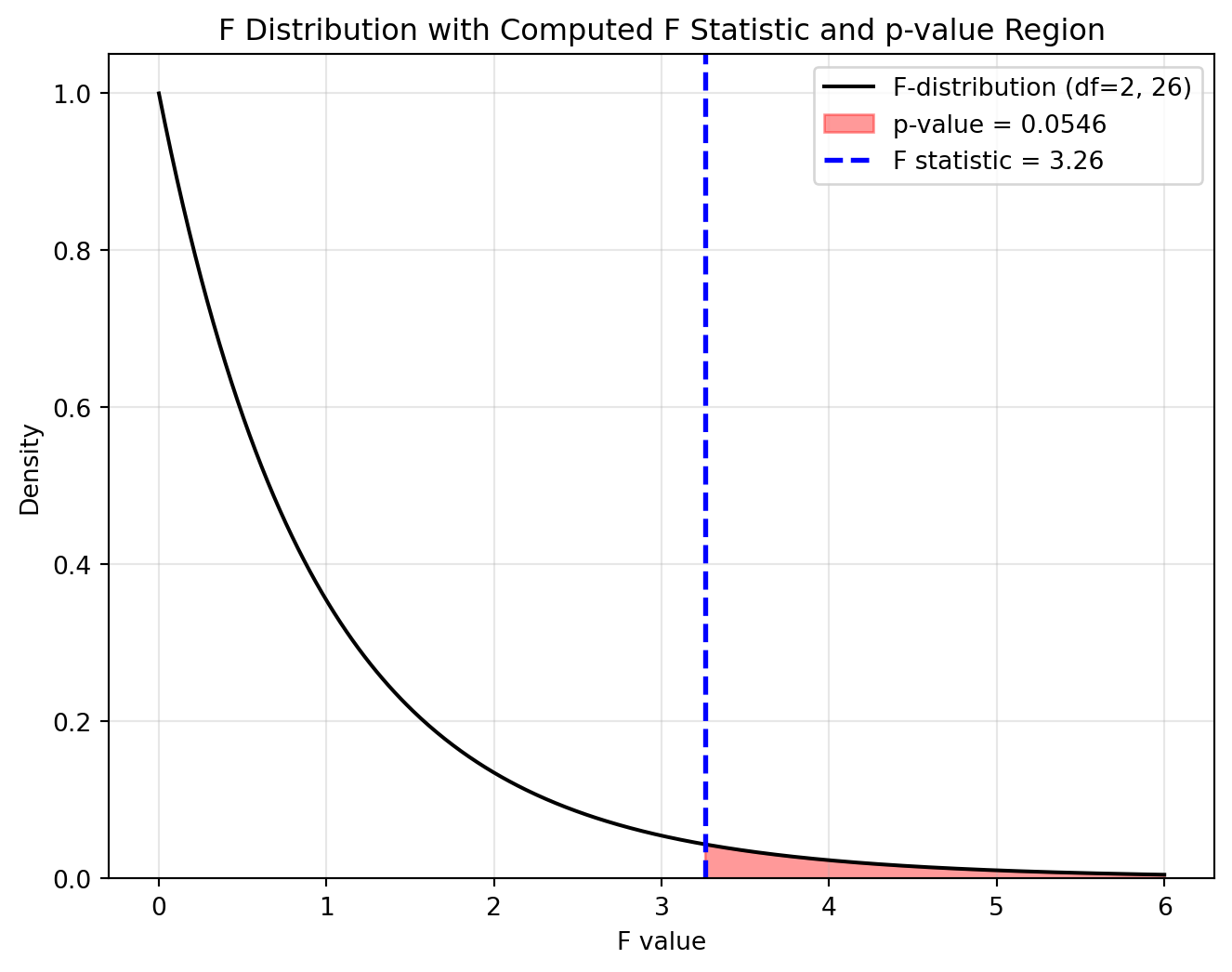
We can also use pingouin to conduct ANOVA between LANAME and ATT8SCR. The grammar is much more concise than statsmodels.
# One-way ANOVA using Pingouin
anova_results = pg.anova(dv='ATT8SCR', between='LANAME', data=df_filtered, detailed=True)

print(anova_results.round(2))
Source SS DF MS F p-unc np2
0 LANAME 335.63 2 167.82 3.26 0.05 0.2
1 Within 1339.10 26 51.50 NaN NaN NaNThe results are aligned with ANOVA using statsmodels.
Column meanings:
- Source: Factor being tested (“LANAME”) or residual.
- SS: Sum of squares. The SS of LANMAE (335.63) represents the between-group variation, while SS of Within (1339.10) represents the within-group variation.
- DF: Degrees of freedom.
- MS: Mean squares.
- F: F-statistic, calculated as: $ [ F(2, 26) = = = ] $
- p-unc: Uncorrected p-value.
- np2: Partial eta-squared (effect size).
You’re Done!
Congratulations on completing the practical on correlation and ANOVA. You’ve also learnt how to debug when an error occurs.
When you use Python (or R), it is common that a task can be completed by different packages. For example, Pearson correlation can be calculated using scipy, pandas, or pingouin. Choose the right tool for your purpose, and ensure you understand the underlying principles and limitations before using a package.
It takes time to learn - remember practice makes perfect!
If you have time, please think about applying the correlation to other variables in the school data, or your own datasets.