Practical 2: Recognising and plotting probability distributions

Exploring student attainment in schools

This week is focussed on using some common functions in Python to plot data and distributions.

Learning Outcomes

  • Familiarise yourself with opening datasets and formatting them in Python.
  • Practise plotting histograms of data in Python.
  • Explore different data distributions.

Starting the Practical

As per last week: download the notebook to your QM folder, switch over to JupyterLab (which will be running in Podman/Docker) and get to work.

Optionally if you want to save the completed notebook to your Github repo, you can add, commit, and push the notebook in Git after you download it. When you’re done for the day, save your changes to the file (This is very important!), then add, commit, and push your work to save the completed notebook.

Loading the data

We are going to look at schools performance data in England.

The data is sourced from gov.uk here, however I have also saved a copy of the relevant dataset to the Github repo (in case the dataset is removed from the website) which you can load directly in the code below. In this notebook we’re using the performance table for academic year 2022/23: ‘Performancetables_130242/2022-2023’.

We have saved a copy of this dataset to the Github repo, in case the dataset is removed from the website.

import pandas as pd
import matplotlib.pyplot as plt
import numpy as np 

# Read CSV file, handling common missing value entries
na_vals = ["", "NA", "SUPP", "NP", "NE", "SP", "SN", "SUPPMAT"]
df_ks4 = pd.read_csv('https://raw.githubusercontent.com/huanfachen/QM/refs/heads/main/sessions/L2_data/england_ks4final.csv',
    na_values = na_vals
)

info_cols = ['RECTYPE', 'LEA', 'SCHNAME', 'TOTPUPS']
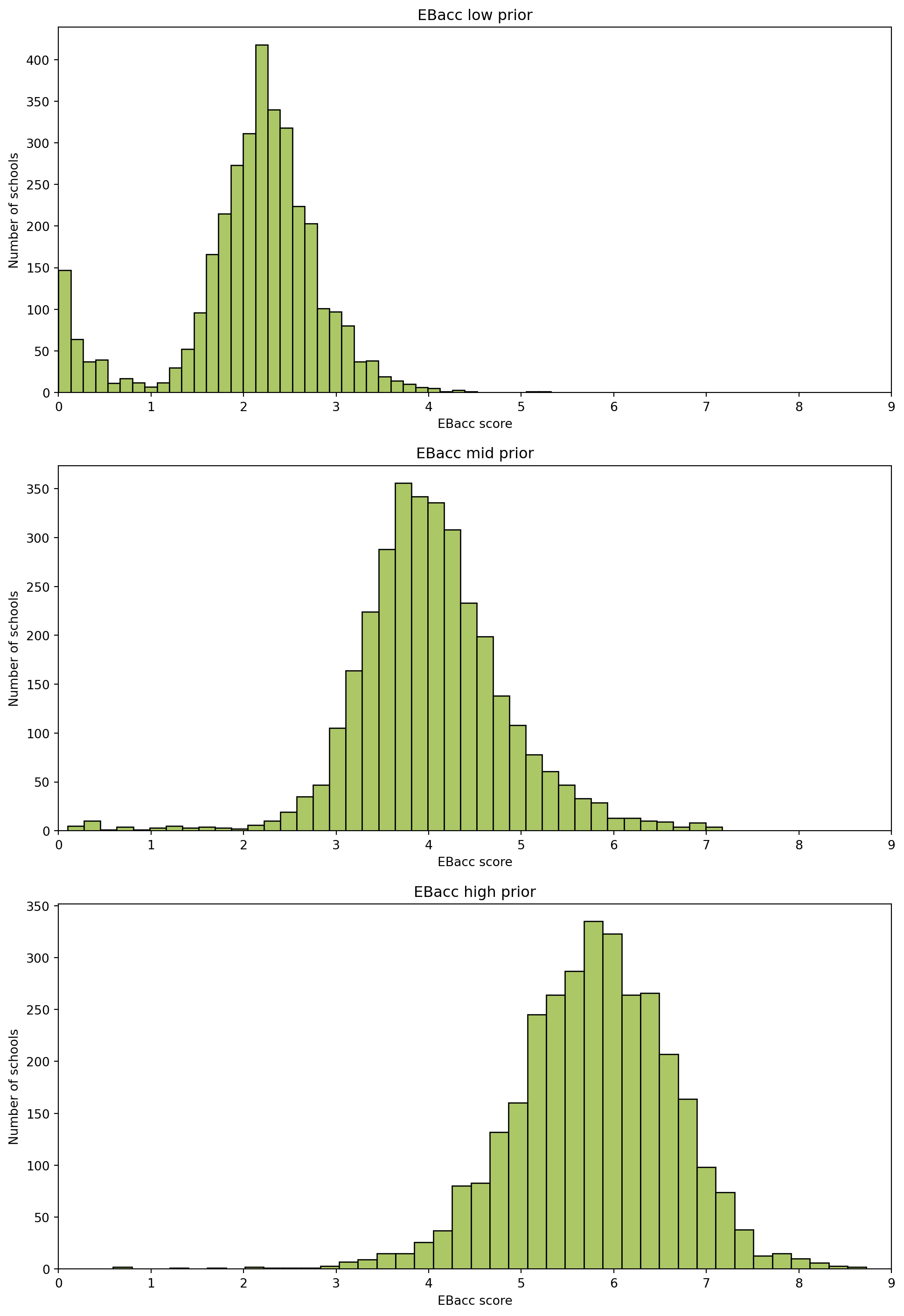
ebaccs_cols = ['EBACCAPS', 'EBACCAPS_LO', 'EBACCAPS_MID', 'EBACCAPS_HI']

df = df_ks4[info_cols + ebaccs_cols]

df.head()
/tmp/ipykernel_12386/1329269953.py:7: DtypeWarning:

Columns (75,77,78,79,80,81,82,83,84,85,86,87,88,89,90,91,92,93,94,144,145,146,147,148,149,150,151,152,177,178,179,180,181,182,183,186,187,188,189,190,191,192,194,195,196,198,199,200,202,203,204,206,207,208,210,211,212,214,215,216,218,219,220,222,223,224,230,233,234,235,236,237,238,239,242,243,244,245,246,247,248,251,252,253,254,255,256,257,266,267,268,269,270,271,272,281,282,283,284,285,286,287,296,297,298,299,300,301,302,311,312,313,314,315,316,317,335,336,337,340,341,342,345,346,347,366,367,368,369,370,371,372,373,374,375,376,377,378,379,380,381,382,383,384,385,386,387,388,389,390,391,392,393,394,395,396,397,398,399,400,401,402,403,404,405,406,407,408,409,410) have mixed types. Specify dtype option on import or set low_memory=False.
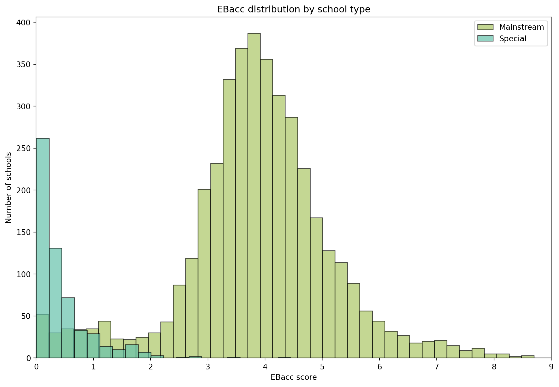
RECTYPE LEA SCHNAME TOTPUPS EBACCAPS EBACCAPS_LO EBACCAPS_MID EBACCAPS_HI
0 1 201.0 City of London School 1045 2.10 NaN NaN NaN
1 1 201.0 City of London School for Girls 739 1.51 NaN NaN NaN
2 1 201.0 David Game College 365 0.56 NaN NaN NaN
3 4 201.0 NaN 0 NaN NaN NaN NaN
4 1 202.0 Acland Burghley School 1163 4.62 1.91 3.81 6.87

You might be wondering why I’ve chosen the columns info_cols and ebaccs_cols. In open source datasets the column headers might be obscure, or difficult to decipher - but typically metadata will be provided that explains the meaning.

Looking at the metadata (which you can see in ‘L2_data/ks4_meta.xlsx’) we can see the full meaning of each column header:

Variable name Meaning
RECTYPE Record type (1=mainstream school; 2=special school; 4=local authority; 5=National (all schools); 7=National (maintained schools))
LEA Local authority
SCHNAME School name
TOTPUPS Number of pupils on roll (all ages)
EBACCAPS Average EBacc APS score per pupil
EBACCAPS_LO Average EBacc APS score per pupil with low prior attainment
EBACCAPS_MID Average EBacc APS score per pupil with middle prior attainment
EBACCAPS_HI Average EBacc APS score per pupil with high prior attainment

EBacc stands for English Baccalaureate. It is a measure of students school grades calculated as an average score across a set number of subjects. It is used by the government as a performance indicator of English schools. You can read more about it here.

The EBacc has a minimum score of 0, which indicates very poor performance, and a maximum score of 9, which indicates very high performance.

Describing the dataframe

The pandas library has lots of useful built in functions for analysing dataframes. Let’s start by seeing how much data we have.

rows, cols = df.shape
print(f"Rows: {rows}, Columns: {cols}")
Rows: 5813, Columns: 8

The function .shape returns the number of rows and columns.

Checking the data type

Let’s check the data type of each of the columns - based on the metadata I am expecting:

Variable name Meaning dtype
RECTYPE Record type (1=mainstream school; 2=special school; 4=local authority; 5=National (all schools); 7=National (maintained schools)) int
LEA Local authority int
SCHNAME School name string
TOTPUPS Number of pupils on roll (all ages) int
EBACCAPS Average EBacc APS score per pupil float
EBACCAPS_LO Average EBacc APS score per pupil with low prior attainment float
EBACCAPS_MID Average EBacc APS score per pupil with middle prior attainment float
EBACCAPS_HI Average EBacc APS score per pupil with high prior attainment float
df.dtypes
RECTYPE           int64
LEA             float64
SCHNAME          object
TOTPUPS          object
EBACCAPS        float64
EBACCAPS_LO     float64
EBACCAPS_MID    float64
EBACCAPS_HI     float64
dtype: object

OK, so we can see that not all the data types are quite as expected. Let’s reformat them to make it easier later.

df[['TOTPUPS']+ebaccs_cols] = df[['TOTPUPS']+ebaccs_cols].apply(pd.to_numeric, errors='coerce')
/tmp/ipykernel_12386/2080033850.py:1: SettingWithCopyWarning:


A value is trying to be set on a copy of a slice from a DataFrame.
Try using .loc[row_indexer,col_indexer] = value instead

See the caveats in the documentation: https://pandas.pydata.org/pandas-docs/stable/user_guide/indexing.html#returning-a-view-versus-a-copy

And we can check again:

df.dtypes
RECTYPE           int64
LEA             float64
SCHNAME          object
TOTPUPS         float64
EBACCAPS        float64
EBACCAPS_LO     float64
EBACCAPS_MID    float64
EBACCAPS_HI     float64
dtype: object

Check how much data is missing

Let’s check how much data is missing for each column in the dataframe - this will help us understand the completeness of the data.

# print how much data is missing for each column
df.isna().mean() * 100 
RECTYPE          0.000000
LEA              0.034406
SCHNAME          2.683640
TOTPUPS          1.221400
EBACCAPS        17.684500
EBACCAPS_LO     38.775159
EBACCAPS_MID    41.149148
EBACCAPS_HI     42.490969
dtype: float64

It seems suspicious that the school names are missing for some of the entries - let’s check these.

# return rows where SCHNAME is missing
df[df['SCHNAME'].isna()]
RECTYPE LEA SCHNAME TOTPUPS EBACCAPS EBACCAPS_LO EBACCAPS_MID EBACCAPS_HI
3 4 201.0 NaN 0.0 NaN NaN NaN NaN
24 4 202.0 NaN 10865.0 4.36 2.03 4.19 6.33
55 4 203.0 NaN 18998.0 4.13 2.14 4.21 5.77
88 4 204.0 NaN 15214.0 4.72 2.32 4.64 6.72
112 4 205.0 NaN 9905.0 5.12 2.26 4.93 6.90
... ... ... ... ... ... ... ... ...
5748 4 941.0 NaN 31801.0 3.96 2.16 4.04 6.08
5776 4 942.0 NaN 17442.0 3.81 2.08 3.85 5.54
5810 4 943.0 NaN 14503.0 3.97 2.29 3.81 5.80
5811 5 NaN NaN 4129401.0 3.88 NaN NaN NaN
5812 7 NaN NaN 3688033.0 4.05 2.07 4.05 6.09

156 rows × 8 columns

So, these are all record type 4, 5, or 7. Looking back at the metadata I see that record types 4, 5 and 7 refer to aggregated data - i.e. they’re not individual schools! Let’s limit the selection to only individual schools, that is 1-mainstream schools and 2-special schools.

# only keep rows where RECTYPE is 1 or 2 
df = df[df['RECTYPE'].isin([1, 2])].copy()

Now we can check the data dimensions again.

rows, cols = df.shape
print(f"Rows: {rows}, Columns: {cols}")
Rows: 5657, Columns: 8

Summary statistics

We can use the describe function in pandas to easily get the summary statistics for a dataframe.

numerical_cols = ['TOTPUPS', 'EBACCAPS', 'EBACCAPS_LO', 'EBACCAPS_MID', 'EBACCAPS_HI']

df[numerical_cols].describe()
TOTPUPS EBACCAPS EBACCAPS_LO EBACCAPS_MID EBACCAPS_HI
count 5586.000000 4631.000000 3406.000000 3268.000000 3190.000000
mean 735.296097 3.428538 2.090628 4.033562 5.782893
std 552.209689 1.679245 0.769925 0.818922 0.856998
min 0.000000 0.000000 0.000000 0.100000 0.590000
25% 165.000000 2.820000 1.830000 3.560000 5.250000
50% 761.000000 3.700000 2.200000 3.980000 5.820000
75% 1149.000000 4.440000 2.520000 4.470000 6.350000
max 3440.000000 8.700000 5.320000 7.170000 8.730000

Histograms

Let’s try plotting the Average EBacc APS score per pupil.

n_bins = 10
fig, ax = plt.subplots(figsize=(12, 8))

ax.hist(df['EBACCAPS'].dropna(), bins=n_bins, color='#abc766', edgecolor='black')
ax.set_title('EBacc distribution')
ax.set_xlabel('EBacc score')
ax.set_ylabel('Number of schools')  
ax.set_xlim(0,9) # the EBacc has a maximum score of 9

plt.show()

What do you observe from this boxplot? Because the bins are quite large it’s difficult to get a sense of the distribution - try changing this to get a better idea of the data spread.

n_bins = ??
fig, ax = plt.subplots(figsize=(12, 8))

ax.hist(df['EBACCAPS'].dropna(), bins=n_bins, color='#abc766', edgecolor='black')
ax.set_title('EBacc distribution')
ax.set_xlabel('EBacc score')
ax.set_ylabel('Number of schools')  
ax.set_xlim(0,9) # the EBacc has a maximum score of 9

plt.show()
n_bins = 40
fig, ax = plt.subplots(figsize=(12, 8))

ax.hist(df['EBACCAPS'].dropna(), bins=n_bins, color='#abc766', edgecolor='black')
ax.set_title('EBacc distribution')
ax.set_xlabel('EBacc score')
ax.set_ylabel('Number of schools')  
ax.set_xlim(0,9) # the EBacc has a maximum score of 9

plt.show()

Is it normally distributed?

Looking at the histogram does the data look normally distributed?

Remember the key features of the normal distribution:

  • Data is continuous
    • it is something you measure not something you count
  • Data is equally likely to be larger or smaller than average
    • symmetric
  • Characteristic size, all data points are close to the mean
    • single peak
  • There is less data further away from the mean
    • smooth tails on both sides

One way to consider whether it is normally distributed is to overlay the normal distribution on top.

We can use the package scipy.stats which has functions for generating probability density functions for common distributions. You can see which common distributions here.

import scipy.stats as sps

# first let's get the mean and stand deviation 
mu = df['EBACCAPS'].dropna().mean()
std = df['EBACCAPS'].dropna().std()

## Create the plot 

# plot the histogram
plt.figure(figsize=(12, 8))
plt.hist(df['EBACCAPS'], bins=40, density=True, color='#abc766', edgecolor='black')

# plot the Probability Density Function (PDF)
xmin = 0 
xmax = 9
x = np.linspace(xmin, xmax, 100)
p = sps.norm.pdf(x, mu, std)
plt.plot(x, p, 'k', linewidth=2, color="#e16fca")

plt.title(f"Fit results: $\mu$ = {mu:.2f},  $\sigma$ = {std:.2f}")
plt.xlim(0, 9)
plt.xlabel("EBacc score")
plt.ylabel("Density")

plt.show()
/tmp/ipykernel_12386/3509817750.py:18: UserWarning:

color is redundantly defined by the 'color' keyword argument and the fmt string "k" (-> color=(0.0, 0.0, 0.0, 1)). The keyword argument will take precedence.

Note that this time we plot the histogram with density=True - this scales the histogram data.

Another way to think about whether soemthing is normally distirbuted is to look at the Q-Q plot.

Q-Q plot

A Q-Q plot is used to see if a dataset follows a ceratin distirbution, by comparing the quartiles of the two. You can read a bit more about Q-Q plots here.

Q-Q plots are a good way to check if a dataset follows a normal distribution.

Thinking about the characteristics of a normal distribution, what would you expect the Q-Q plot of a normally distributed dataset to look like?

If the data is normally distributed, the points in the Q-Q plot will lie close to a straight diagonal line. This happens because the quantiles of the sample match the quantiles of the theoretical normal distribution.

The results of the Q-Q plot can help us to understand the dataset:

  • For perfectly normal data: points fall almost exactly on the diagonal line
  • Heavy tails (more extreme values than normal): points curve away at the end
  • Light tails (fewer extreme values than normal): points bend inward at the ends
  • Skewed data: points systematically deviate above or below the line

We can plot the Q-Q plot in Python:

# Drop missing values
data = df['EBACCAPS'].dropna().values
n = len(data)

# Sort the sample data
sample_quantiles = np.sort(data)

# Compute plotting positions (probabilities)
p = (np.arange(1, n+1) - 0.5) / n

# Compute theoretical quantiles from standard normal
theoretical_quantiles = sps.norm.ppf(p)

# Plot
plt.scatter(theoretical_quantiles, sample_quantiles, alpha=0.5, color='#abc766')
plt.plot(theoretical_quantiles, theoretical_quantiles, color='black', linestyle='--')  # reference line
plt.title("Q-Q plot for EBacc scores")
plt.xlabel("Theoretical quantiles (Normal)")
plt.ylabel("Sample quantiles")

plt.show()

Ok, so in case it wasn’t clear from the previous plot we can see that the data definitely isn’t normal.

What’s causing the skew?

If you remember above this dataset includes schools of two different types, we have mainstream schools and special schools. ‘special schools’ refers to schools which cater to students with special educational needs. let’s see whta happens when we split our historgram according to the type of school.

# histogram of # plot histogram of EBACCAPS by RECTYPE
n_bins = {1:40, 2:20}
fig, ax = plt.subplots(figsize=(12, 8))
for rectype, color, label in zip([1, 2], ['#abc766', '#66c2ab'], ['Mainstream', 'Special']):
    ax.hist(df_ks4.loc[df_ks4['RECTYPE'] == rectype, 'EBACCAPS'].dropna(), bins=n_bins[rectype], alpha=0.7, color=color, edgecolor='black', label=label)
ax.set_title('EBacc distribution by school type')
ax.set_xlabel('EBacc score')
ax.set_ylabel('Number of schools')  
ax.set_xlim(0,9)
ax.legend()

plt.show()

Note that I’ve played with the number of total bins for each group so that the histograms look nice.

Looking now at the histogram it becomes clear that the skewness of the data is caused by the different school types.

Another check for normality

Let’s try again to see if the data is normal - this time splitting the dataset according to the school type.

We can start by splitting the dataset according to the school type.

# mainstream school
df1 = df[??]

# special schools 
df2 = df[??]
# mainstream school
df1 = df[df['RECTYPE'] == 1]

# special schools 
df2 = df[df['RECTYPE'] == 2]

Q-Q plot for mainstream schools

# Drop missing values
data = df1['EBACCAPS'].dropna().values
n = len(data)

# Sort the sample data
sample_quantiles = ??

# Compute plotting positions (probabilities)
p = ??

# Compute theoretical quantiles from standard normal
theoretical_quantiles = ??

# Plot
plt.scatter(theoretical_quantiles, sample_quantiles, alpha=0.5, color='#abc766')
plt.plot(theoretical_quantiles, theoretical_quantiles, color='black', linestyle='--')  # reference line
plt.title("Mainstream schools: Q-Q plot for EBacc scores")
plt.xlabel("Theoretical quantiles (Normal)")
plt.ylabel("Sample quantiles")

plt.show()
# Drop missing values
data = df1['EBACCAPS'].dropna().values
n = len(data)

# Sort the sample data
sample_quantiles = np.sort(data)

# Compute plotting positions (probabilities)
p = (np.arange(1, n+1) - 0.5) / n

# Compute theoretical quantiles from standard normal
theoretical_quantiles = sps.norm.ppf(p)

# Plot
plt.scatter(theoretical_quantiles, sample_quantiles, alpha=0.5, color='#abc766')
plt.plot(theoretical_quantiles, theoretical_quantiles, color='black', linestyle='--')  # reference line
plt.title("Mainstream schools: Q-Q plot for EBacc scores")
plt.xlabel("Theoretical quantiles (Normal)")
plt.ylabel("Sample quantiles")

plt.show()

Q-Q plot for special schools

# Drop missing values
data = df2['EBACCAPS'].dropna().values
n = len(data)

# Sort the sample data
sample_quantiles = ??

# Compute plotting positions (probabilities)
p = ??

# Compute theoretical quantiles from standard normal
theoretical_quantiles = ??

# Plot
plt.scatter(theoretical_quantiles, sample_quantiles, alpha=0.5, color='#abc766')
plt.plot(theoretical_quantiles, theoretical_quantiles, color='black', linestyle='--')  # reference line
plt.title("Special schools: Q-Q plot for EBacc scores")
plt.xlabel("Theoretical quantiles (Normal)")
plt.ylabel("Sample quantiles")

plt.show()
# Drop missing values
data = df2['EBACCAPS'].dropna().values
n = len(data)

# Sort the sample data
sample_quantiles = np.sort(data)

# Compute plotting positions (probabilities)
p = (np.arange(1, n+1) - 0.5) / n

# Compute theoretical quantiles from standard normal
theoretical_quantiles = sps.norm.ppf(p)

# Plot
plt.scatter(theoretical_quantiles, sample_quantiles, alpha=0.5, color='#abc766')
plt.plot(theoretical_quantiles, theoretical_quantiles, color='black', linestyle='--')  # reference line
plt.title("Special schools: Q-Q plot for EBacc scores")
plt.xlabel("Theoretical quantiles (Normal)")
plt.ylabel("Sample quantiles")

plt.show()

Looking at the resultant Q-Q plots what can we say about the data? We see that the mainstream schools is a skewed dataset, whilst the special schools dataset has a heavy tail.

Extension

EBacc by prior attainment

If you’ve finished looking at the histogram plots of the EBacc data, try plotting the histograms of the columns ‘EBACCAPS_LO’, ‘EBACCAPS_MID’, ‘EBACCAPS_HI’. What can you say about these data distributions? Does plotting the Q-Q plots help?

n_bins = ??
fig, ax = plt.subplots(3, 1, figsize=(12, 18))
plot_names = ['EBacc low prior', 'EBacc mid prior', 'EBacc high prior']

for i, col in ??:
    ax[i].hist(df[col].dropna(), bins=n_bins, color='#abc766', edgecolor='black')
    ax[i].set_title(plot_names[i])
    ax[i].set_xlabel('EBacc score')
    ax[i].set_ylabel('Number of schools')  
    ax[i].set_xlim(0,9) # the EBacc has a maximum score of 9
    
plt.show()
n_bins = 40
fig, ax = plt.subplots(3, 1, figsize=(12, 18))
plot_names = ['EBacc low prior', 'EBacc mid prior', 'EBacc high prior']

for i, col in enumerate(['EBACCAPS_LO', 'EBACCAPS_MID', 'EBACCAPS_HI']):
    ax[i].hist(df[col].dropna(), bins=n_bins, color='#abc766', edgecolor='black')
    ax[i].set_title(plot_names[i])
    ax[i].set_xlabel('EBacc score')
    ax[i].set_ylabel('Number of schools')  
    ax[i].set_xlim(0,9) # the EBacc has a maximum score of 9

plt.show()

EBacc by school size

Try plotting the EBacc scores against the total number of pupils (‘TOTPUPS’) - what can you say about this distribution?

You’re Done!

Congratulations on completing the second QM practical session! If you are still working on it, take your time.

Don’t worry about understanding every detail of the Python code — what matters most is knowing which functions to use for a specific task, like plotting histograms of data, and knowing how to debug when it goes wrong. Remember, practice makes perfect.