import numpy as np
import pandas as pd
import matplotlib.pyplot as plt
import seaborn as sns

from sklearn.impute import KNNImputer
from sklearn.preprocessing import StandardScaler
from sklearn.cluster import KMeans, AgglomerativeClustering
from scipy.cluster.hierarchy import dendrogram

sns.set(style="whitegrid", context="notebook")
plt.rcParams["figure.figsize"] = (8, 6)Practical 10: Clustering analysis
This week, we will focus on clustering analysis on the attainment and disadvantage variables of schools in England, aiming to identify the groups within these schools in terms of attainment and disadvantange dimensions.
The practical consists of the following steps:
- Load the national school performance dataset.
- Filter to schools in Greater London.
- Select a subset of variables related to disadvantage and attainment.
- Handle missing values and standardise the data.
- Run K-means and hierarchical (agglomerative) clustering.
- Compare the two clustering results.
- Map the schools using their geospatial locations.
Setup
We first import the Python libraries needed for data handling, clustering, and plotting.
Load school data
We now load the DfE school dataset of 2022-2023.
url_school = "https://raw.githubusercontent.com/huanfachen/QM/refs/heads/main/sessions/L6_data/Performancetables_130242/2022-2023/england_filtered.csv"

df_school = pd.read_csv(url_school)

print(df_school.shape)

print(df_school.head())
(3056, 37)
URN SCHNAME.x LEA LANAME TOWN.x \
0 100053 Acland Burghley School 202 Camden London
1 100054 The Camden School for Girls 202 Camden London
2 100052 Hampstead School 202 Camden London
3 100049 Haverstock School 202 Camden London
4 100059 La Sainte Union Catholic Secondary School 202 Camden London
gor_name TOTPUPS ATT8SCR ATT8SCRENG ATT8SCRMAT ... PPERSABS10 \
0 London 1163.0 50.3 10.7 10.2 ... 24.7
1 London 1047.0 65.8 13.5 12.7 ... 6.6
2 London 1319.0 44.6 9.7 9.1 ... 24.0
3 London 982.0 41.7 8.7 8.8 ... 33.1
4 London 817.0 49.6 10.8 9.4 ... 33.8
SCHOOLTYPE.x RELCHAR ADMPOL.y ADMPOL_PT \
0 State-funded secondary Does not apply Non-selective OTHER NON SEL
1 State-funded secondary NaN Non-selective OTHER NON SEL
2 State-funded secondary Does not apply Non-selective OTHER NON SEL
3 State-funded secondary Does not apply Non-selective OTHER NON SEL
4 State-funded secondary Roman Catholic Non-selective OTHER NON SEL
gender_name OFSTEDRATING MINORGROUP easting northing
0 Mixed Good Maintained school 528962.0 185931.0
1 Girls Good Maintained school 529441.0 184659.0
2 Mixed Good Maintained school 524402.0 185633.0
3 Mixed Good Maintained school 528159.0 184498.0
4 Girls Good Maintained school 528379.0 186191.0
[5 rows x 37 columns]Load LAD-to-county lookup and filter to London
We need to keep only schools in Inner London or Outer London. To do this, we join a LAD-to-county lookup table to the school data.
# Raw link to the lookup table
url_lad_county = "https://raw.githubusercontent.com/huanfachen/QM/refs/heads/main/sessions/L10_data/Local_Authority_District_to_County_(December_2024)_Lookup_in_EN.csv"

df_lad_county = pd.read_csv(url_lad_county)

print(df_lad_county.head())
LAD24CD LAD24NM CTY24CD CTY24NM ObjectId
0 E07000008 Cambridge E10000003 Cambridgeshire 1
1 E07000009 East Cambridgeshire E10000003 Cambridgeshire 2
2 E07000010 Fenland E10000003 Cambridgeshire 3
3 E07000011 Huntingdonshire E10000003 Cambridgeshire 4
4 E07000012 South Cambridgeshire E10000003 Cambridgeshire 5Now, we join the lookup to the school data:
- Match
LANAMEindf_schoolwithLAD24NMindf_lad_county.
- Keep only rows where
CTY24NMis Inner London or Outer London.
# Merge school data with LAD→County lookup
df_school_london = df_school.merge(
    df_lad_county[["LAD24NM", "CTY24NM"]],
    left_on="LANAME",
    right_on="LAD24NM",
    how="left"
)

# Filter to Inner and Outer London
london_filter = df_school_london["CTY24NM"].isin(["Inner London", "Outer London"])
df_school_london = df_school_london[london_filter].copy()

df_school_london["CTY24NM"].value_counts()
CTY24NM
Outer London 294
Inner London 149
Name: count, dtype: int64Select clustering variables
The metadata of the school data is available here. For convenience, the columns are described as below:
1. URN: Unique Reference Number identifying a school.
2. SCHNAME.x: School name as recorded in the official register.
3. LEA: Local Education Authority (code).
4. LANAME: Name of the Local Authority.
5. TOWN.x: Town in which the school is located.
6. gor_name: Government Office Region name.
7. TOTPUPS: Total number of pupils on roll.
8. ATT8SCR: Average Attainment 8 score for all pupils.
9. ATT8SCRENG: Average Attainment 8 score for English subject grouping.
10. ATT8SCRMAT: Average Attainment 8 score for Maths subject grouping.
11. ATT8SCR_FSM6CLA1A: Average Attainment 8 score for pupils eligible for Free School Meals in the last 6 years and/or Children Looked After.
12. ATT8SCR_NFSM6CLA1A: Average Attainment 8 score for pupils not eligible for Free School Meals in the last 6 years and not Children Looked After.
13. ATT8SCR_BOYS: Average Attainment 8 score for male pupils.
14. ATT8SCR_GIRLS: Average Attainment 8 score for female pupils.
15. P8MEA: Progress 8 measure for all pupils.
16. P8MEA_FSM6CLA1A: Progress 8 measure for disadvantaged pupils (FSM6 and/or CLA1A).
17. P8MEA_NFSM6CLA1A: Progress 8 measure for non-disadvantaged pupils.
18. PTFSM6CLA1A: Percentage of pupils eligible for FSM6 and/or CLA1A.
19. PTNOTFSM6CLA1A: Percentage of pupils not eligible for FSM6 and/or CLA1A.
20. PNUMEAL: Percentage of pupils whose first language is known or believed to be other than English.
21. PNUMENGFL: Percentage of pupils whose first language is English.
22. PTPRIORLO: Percentage of pupils with low prior attainment from Key Stage 2.
23. PTPRIORHI: Percentage of pupils with high prior attainment from Key Stage 2.
24. NORB: Number of boys on roll.
25. NORG: Number of girls on roll.
26. PNUMFSMEVER: Percentage of pupils who have been eligible for free school meals in the past six years (FSM6 measure).
27. PERCTOT: Percentage of total pupil absence (authorised and unauthorised combined).
28. PPERSABS10: Percentage of pupils who are persistently absent (overall absence rate 10% or more).
29. SCHOOLTYPE.x: Official classification of the school type (e.g., Academy, Community, Voluntary Aided).
30. RELCHAR: Religious character of the school (e.g., Church of England, Roman Catholic, None).
31. ADMPOL.y: Admission policy type (e.g., non-selective, selective).
32. ADMPOL_PT: Percentage breakdown related to admission policy (context-specific).
33. gender_name: Gender intake of the school (Mixed, Boys, Girls).
34. OFSTEDRATING: Latest Ofsted inspection overall effectiveness grade.
35. MINORGROUP: Ethnic minority group classification for aggregation purposes.
36. easting: Ordnance Survey Easting coordinate of school location.
37. northing: Ordnance Survey Northing coordinate of school location.
As the focus is to explore the performance and disadvantage of schools, we will keep the following variables, which is the same as Week-9:
- PTFSM6CLA1A – Percentage of pupils eligible for Free School Meals in the past six years (FSM6) and/or Children Looked After (CLA1A).
- PTNOTFSM6CLA1A – Percentage of pupils not eligible for FSM6 and not CLA1A.
- PNUMEAL – Percentage of pupils whose first language is known or believed to be other than English.
- PNUMFSMEVER – Percentage of pupils who have ever been eligible for Free School Meals in the past six years (FSM6 measure).
- ATT8SCR_FSM6CLA1A – Average Attainment 8 score for pupils eligible for FSM6 and/or CLA1A.
- ATT8SCR_NFSM6CLA1A – Average Attainment 8 score for pupils not eligible for FSM6 and not CLA1A.
- ATT8SCR_BOYS – Average Attainment 8 score for male pupils.
- ATT8SCR_GIRLS – Average Attainment 8 score for female pupils.
- P8MEA_FSM6CLA1A – Progress 8 measure for disadvantaged pupils (FSM6 and/or CLA1A).
- P8MEA_NFSM6CLA1A – Progress 8 measure for non-disadvantaged pupils.
cols_for_clustering = [
    "PTFSM6CLA1A", "PTNOTFSM6CLA1A", "PNUMEAL", "PNUMFSMEVER",
    "ATT8SCR_FSM6CLA1A", "ATT8SCR_NFSM6CLA1A", "ATT8SCR_BOYS", "ATT8SCR_GIRLS",
    "P8MEA_FSM6CLA1A", "P8MEA_NFSM6CLA1A"
]

df_school_reduced = df_school_london[cols_for_clustering].copy()
df_school_reduced.head()| PTFSM6CLA1A | PTNOTFSM6CLA1A | PNUMEAL | PNUMFSMEVER | ATT8SCR_FSM6CLA1A | ATT8SCR_NFSM6CLA1A | ATT8SCR_BOYS | ATT8SCR_GIRLS | P8MEA_FSM6CLA1A | P8MEA_NFSM6CLA1A | |
|---|---|---|---|---|---|---|---|---|---|---|
| 0 | 37.0 | 63.0 | 23.6 | 39.6 | 34.8 | 59.2 | 51.5 | 46.8 | -0.99 | 0.34 |
| 1 | 36.0 | 64.0 | 25.5 | 30.3 | 54.7 | 72.0 | NaN | 65.8 | 0.25 | 1.13 |
| 2 | 45.0 | 55.0 | 38.1 | 51.3 | 39.3 | 49.0 | 41.9 | 47.1 | -0.18 | 0.09 |
| 3 | 63.0 | 37.0 | 57.5 | 69.8 | 37.7 | 48.5 | 40.1 | 43.7 | -0.44 | 0.02 |
| 4 | 41.0 | 59.0 | 50.6 | 42.7 | 45.9 | 52.2 | NaN | 49.6 | -0.20 | 0.25 |
Check and handle missing values
Clustering algorithms cannot directly work with missing values, so we have to handle them. We will use KNN imputation, which fills in missing values based on similar rows.
df_school_reduced.isna().sum()PTFSM6CLA1A 11
PTNOTFSM6CLA1A 11
PNUMEAL 2
PNUMFSMEVER 2
ATT8SCR_FSM6CLA1A 20
ATT8SCR_NFSM6CLA1A 19
ATT8SCR_BOYS 86
ATT8SCR_GIRLS 63
P8MEA_FSM6CLA1A 23
P8MEA_NFSM6CLA1A 21
dtype: int64# Use K-nearest neighbours imputation (k = 5)
imputer = KNNImputer(n_neighbors=5)
reduced_imputed_array = imputer.fit_transform(df_school_reduced)
df_reduced_imputed = pd.DataFrame(
reduced_imputed_array,
columns=cols_for_clustering,
index=df_school_london.index
)
df_reduced_imputed.head()| PTFSM6CLA1A | PTNOTFSM6CLA1A | PNUMEAL | PNUMFSMEVER | ATT8SCR_FSM6CLA1A | ATT8SCR_NFSM6CLA1A | ATT8SCR_BOYS | ATT8SCR_GIRLS | P8MEA_FSM6CLA1A | P8MEA_NFSM6CLA1A | |
|---|---|---|---|---|---|---|---|---|---|---|
| 0 | 37.0 | 63.0 | 23.6 | 39.6 | 34.8 | 59.2 | 51.50 | 46.8 | -0.99 | 0.34 |
| 1 | 36.0 | 64.0 | 25.5 | 30.3 | 54.7 | 72.0 | 60.18 | 65.8 | 0.25 | 1.13 |
| 2 | 45.0 | 55.0 | 38.1 | 51.3 | 39.3 | 49.0 | 41.90 | 47.1 | -0.18 | 0.09 |
| 3 | 63.0 | 37.0 | 57.5 | 69.8 | 37.7 | 48.5 | 40.10 | 43.7 | -0.44 | 0.02 |
| 4 | 41.0 | 59.0 | 50.6 | 42.7 | 45.9 | 52.2 | 48.12 | 49.6 | -0.20 | 0.25 |
For each missing value, KNNImputer looks at the 5 most similar schools and uses their values to fill the gap. This helps us keep as many London schools as possible in the analysis.
Standardise variables
Different variables are measured on different scales (e.g. ratio vs scores). To avoid one variable dominating the distance measure, we standardise them so each has mean \[0\] and standard deviation \[1\].
scaler = StandardScaler()

scaled_array = scaler.fit_transform(df_reduced_imputed)

df_scaled = pd.DataFrame(
    scaled_array,
    columns=cols_for_clustering,
    index=df_school_london.index
)

df_scaled.describe().T| count | mean | std | min | 25% | 50% | 75% | max | |
|---|---|---|---|---|---|---|---|---|
| PTFSM6CLA1A | 443.0 | -1.122754e-16 | 1.001131 | -2.058274 | -0.760004 | -0.045956 | 0.733006 | 2.875152 |
| PTNOTFSM6CLA1A | 443.0 | 5.453375e-16 | 1.001131 | -2.874922 | -0.733408 | 0.045324 | 0.759162 | 2.057049 |
| PNUMEAL | 443.0 | -2.004917e-16 | 1.001131 | -1.853002 | -0.769305 | -0.097718 | 0.751942 | 2.731088 |
| PNUMFSMEVER | 443.0 | 1.122754e-16 | 1.001131 | -2.045314 | -0.731927 | -0.045829 | 0.764420 | 2.685495 |
| ATT8SCR_FSM6CLA1A | 443.0 | 1.603934e-16 | 1.001131 | -3.122449 | -0.612879 | -0.115071 | 0.423794 | 4.195848 |
| ATT8SCR_NFSM6CLA1A | 443.0 | -6.656326e-16 | 1.001131 | -2.577729 | -0.634894 | -0.058202 | 0.512891 | 3.581115 |
| ATT8SCR_BOYS | 443.0 | 3.689048e-16 | 1.001131 | -2.175972 | -0.675904 | -0.107455 | 0.501233 | 3.772215 |
| ATT8SCR_GIRLS | 443.0 | 8.019670e-16 | 1.001131 | -2.820539 | -0.636080 | -0.072172 | 0.486261 | 3.793060 |
| P8MEA_FSM6CLA1A | 443.0 | 2.004917e-17 | 1.001131 | -3.131726 | -0.683721 | -0.022580 | 0.638560 | 3.729837 |
| P8MEA_NFSM6CLA1A | 443.0 | 8.019670e-17 | 1.001131 | -3.953417 | -0.635673 | 0.061904 | 0.682918 | 4.340944 |
After scaling, each variable is on a similar scale, which makes distance-based methods like K-means and hierarchical clustering more sensible.
K-means clustering
We now run K-means on the scaled data. We need to choose the number of clusters \[k\]. We will:
- Try different values of k.
- Plot the inertia (within-cluster sum of squares).
- Use the elbow method to pick a reasonable \[k\].
Elbow plot to choose \[k\]
inertias = []
k_values = range(2, 11)  # try k = 2 to 10

for k in k_values:
    kmeans = KMeans(
        n_clusters=k,
        random_state=42,
        n_init="auto"
    )
    kmeans.fit(df_scaled)
    inertias.append(kmeans.inertia_)

plt.figure()
plt.plot(k_values, inertias, marker="o")
plt.xlabel("Number of clusters (k)")
plt.ylabel("Inertia (within-cluster sum of squares)")
plt.title("K-means: Elbow plot (London schools)")
plt.xticks(k_values)
plt.show()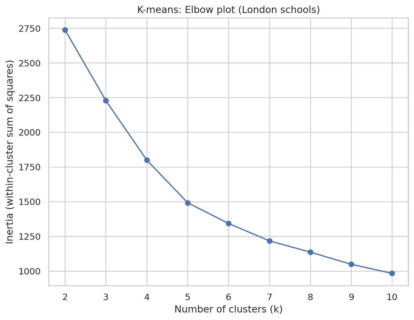
In this elbow plot, each point shows how tight the clusters are for that k, and we are looking for a “bend” or “elbow” where increasing k gives only small improvements. This k represents a good trade-off between model complexity (i.e. number of clusters) and performance. Here, we will choose k=5
Fit K-means with chosen \[k\]
k_val = 5

kmeans_final = KMeans(
    n_clusters=k_val,
    random_state=42,
    n_init="auto"
)

kmeans_final.fit(df_scaled)

kmeans_labels = kmeans_final.labels_

# Store labels in the London school dataframe
df_school_london["cluster_kmeans"] = kmeans_labels

print(df_school_london["cluster_kmeans"].value_counts().sort_index())
cluster_kmeans
0 20
1 83
2 111
3 118
4 111
Name: count, dtype: int64Inspect K-means cluster centroids
We will look at the typical school in each cluster by examining the cluster centroids back in the original units.
centroids_scaled = kmeans_final.cluster_centers_
centroids_original = scaler.inverse_transform(centroids_scaled)

df_centroids = pd.DataFrame(
    centroids_original,
    columns=cols_for_clustering
)
df_centroids.index = [f"Cluster {i}" for i in range(k_val)]

print(df_centroids)
PTFSM6CLA1A PTNOTFSM6CLA1A PNUMEAL PNUMFSMEVER \
Cluster 0 7.350000 92.700000 34.795000 8.125000
Cluster 1 44.602410 55.424096 44.860241 46.492771
Cluster 2 23.940741 76.059426 25.184156 25.829754
Cluster 3 44.986441 55.013559 53.217797 46.264407
Cluster 4 20.106306 79.902703 33.760360 21.265766
ATT8SCR_FSM6CLA1A ATT8SCR_NFSM6CLA1A ATT8SCR_BOYS ATT8SCR_GIRLS \
Cluster 0 76.120000 79.683000 78.516000 79.736000
Cluster 1 35.532048 44.074940 39.069157 42.077590
Cluster 2 39.858803 52.114166 47.990934 51.002290
Cluster 3 46.191864 53.223729 48.102203 51.559322
Cluster 4 50.031712 61.180180 57.813874 59.716036
P8MEA_FSM6CLA1A P8MEA_NFSM6CLA1A
Cluster 0 0.796200 0.953400
Cluster 1 -0.577301 -0.091373
Cluster 2 -0.430990 0.223202
Cluster 3 0.161915 0.535220
Cluster 4 0.397964 0.895892 Plot of K-means cluster centroids
We will use the following code to visualise the cluster centroids in multiple dimensions.
# adapted from this tutorial: https://towardsdatascience.com/how-to-make-stunning-radar-charts-with-python-implemented-in-matplotlib-and-plotly-91e21801d8ca
def radar_plot_cluster_centroids(df_cluster_centroid):
    # parameters
    # df_cluster_centroid: a dataframe with rows representing a cluster centroid and columns representing variables

    # manually 'close' the line
    categories = df_cluster_centroid.columns.values.tolist()
    categories = [*categories, categories[0]]

    label_loc = np.linspace(start=0, stop=2 * np.pi, num=len(categories))

    plt.figure(figsize=(12, 8))
    plt.subplot(polar=True)
    for index, row in df_cluster_centroid.iterrows():
        centroid = row.tolist()
        centroid = [*centroid, centroid[0]]
        label = "{}".format(index)
        plt.plot(label_loc, centroid, label=label)
    plt.title('Cluster centroid comparison', size=20, y=1.05)
    lines, labels = plt.thetagrids(np.degrees(label_loc), labels=categories)
    plt.legend(loc="upper right")
    plt.show()
Can you observe and describe the difference between cluster centroids?
radar_plot_cluster_centroids(df_centroids)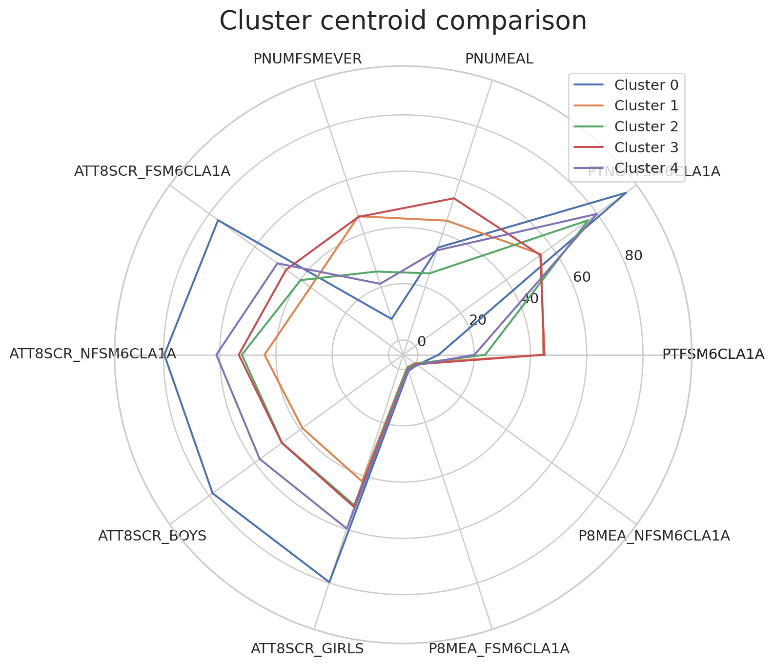
Visualising clusters with selected variables
To visualise all data points coloured by the clusters, we can pick up two variables (such as Attainment 8 for FSM vs non-FSM students) and create a scatterplot.
x_var = "ATT8SCR_FSM6CLA1A"
y_var = "ATT8SCR_NFSM6CLA1A"

plt.figure()
sns.scatterplot(
    data=df_school_london,
    x=x_var, y=y_var,
    hue="cluster_kmeans",
    palette="tab10",
    alpha=0.7
)
plt.title(f"K-means clusters (k={k_val}) on {x_var} vs {y_var} (London schools)")
plt.legend(title="Cluster", bbox_to_anchor=(1.05, 1), loc="upper left")
plt.tight_layout()
plt.show()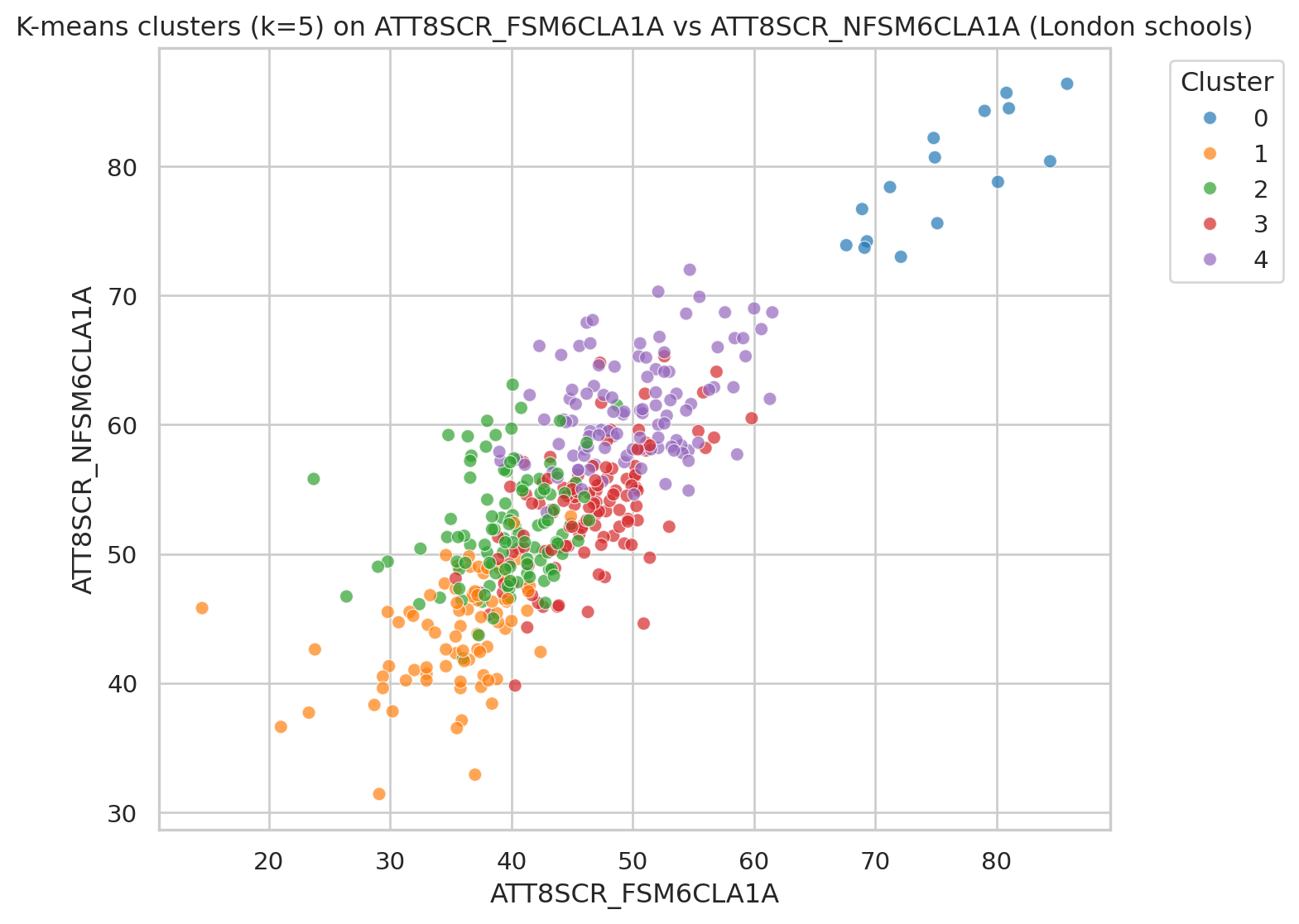
Hierarchical (Agglomerative) clustering
We now apply hierarchical clustering using AgglomerativeClustering. This builds a tree (dendrogram) that shows how clusters are merged step-by-step.
Helper function to plot dendrogram
We reconstruct a linkage matrix from the fitted model, following the pattern used in scikit-learn tutorials.
def plot_dendrogram(model, **kwargs):
    """
    Plot a dendrogram for a fitted AgglomerativeClustering model.

    This reconstructs the linkage matrix from the model's children_ and distances_.
    """
    # Number of samples
    n_samples = len(model.labels_)

    # Count samples under each node
    counts = np.zeros(model.children_.shape[0])
    for i, (left_child, right_child) in enumerate(model.children_):
        count = 0
        for child in (left_child, right_child):
            if child < n_samples:
                count += 1  # leaf
            else:
                count += counts[child - n_samples]
        counts[i] = count

    linkage_matrix = np.column_stack(
        [model.children_, model.distances_, counts]
    ).astype(float)

    dendrogram(linkage_matrix, **kwargs)
Fit hierarchical model
We first fit a model that builds the full tree so that we can draw the dendrogram.
agg_full = AgglomerativeClustering(
    distance_threshold=0,
    n_clusters=None,
    metric="euclidean",
    linkage="ward"
)

agg_full = agg_full.fit(df_scaled)
Plot truncated dendrogram
We only show the top few levels so the plot is not too crowded.
plt.figure(figsize=(10, 6))
plt.title("Hierarchical Clustering Dendrogram (truncated) - London schools")

plot_dendrogram(
    agg_full,
    truncate_mode="level",  # show only upper levels
    p=3                     # number of levels to show
)

plt.xlabel("Cluster index (not individual school)")
plt.ylabel("Distance")
plt.tight_layout()
plt.show()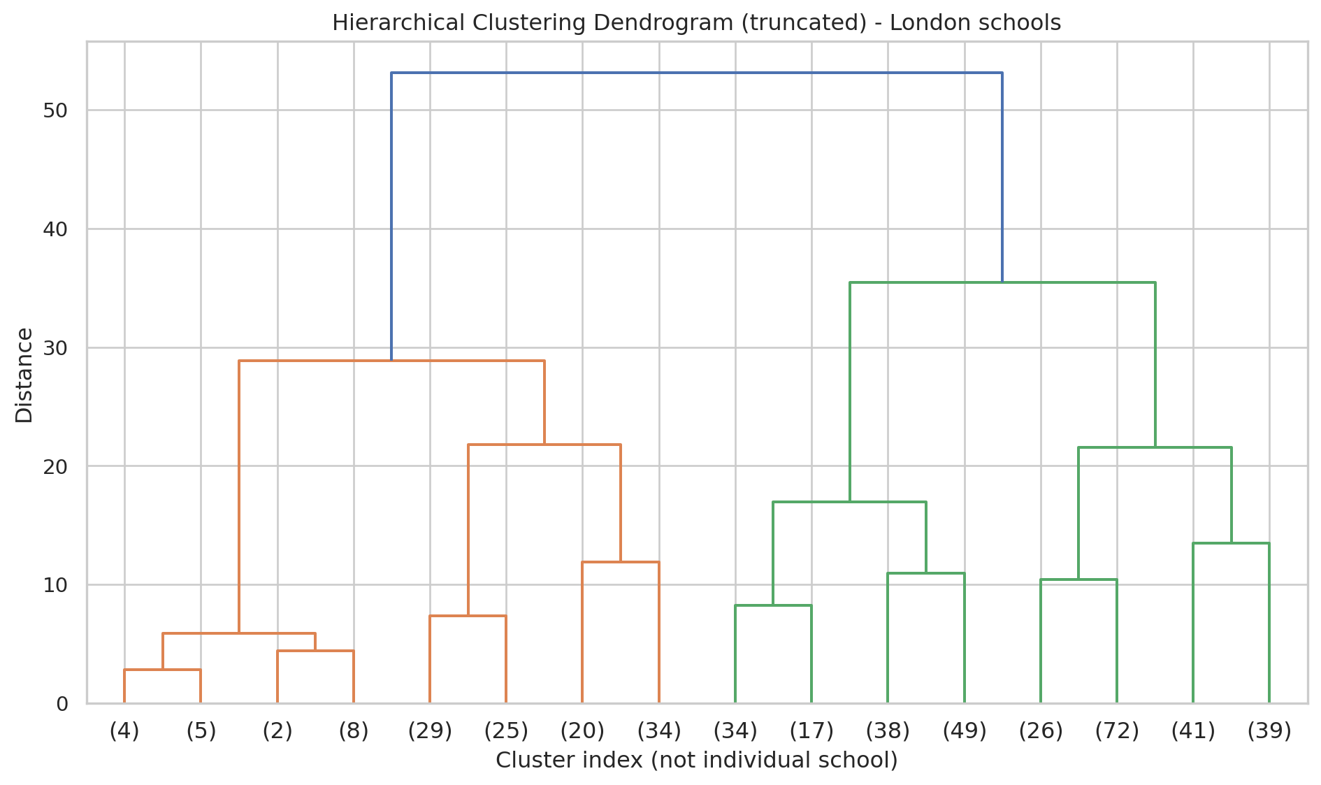
- Each merge in the tree shows two clusters being joined.
- A big vertical jump suggests a natural place to cut the tree into a small number of clusters.### Cut tree into a chosen number of clusters
We now choose a number of clusters (e.g. 5, for easier comparison with K-means).
n_clusters_hier = 5

agg_cut = AgglomerativeClustering(
    n_clusters=n_clusters_hier,
    metric="euclidean",
    linkage="ward"
)

hier_labels = agg_cut.fit_predict(df_scaled)

df_school_london = df_school_london.assign(cluster_hier=hier_labels)

df_school_london["cluster_hier"].value_counts().sort_index()
cluster_hier
0 178
1 54
2 138
3 19
4 54
Name: count, dtype: int64Plot of hierarchical cluster centroids
df_hc = df_school_reduced.copy()
df_hc = df_hc.assign(cluster_hier=hier_labels)
df_hc_centroid = df_hc.groupby('cluster_hier').mean()

radar_plot_cluster_centroids(df_hc_centroid)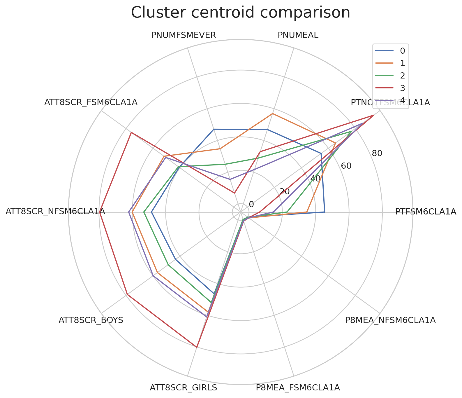
Visualising clusters with selected variables
We reuse the same two attainment variables but colour by hierarchical cluster.
plt.figure()
sns.scatterplot(
    data=df_school_london,
    x=x_var, y=y_var,
    hue="cluster_hier",
    palette="tab10",
    alpha=0.7
)
plt.title(f"Hierarchical clusters (n={n_clusters_hier}) on {x_var} vs {y_var} (London schools)")
plt.legend(title="Cluster", bbox_to_anchor=(1.05, 1), loc="upper left")
plt.tight_layout()
plt.show()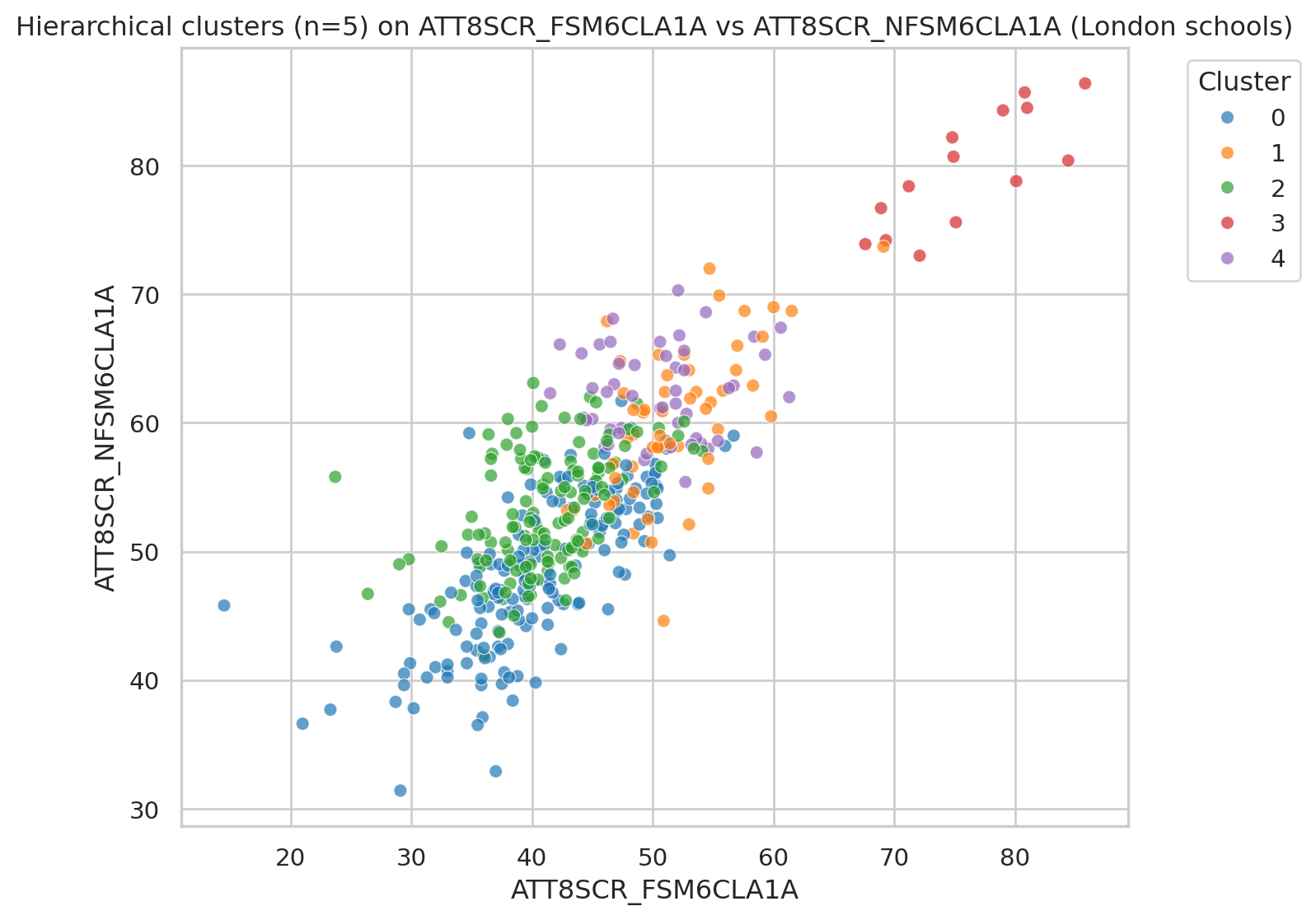
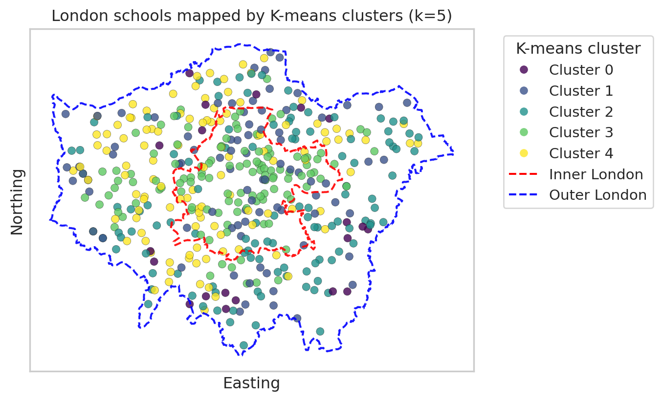
Map London schools by cluster
Finally, we map the London schools in 2D space using their easting and northing coordinates.
Each point represents a school, and the colour shows its cluster. This is a simple scatter plot (not a full GIS map), but it still reveals spatial patterns. We will map:
- Once for K-means clusters.
- Once for hierarchical clusters.
Map with K-means clusters
import geopandas as gpd
from shapely.geometry import Polygon, MultiPolygon
import matplotlib.lines as mlines
import matplotlib.pyplot as plt

# --- read and prepare boundaries (do this once in the document) ---
url_geojson = "https://raw.githubusercontent.com/huanfachen/QM/refs/heads/main/sessions/L10_data/London_Boroughs.geojson"

gdf_boroughs = gpd.read_file(url_geojson)

gdf_boroughs["BOROUGH"] = gdf_boroughs["BOROUGH"].str.replace("&", "and")

# Reproject to British National Grid (EPSG:27700)
gdf_boroughs = gdf_boroughs.to_crs(epsg=27700)

# Merge with df_lad_county to get Inner / Outer London label
gdf_london = gdf_boroughs.merge(
    df_lad_county[["LAD24NM", "CTY24NM"]],
    left_on="BOROUGH",
    right_on="LAD24NM",
    how="inner"
)

# Dissolve into single polygons for Inner / Outer London
gdf_inner_outer = gdf_london.dissolve(by="CTY24NM")  # index: "Inner London", "Outer London"

# --- build a single 'outer London' boundary from ALL boroughs (Inner + Outer) ---
# union of all geometries gives whole London footprint
london_union = gdf_london.unary_union      # Polygon or MultiPolygon

# make GeoSeries so we can plot its boundary
gseries_london_union = gpd.GeoSeries([london_union], crs=gdf_london.crs)

plt.figure(figsize=(8, 8))

# --- scatter of schools, coloured by K-means cluster ---
scatter = plt.scatter(
    df_school_london["easting"],
    df_school_london["northing"],
    c=df_school_london["cluster_kmeans"],
    cmap="viridis",
    alpha=0.8,
    edgecolor="k",
    linewidth=0.2
)

ax = plt.gca()
ax.set_aspect("equal", "box")

# --- plot Inner London boundary (red, dashed) ---
inner_geom = gdf_inner_outer.loc["Inner London"].geometry
gpd.GeoSeries([inner_geom], crs=gdf_london.crs).boundary.plot(
    ax=ax,
    edgecolor="red",
    linewidth=1.5,
    linestyle="--",
    alpha=0.9
)

# --- plot Outer London *overall* boundary from all boroughs (blue, dashed) ---
gseries_london_union.boundary.plot(
    ax=ax,
    edgecolor="blue",
    linewidth=1.5,
    linestyle="--",
    alpha=0.9
)

plt.xlabel("Easting")
plt.ylabel("Northing")
plt.title(f"London schools mapped by K-means clusters (k={k_val})")

# --- legend for clusters ---
handles_clusters, _ = scatter.legend_elements(prop="colors", alpha=0.8)
labels_clusters = [f"Cluster {i}" for i in range(k_val)]

# --- legend for Inner / Outer London boundaries ---
inner_line = mlines.Line2D(
    [], [], color="red", linestyle="--", linewidth=1.5, label="Inner London"
)
outer_line = mlines.Line2D(
    [], [], color="blue", linestyle="--", linewidth=1.5, label="Outer London boundary"
)

# combine legends
handles_all = handles_clusters + [inner_line, outer_line]
labels_all = labels_clusters + ["Inner London", "Outer London"]

plt.legend(
    handles_all,
    labels_all,
    title="K-means cluster",
    bbox_to_anchor=(1.05, 1),
    loc="upper left"
)

plt.tight_layout()

# 1. Remove axis tick text (and ticks if you like)
ax.set_xticks([])
ax.set_yticks([])

plt.show()
/tmp/ipykernel_34593/2539784033.py:29: DeprecationWarning:
The 'unary_union' attribute is deprecated, use the 'union_all()' method instead.
Map with hierarchical clusters
import matplotlib.lines as mlines

plt.figure(figsize=(8, 8))

# --- scatter of schools, coloured by hierarchical cluster ---
scatter_h = plt.scatter(
    df_school_london["easting"],
    df_school_london["northing"],
    c=df_school_london["cluster_hier"],
    cmap="viridis",
    alpha=0.8,
    edgecolor="k",
    linewidth=0.2
)

ax = plt.gca()
ax.set_aspect("equal", "box")

# --- plot Inner London boundary (red, dashed) ---
inner_geom = gdf_inner_outer.loc["Inner London"].geometry
gpd.GeoSeries([inner_geom], crs=gdf_london.crs).boundary.plot(
    ax=ax,
    edgecolor="red",
    linewidth=1.5,
    linestyle="--",
    alpha=0.9
)

# --- plot Outer London *overall* boundary from all boroughs (blue, dashed) ---
gseries_london_union.boundary.plot(
    ax=ax,
    edgecolor="blue",
    linewidth=1.5,
    linestyle="--",
    alpha=0.9
)

plt.xlabel("Easting")
plt.ylabel("Northing")
plt.title(f"London schools mapped by hierarchical clusters (n={n_clusters_hier})")

# --- legend for hierarchical clusters ---
handles_h, _ = scatter_h.legend_elements(prop="colors", alpha=0.8)
labels_h = [f"Cluster {i}" for i in range(n_clusters_hier)]

# --- legend entries for Inner / Outer London ---
inner_line = mlines.Line2D(
    [], [], color="red", linestyle="--", linewidth=1.5, label="Inner London"
)
outer_line = mlines.Line2D(
    [], [], color="blue", linestyle="--", linewidth=1.5, label="Outer London boundary"
)

# combine legends
handles_all = handles_clusters + [inner_line, outer_line]
labels_all = labels_clusters + ["Inner London", "Outer London"]

plt.legend(handles_all, labels_all,
           title="Hier. cluster",
           bbox_to_anchor=(1.05, 1), loc="upper left")

# 1. Remove axis tick text (and ticks if you like)
ax.set_xticks([])
ax.set_yticks([])

plt.tight_layout()
plt.show()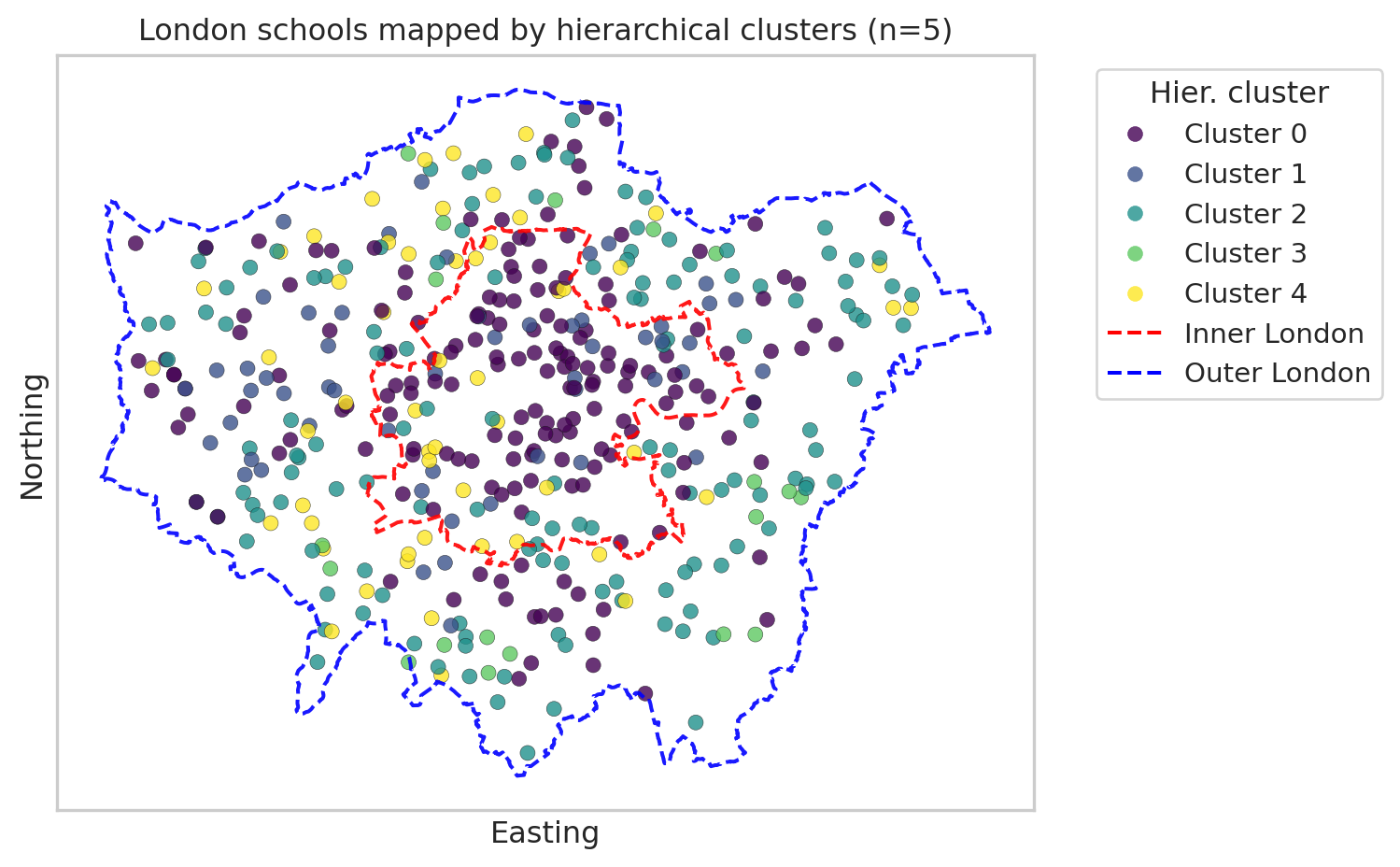
We’ve seen two maps of clusters of London schools, each with 5 clusters. Please note that the cluster numbering (0-5) is nominal rather than ordinal; it doesn’t indicate an order. In addition, we can’t compare Cluster 0 from Kmeans with Cluster 0 from hierarchical clustering.
The Kmeans clustering map shows that most schools in Cluster 3 are in Inner London, while most of the schools in Cluster 0 or 4 are outsider Inner London.
In comparison, the hierarchical clustering map shows that Cluster 0 are mostly in Inner London. For further analysis, we can link the clustering with spatial or socio-economic variables to check why these clusters are concentrated in space.
You’re Done!
In this practical, we’ve used clustering analysis to inspect the grouping of schools in London.
If you have time, you can now: - Try different variable subsets or add in more variables on census and/or performance. - Add more interpretation about what each cluster represents in educational terms.