# If needed, uncomment and run these lines once:
# %pip install xgboost shap lime

import warnings
warnings.filterwarnings('ignore')

import numpy as np
import pandas as pd
import matplotlib.pyplot as plt

from sklearn.datasets import fetch_california_housing
from sklearn.model_selection import train_test_split
from sklearn.metrics import r2_score, mean_absolute_error, mean_squared_error

from xgboost import XGBRegressorPractical 7: Model Interpretation
This week we will focus on model interpretation for machine learning models. We will use the California housing dataset from sklearn, train an XGBoost model, evaluate training/testing performance, and apply selected global and local explanation tools to explain this model.
Learning Outcomes
- Understand global interpretation methods: permutation importance and partial dependence plots (PDP).
- Understand local and global explanation using SHAP.
- Understand local explanation with LIME on selected instances.
Starting the Practical
The process for this week is similar with previous weeks: download the notebook to your DSSS folder (or wherever you keep your course materials), switch over to JupyterLab (running in Podman/Docker), and work through each section.
If you want to save the completed notebook to your Github repo, remember to add, commit, and push your work.
Note
Suggestions for a Better Learning Experience:
- Keep software language set to English for easier debugging and searching.
- Back up your work using cloud storage and/or Git.
- Avoid whitespace in filenames and dataset column names.
Load data and train an XGBoost model
We will use the California housing dataset from sklearn. The target variable is the median house value of block groups, so this is a regression task.
This dataset consists of 20640 instances and 8 features, as follows:
| Feature | Description |
|---|---|
| MedInc | Median income in block group |
| HouseAge | Median house age in block group |
| AveRooms | Average number of rooms per household |
| AveBedrms | Average number of bedrooms per household |
| Population | Block group population |
| AveOccup | Average number of household members |
| Latitude | Block group latitude |
| Longitude | Block group longitude |
# load California housing dataset
housing = fetch_california_housing(as_frame=True)
X = housing.data.copy()
y = housing.target.copy()

print("Feature names:", list(X.columns))
print("Data shape:", X.shape)
Feature names: ['MedInc', 'HouseAge', 'AveRooms', 'AveBedrms', 'Population', 'AveOccup', 'Latitude', 'Longitude']
Data shape: (20640, 8)# train-test split
X_train, X_test, y_train, y_test = train_test_split(
X, y, test_size=0.2, random_state=42
)
# train XGBoost regressor
xgb_model = XGBRegressor(
n_estimators=400,
max_depth=5,
learning_rate=0.05,
subsample=0.8,
colsample_bytree=0.8,
reg_lambda=1.0,
random_state=42,
n_jobs=-1
)
xgb_model.fit(X_train, y_train)
# "accuracy" for regression is usually represented by R-squared
train_acc = xgb_model.score(X_train, y_train)
test_acc = xgb_model.score(X_test, y_test)
print(f"Train accuracy (R-squared): {train_acc:.3f}")
print(f"Test accuracy (R-squared): {test_acc:.3f}")
# optional additional metrics
pred_test = xgb_model.predict(X_test)
print(f"Test MAE: {mean_absolute_error(y_test, pred_test):.3f}")
print(f"Test RMSE: {mean_squared_error(y_test, pred_test):.3f}")Train accuracy (R-squared): 0.900
Test accuracy (R-squared): 0.838
Test MAE: 0.307
Test RMSE: 0.212Global interpretation #1: Permutation Importance
Permutation importance measures how much model performance drops after randomly shuffling one feature at a time.
from sklearn.inspection import permutation_importance

perm = permutation_importance(
    xgb_model,
    X_test,
    y_test,
    scoring='r2',
    n_repeats=10,
    random_state=42,
    n_jobs=-1
)

perm_df = pd.DataFrame({
    'feature': X_test.columns,
    'importance_mean': perm.importances_mean,
    'importance_std': perm.importances_std
}).sort_values('importance_mean', ascending=False)

print(perm_df.head(10))
feature importance_mean importance_std
6 Latitude 1.133638 0.022544
7 Longitude 1.000647 0.014441
0 MedInc 0.400575 0.009796
5 AveOccup 0.147390 0.004267
2 AveRooms 0.067097 0.004132
1 HouseAge 0.041389 0.002588
4 Population 0.006165 0.000736
3 AveBedrms 0.005258 0.000787# plot permutation importance
fig, ax = plt.subplots(figsize=(8, 5))
plot_df = perm_df.head(10).iloc[::-1]
ax.barh(plot_df['feature'], plot_df['importance_mean'], xerr=plot_df['importance_std'])
ax.set_xlabel('Decrease in R-squared after permutation')
ax.set_title('Permutation Importance (Top 10 Features)')
plt.tight_layout()
plt.show()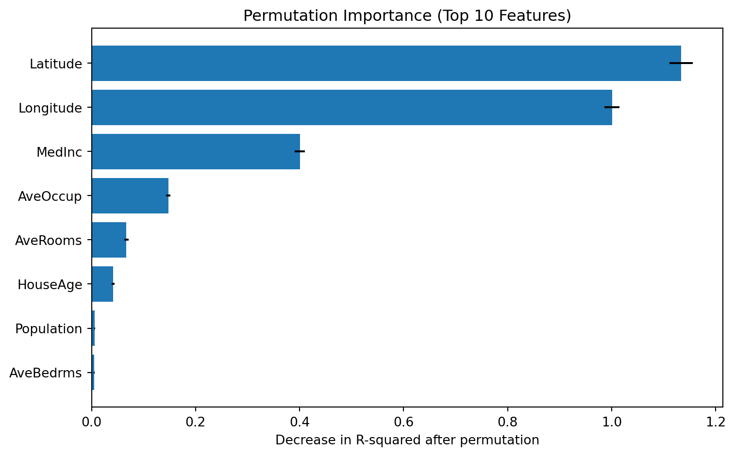
Global interpretation #2: Partial Dependence Plot (PDP)
PDP shows the marginal relationship between selected features and model prediction.
from sklearn.inspection import PartialDependenceDisplay

top_features = perm_df['feature'].head(2).tolist()
print("Features used for PDP:", top_features)

fig, ax = plt.subplots(figsize=(10, 4))
PartialDependenceDisplay.from_estimator(
    xgb_model,
    X_test,
    features=top_features,
    kind='average',
    ax=ax
)
plt.tight_layout()
plt.show()
Features used for PDP: ['Latitude', 'Longitude']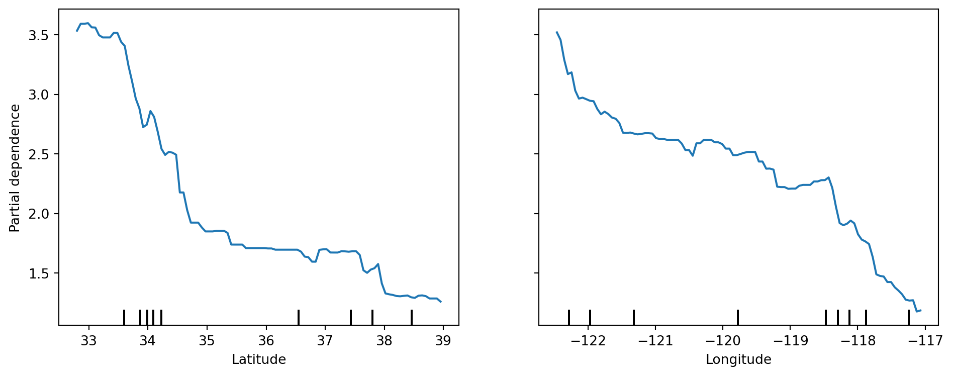
# 2D PDP interaction for the top 2 features
fig, ax = plt.subplots(figsize=(6, 5))
PartialDependenceDisplay.from_estimator(
    xgb_model,
    X_test,
    features=[(top_features[0], top_features[1])],
    kind='average',
    ax=ax
)
plt.tight_layout()
plt.show()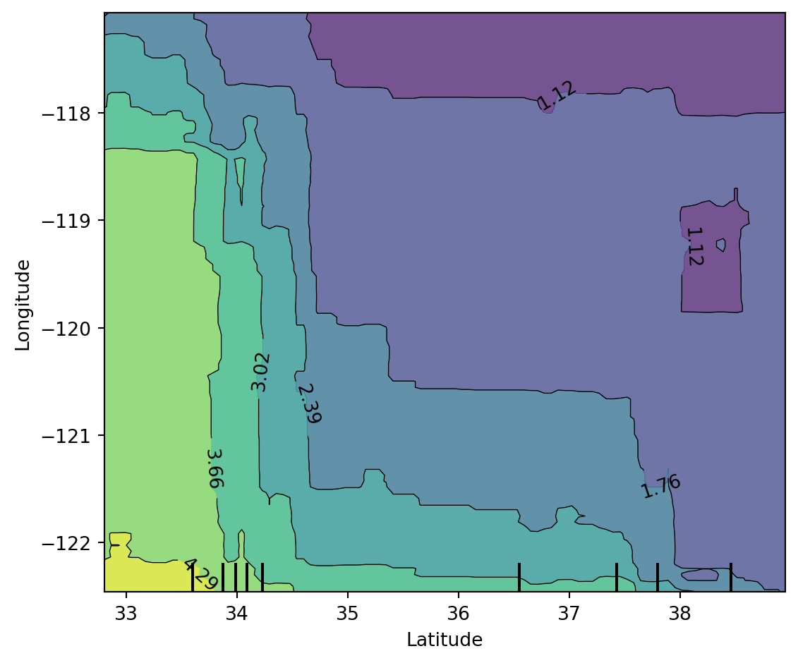
LIME explanations on selected instances
LIME fits a local surrogate model around one observation to explain that prediction.
from lime.lime_tabular import LimeTabularExplainer

lime_explainer = LimeTabularExplainer(
    training_data=X_train.values,
    feature_names=X_train.columns.tolist(),
    mode='regression',
    random_state=42
)

selected_instances = [0, 25]
print("Selected test indices for LIME:", selected_instances)
Selected test indices for LIME: [0, 25]# explain first selected instance
idx = selected_instances[0]
exp0 = lime_explainer.explain_instance(
data_row=X_test.iloc[idx].values,
predict_fn=xgb_model.predict,
num_features=8
)
print("LIME explanation (instance 0):")
for item in exp0.as_list():
print(item)LIME explanation (instance 0):
('34.26 < Latitude <= 37.72', -0.7837524926243596)
('MedInc <= 2.57', -0.5889227458599529)
('AveOccup > 3.28', -0.3902649272832995)
('-121.81 < Longitude <= -118.51', 0.32934340025813946)
('AveRooms <= 4.45', -0.2756012553522709)
('1.01 < AveBedrms <= 1.05', -0.05715969923834868)
('18.00 < HouseAge <= 29.00', -0.021056359465906282)
('1167.00 < Population <= 1726.00', -0.010292394052920673)fig = exp0.as_pyplot_figure()
fig.set_size_inches(8, 4)
plt.tight_layout()
plt.show()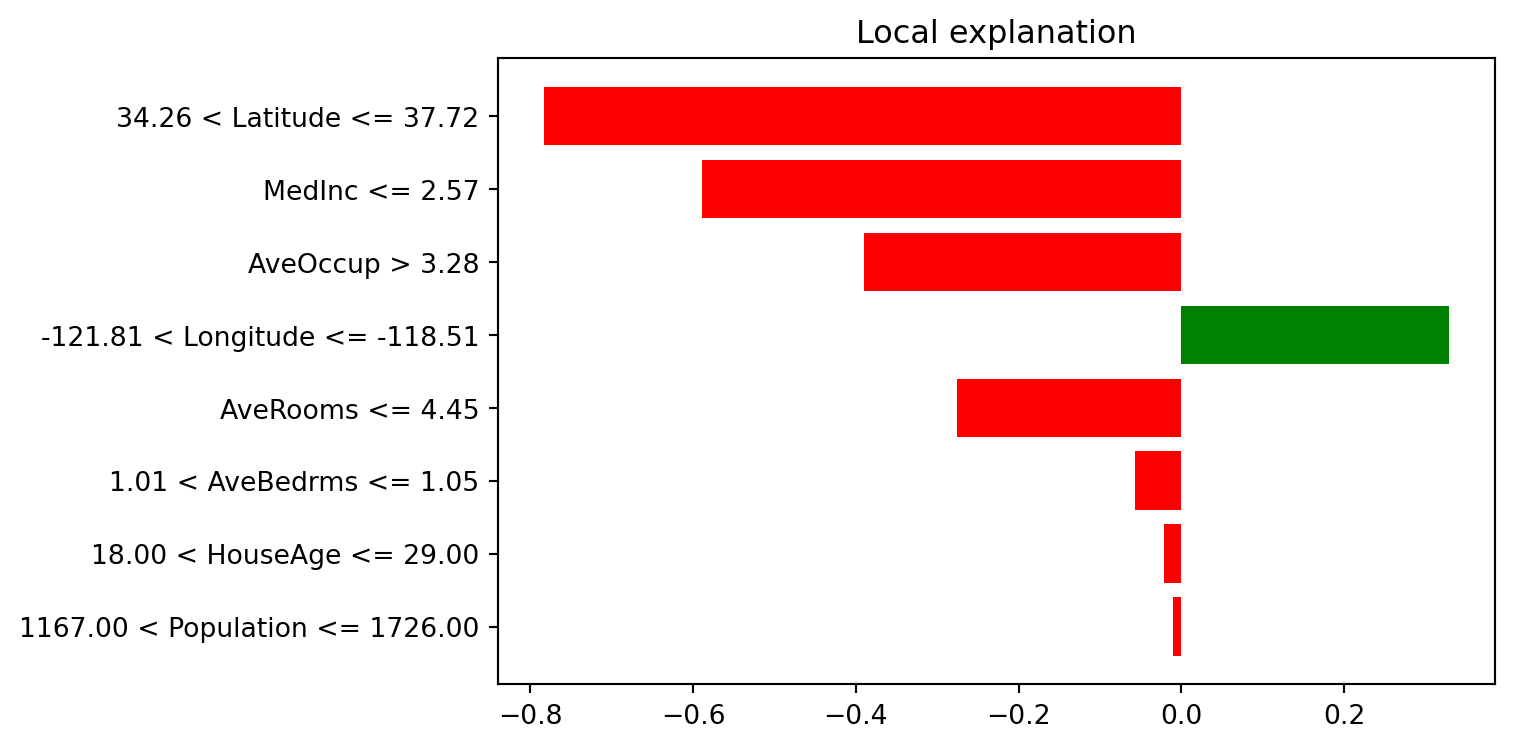
# explain second selected instance
idx = selected_instances[1]
exp1 = lime_explainer.explain_instance(
    data_row=X_test.iloc[idx].values,
    predict_fn=xgb_model.predict,
    num_features=8
)

print("LIME explanation (instance 25):")
for item in exp1.as_list():
    print(item)
LIME explanation (instance 25):
('34.26 < Latitude <= 37.72', -0.8357020876638822)
('MedInc <= 2.57', -0.5262201177132678)
('-121.81 < Longitude <= -118.51', 0.386953637862254)
('AveOccup > 3.28', -0.347359724491345)
('AveRooms <= 4.45', -0.25683613674482825)
('1167.00 < Population <= 1726.00', 0.06943511133454212)
('1.01 < AveBedrms <= 1.05', 0.027832879625163547)
('HouseAge > 37.00', -0.007124887818044562)fig = exp1.as_pyplot_figure()
fig.set_size_inches(8, 4)
plt.tight_layout()
plt.show()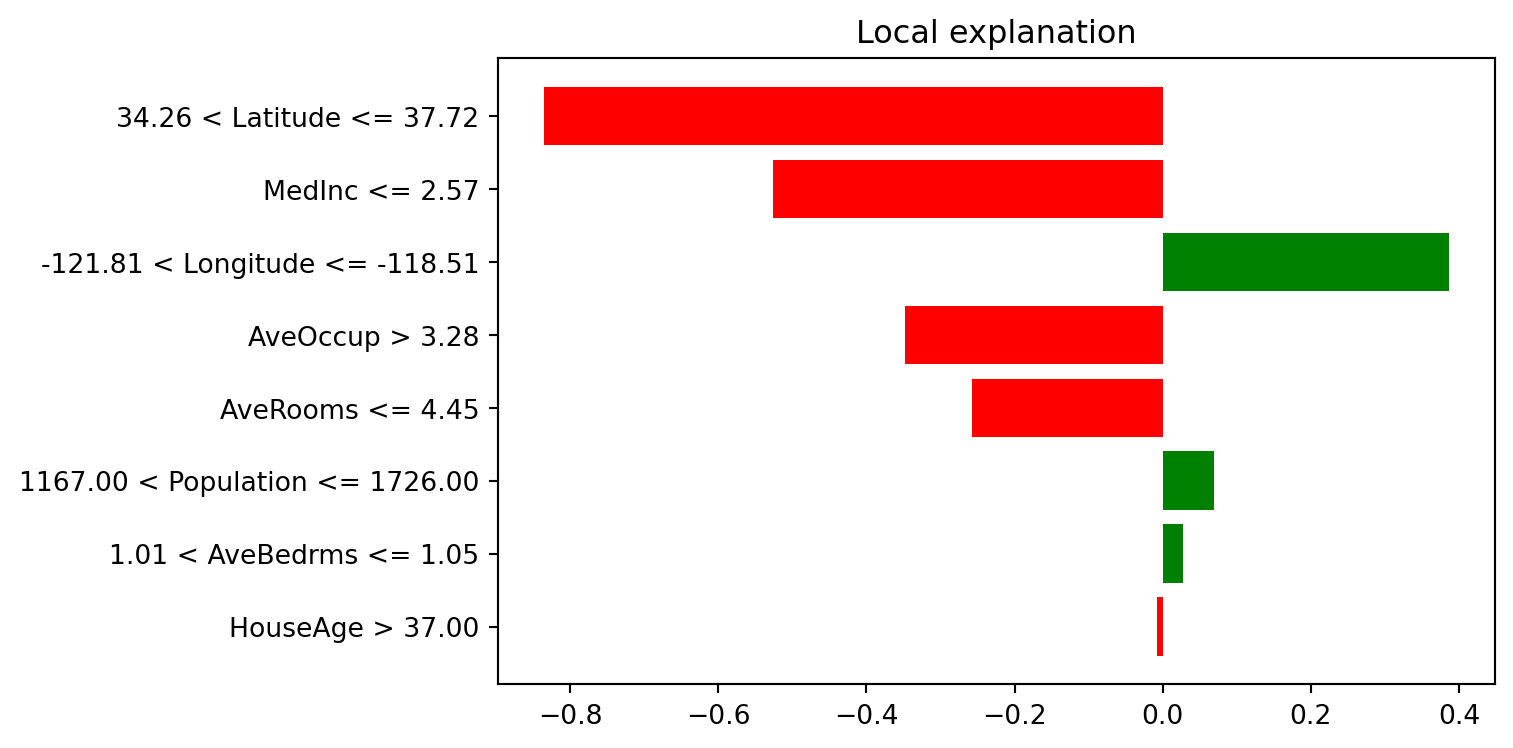
SHAP explanations
SHAP explains predictions using additive feature attributions.
import shap

# for faster plotting, sample test data
X_test_sample = X_test.sample(n=min(500, len(X_test)), random_state=42)

explainer = shap.TreeExplainer(xgb_model)
shap_values = explainer(X_test_sample)

print("SHAP values shape:", shap_values.values.shape)
SHAP values shape: (500, 8)SHAP waterfall plot (single instance)
instance_idx = 0
shap.plots.waterfall(shap_values[instance_idx], max_display=12)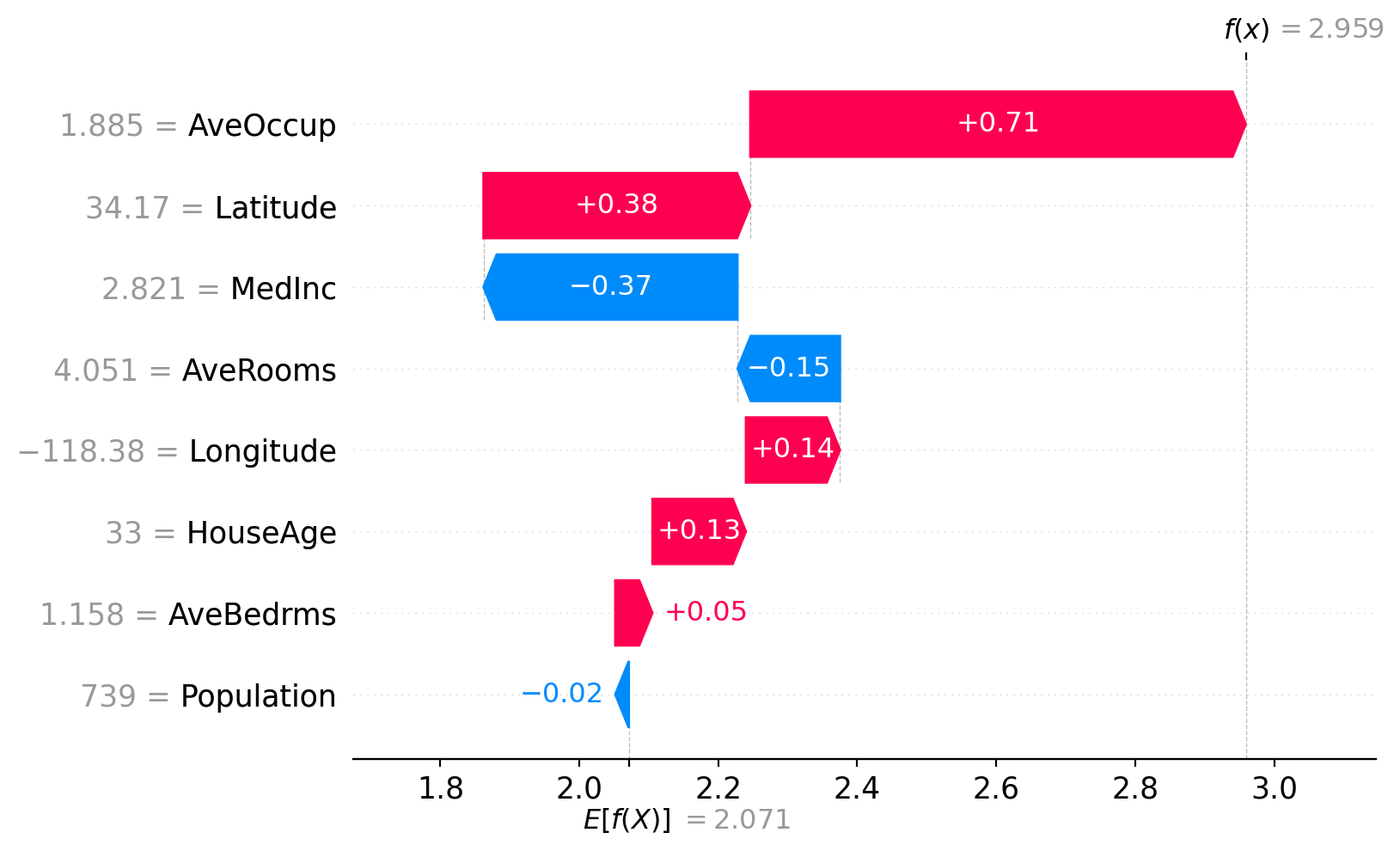
SHAP force plot (single instance)
# static matplotlib force plot for compatibility in Quarto output
shap.force_plot(
    base_value=explainer.expected_value,
    shap_values=shap_values.values[instance_idx, :],
    features=X_test_sample.iloc[instance_idx, :],
    feature_names=X_test_sample.columns,
    matplotlib=True,
    show=False
)
plt.tight_layout()
plt.show()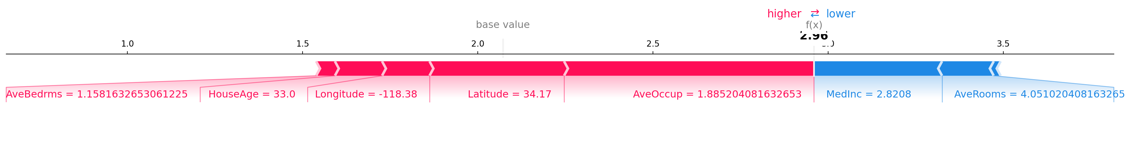
SHAP beeswarm plot
shap.plots.beeswarm(shap_values, max_display=15)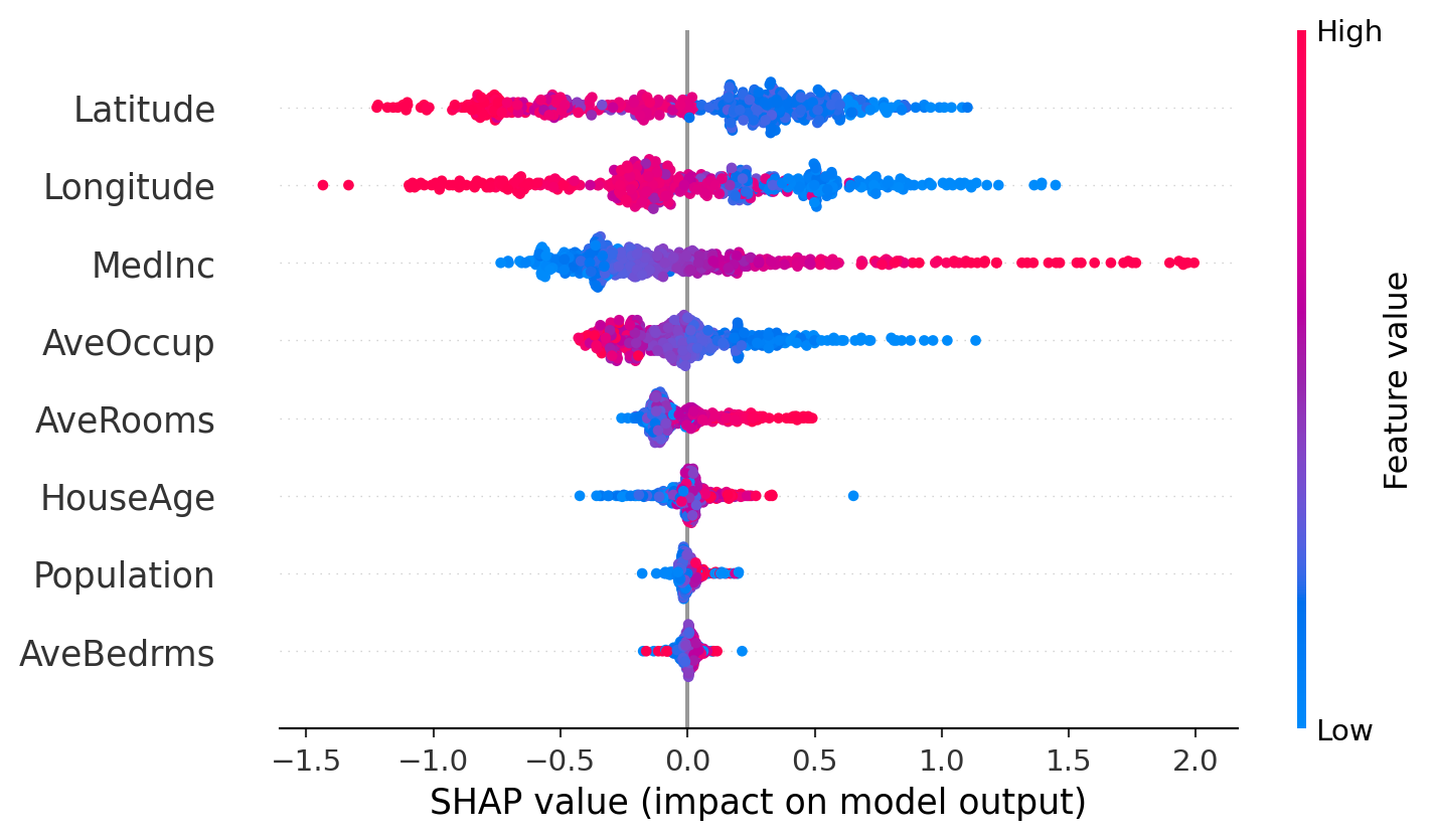
SHAP feature importance plot (global)
shap.plots.bar(shap_values, max_display=15)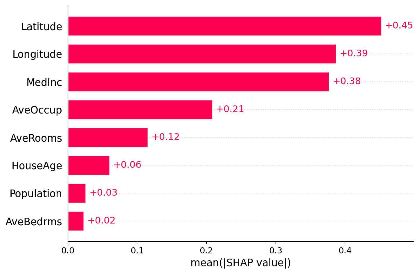
Comparing permutation importance and SHAP feature importance
Although these two methods sound similar, they are different in nature. These two methods can give different feature rankings because they measure different things: permutation importance measures the impact on model performance, while SHAP measures the average contribution to predictions.
So, how much do they agree with each other?
# create a combined dataframe for comparison
shap_importance_df = pd.DataFrame({
    'feature': X_test_sample.columns,
    'shap_importance': np.abs(shap_values.values).mean(axis=0)
}).sort_values('shap_importance', ascending=False)

comparison_df = perm_df.merge(shap_importance_df, on='feature', how='inner')
print(comparison_df)
feature importance_mean importance_std shap_importance
0 Latitude 1.133638 0.022544 0.452462
1 Longitude 1.000647 0.014441 0.386787
2 MedInc 0.400575 0.009796 0.377017
3 AveOccup 0.147390 0.004267 0.208232
4 AveRooms 0.067097 0.004132 0.115399
5 HouseAge 0.041389 0.002588 0.060043
6 Population 0.006165 0.000736 0.025706
7 AveBedrms 0.005258 0.000787 0.022653Summary
Congratulations! You have completed the practical on model interpretation and feature importance. To summarise, we have practiced with the following methods:
- Permutation importance gives robust and model-agnostic global ranking by performance drop.
- PDP shows average marginal effect of a feature (or feature pair).
- SHAP provides both global and local additive attributions with consistent units.
- LIME gives local and instance-specific surrogate explanations.
Note
Always remember that these methods explain the model, not the data. For a given task, the feature importance can differ across different models (e.g. random forest, XGBoost, neural network) and different explanation methods (e.g. permutation importance, SHAP feature importance).
Exercises
- Try LIME on two extreme predictions (very high and very low) and compare explanations.
- Use PDP for other feature pairs and discuss possible non-linear relationships.
- Use these methods on your own dataset and interpret the results with caution.